|
|
|
|
|
|
| |
| |
|
|
|
|
| |
| |
|
|
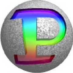
Yet another logo!
This is simply a special "P" in a circle. The P is made of basic primitives,
and no text object is involved. I have made different color versions to show
that you can color it as you please.
What do you think?
Greetings,
Rune
---
Updated April 25: http://rsj.mobilixnet.dk
Containing 3D images, stereograms, tutorials,
The POV Desktop Theme, 350+ raytracing jokes,
miscellaneous other things, and a lot of fun!
Post a reply to this message
Attachments:
Download 'bigp_a.gif' (2 KB)
Download 'bigp_b.gif' (1 KB)
Download 'bigp_c.jpg' (8 KB)
Download 'bigp_d.jpg' (9 KB)
Preview of image 'bigp_a.gif'

Preview of image 'bigp_b.gif'

Preview of image 'bigp_c.jpg'

Preview of image 'bigp_d.jpg'
|
|
| |
| |
|
|
|
|
| |
| |
|
|
It looks kinda cartoony... IMHO Tony's looks more professional.
--
David Fontaine <dav### [at] faricy net> ICQ 55354965
Please visit my website: http://www.faricy.net/~davidf/ net> ICQ 55354965
Please visit my website: http://www.faricy.net/~davidf/
Post a reply to this message
|
|
| |
| |
|
|
|
|
| |
| |
|
|
CSG, huh? That's pretty impressive. I mean it's a nice P - I like the top
one best. I've also started to like your compact text logo.
Hepp,
sig
Post a reply to this message
|
|
| |
| |
|
|
|
|
| |
| |
|
|
"Sigmund Kyrre Aas" wrote:
> CSG, huh? That's pretty impressive.
> I mean it's a nice P
Thanks!
> I've also started to like your compact text logo.
Glad you do!
Do you have any suggestions of how I could improve either of them?
Greetings,
Rune
---
Updated April 25: http://rsj.mobilixnet.dk
Containing 3D images, stereograms, tutorials,
The POV Desktop Theme, 350+ raytracing jokes,
miscellaneous other things, and a lot of fun!
Post a reply to this message
|
|
| |
| |
|
|
|
|
| |
| |
|
|
"David Fontaine" wrote:
> It looks kinda cartoony...
> IMHO Tony's looks more professional.
Me too... But you never know what people think, so it's best to post all
ideas you get! :-)
Greetings,
Rune
---
Updated April 25: http://rsj.mobilixnet.dk
Containing 3D images, stereograms, tutorials,
The POV Desktop Theme, 350+ raytracing jokes,
miscellaneous other things, and a lot of fun!
Post a reply to this message
|
|
| |
| |
|
|
|
|
| |