 |
 |
|
 |
|
 |
|  |
|  |
|
 |
|
 |
|  |
|  |
|
 |
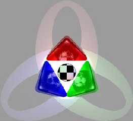
O.k. o.k. So I finally made a stab at this POV logo thing. :{P
Comments?
David
Post a reply to this message
Attachments:
Download 'povlogo1.jpg' (23 KB)
Download 'povlogo2.jpg' (10 KB)
Download 'povlogo1.gif' (26 KB)
Download 'povlogo2.gif' (6 KB)
Preview of image 'povlogo1.jpg'
Preview of image 'povlogo2.jpg'

Preview of image 'povlogo1.gif'
Preview of image 'povlogo2.gif'
|
 |
|  |
|  |
|
 |
|
 |
|  |
|  |
|
 |
Hmmm, maybe. :) I would throw out the lines on the BG and zoom into the
triangles and sphere. Can we also have an icon size view?
Post a reply to this message
|
 |
|  |
|  |
|
 |
|
 |
|  |
|  |
|
 |
TonyB <ben### [at] panama c-com c-com net> wrote in message
news:391230bf@news.povray.org...
> Hmmm, maybe. :) I would throw out the lines on the BG and zoom into the
> triangles and sphere. Can we also have an icon size view?
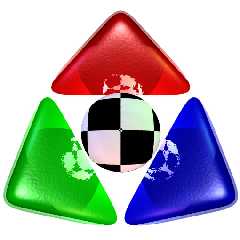
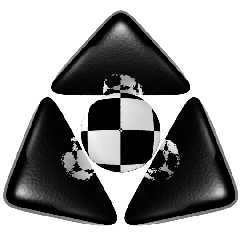
O.k... Here goes.. Eliminated the lightflows from the spotlights and brought
the camera in closer. The smaller images are 32 by 32 pixels. ie, icon size.
Better?
David net> wrote in message
news:391230bf@news.povray.org...
> Hmmm, maybe. :) I would throw out the lines on the BG and zoom into the
> triangles and sphere. Can we also have an icon size view?
O.k... Here goes.. Eliminated the lightflows from the spotlights and brought
the camera in closer. The smaller images are 32 by 32 pixels. ie, icon size.
Better?
David
Post a reply to this message
Attachments:
Download 'povlogo3.jpg' (60 KB)
Download 'povlogo4.jpg' (7 KB)
Download 'povlogo3.gif' (84 KB)
Download 'povlogo4.gif' (2 KB)
Preview of image 'povlogo3.jpg'
Preview of image 'povlogo4.jpg'

Preview of image 'povlogo3.gif'
Preview of image 'povlogo4.gif'
|
 |
|  |
|  |
|
 |
|
 |
|  |
|  |
|
 |
Those reflections just don't seem to work for this type thing.
Not much left of this if those go.
I liked the first one I saw, seemed more complete.
Bob
"David Heys" <sou### [at] gci net> wrote in message news:39124ea5@news.povray.org...
| TonyB <ben### [at] panama net> wrote in message news:39124ea5@news.povray.org...
| TonyB <ben### [at] panama c-com c-com net> wrote in message
| news:391230bf@news.povray.org...
| > Hmmm, maybe. :) I would throw out the lines on the BG and zoom into the
| > triangles and sphere. Can we also have an icon size view?
|
| O.k... Here goes.. Eliminated the lightflows from the spotlights and brought
| the camera in closer. The smaller images are 32 by 32 pixels. ie, icon size.
| Better?
|
| David
|
|
|
| net> wrote in message
| news:391230bf@news.povray.org...
| > Hmmm, maybe. :) I would throw out the lines on the BG and zoom into the
| > triangles and sphere. Can we also have an icon size view?
|
| O.k... Here goes.. Eliminated the lightflows from the spotlights and brought
| the camera in closer. The smaller images are 32 by 32 pixels. ie, icon size.
| Better?
|
| David
|
|
|
|
Post a reply to this message
|
 |
|  |
|  |
|
 |
|
 |
|  |
|  |
|
 |
>O.k... Here goes.. Eliminated the lightflows from the spotlights and
brought
>the camera in closer. The smaller images are 32 by 32 pixels. ie, icon
size.
>Better?
Yes. I would unfuzz the reflections, though, but that's just me. You know
what you want this to look like. I'd say it looks nice right now. I would
probably* even vote for it. :)
*I say "probably", because I've come up with some new ideas recently for a
new logo that will look really cool (or so I hope).
Post a reply to this message
|
 |
|  |
|  |
|
 |
|
 |
|  |


![]()