|
|
|
|
|
|
| |
| |
|
|
|
|
| |
| |
|
|
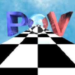
This time I did it.
Unsimple, unoriginal (see last message and follow-ups ;-), and ugly.
My main problem is with the 2 color b/w version.
The last on uses radiosity, although it's not really visible.
Comments?
Enjoy!
BTW: Rune, see this as a submission.
Post a reply to this message
Attachments:
Download 'povray1bw642c.gif' (1 KB)
Download 'povray1bw64aa.gif' (2 KB)
Download 'povray164c.gif' (3 KB)
Download 'povray1128c.gif' (7 KB)
Preview of image 'povray1bw642c.gif'

Preview of image 'povray1bw64aa.gif'

Preview of image 'povray164c.gif'

Preview of image 'povray1128c.gif'
|
|
| |
| |
|
|
|
|
| |
| |
|
|
Hmmm, what appears to be a burnt edge on that "V" doesn't seem
to go with the others. Also, I was seeing that V as a large "y" in all
but the last image so I thought a POV-Ray was being done.
Bob
"Lewis" <nle### [at] netvision netil> wrote in message
news:390F6216.2FE1205D@netvision.net.il...
| This time I did it.
| Unsimple, unoriginal (see last message and follow-ups ;-), and ugly.
| My main problem is with the 2 color b/w version.
|
| The last on uses radiosity, although it's not really visible.
|
| Comments?
| Enjoy!
|
| BTW: Rune, see this as a submission. netil> wrote in message
news:390F6216.2FE1205D@netvision.net.il...
| This time I did it.
| Unsimple, unoriginal (see last message and follow-ups ;-), and ugly.
| My main problem is with the 2 color b/w version.
|
| The last on uses radiosity, although it's not really visible.
|
| Comments?
| Enjoy!
|
| BTW: Rune, see this as a submission.
Post a reply to this message
|
|
| |
| |
|
|
|
|
| |
| |
|
|
I like these.... very nice. Seem to have icon potential....
-paul
Lewis wrote:
> This time I did it.
> Unsimple, unoriginal (see last message and follow-ups ;-), and ugly.
> My main problem is with the 2 color b/w version.
>
> The last on uses radiosity, although it's not really visible.
>
> Comments?
> Enjoy!
>
> BTW: Rune, see this as a submission.
>
> ------------------------------------------------------------------------
> [Image] [Image] [Image] [Image]
Post a reply to this message
|
|
| |
| |
|
|
|
|
| |
| |
|
|
"Lewis" wrote:
> This time I did it.
> Comments?
Nice, but I think it would be a better if you chopped off the lower half
part.
> BTW: Rune, see this as a submission.
Sorry, I can't.
In the new contest we haven't made the rules yet. The formats in which the
logos should be submitted have not yet been decided.
However, your efforts haven't been wasted. You can still get feedback from
others. You can keep the logo (and maybe improve it), and then submit it
when it becomes possible.
Greetings,
Rune
---
Updated April 25: http://rsj.mobilixnet.dk
Containing 3D images, stereograms, tutorials,
The POV Desktop Theme, 350+ raytracing jokes,
miscellaneous other things, and a lot of fun!
Post a reply to this message
|
|
| |
| |
|
|
|
|
| |
|
|