|
|
|
|
|
|
| |
| |
|
|
|
|
| |
| |
|
|
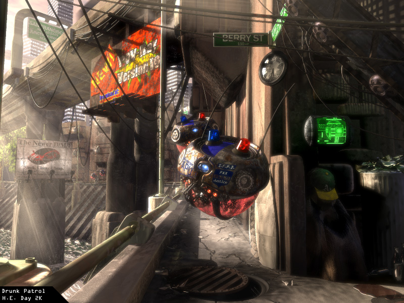
Yes indeedy.  I be done.  I don't think I can wait two weeks for
feedback,
so I'd like to request the ng's comments.  Please comment!!
Someone here said that they should be worried about me, Gilles, and
Nathan.
Personally, I'm only scared spitless of Gilles. Nathan and I are about
even. I guess.
You judge.
Oh, and enjoy.

--
H.E. Day
<><
Post a reply to this message
Attachments:
Download 'drunkpat.jpg' (220 KB)
Preview of image 'drunkpat.jpg'
|
|
| |
| |
|
|
|
|
| |
| |
|
|
>Yes indeedy.  I be done.  I don't think I can wait two weeks for
>feedback, so I'd like to request the ng's comments.  Please comment!!

Yes, master! Excellent image. Not the kind of output one is used to seeing
from POV. Wonderful control of natural lighting conditions. It's a little
hard to see the drunk, but one can imagine a human form under that. I think
I see a smidgen of his face there, too, but just barely. I would like to
know what that plate under the Berry St. sign is and also how you flipped
the camera image in this second version.

>Someone here said that they should be worried about me, Gilles, and
>Nathan. Personally, I'm only scared spitless of Gilles. Nathan and I are
>about even. I guess. You judge.

You're all excellent artists. Gilles has been good longer than you, but
right now, although your styles are different, I consider you equals. Your
control of blobs, though, certainly outdoes his. This is just my opinion.

>Oh, and enjoy.

Hey, that's my line. ;) And, I did. :)
Post a reply to this message
|
|
| |
| |
|
|
|
|
| |
| |
|
|
It's superb. I had to wonder why I street sign is located there but I
don't think this image should have to be "accurate" since it deals
with fiction. The buildings are what trouble me most. Identical.
I can see how they show up better being so much in the background
however explaining them to be such clones might be difficult to pass off.
Didn't someone mention that before? Anyway, that's my only criticism.
Bob
"H.E. Day" <The### [at] heday freeserverscom> wrote in message
news:390CF25B.DBBAD459@heday.freeservers.com...
| Yes indeedy. I be done. I don't think I can wait two weeks for
| feedback,
| so I'd like to request the ng's comments. Please comment!!
| Someone here said that they should be worried about me, Gilles, and
| Nathan.
| Personally, I'm only scared spitless of Gilles. Nathan and I are about
| even. I guess.
| You judge.
| Oh, and enjoy.
|
| --
| H.E. Day
| <><
|
|
--------------------------------------------------------------------------------
Post a reply to this message
|
|
| |
| |
|
|
|
|
| |
| |
|
|
I just have one word to say...
AWESOME!


"H.E. Day" wrote:

> Yes indeedy.  I be done.  I don't think I can wait two weeks for
> feedback,
> so I'd like to request the ng's comments.  Please comment!!
> Someone here said that they should be worried about me, Gilles, and
> Nathan.
> Personally, I'm only scared spitless of Gilles. Nathan and I are about
> even. I guess.
> You judge.
> Oh, and enjoy.
>
> --
> H.E. Day
> <><
>
>   ------------------------------------------------------------------------
>  [Image]
Post a reply to this message
Attachments:
Download 'us-ascii' (1 KB)
|
|
| |
| |
|
|
|
|
| |
| |
|
|
>I would like to
> know what that plate under the Berry St. sign is and also how you flipped
> the camera image in this second version.
It's a broken clock. and I used

right -x*1.33

in the camera statement.

H.E. Day
Post a reply to this message
|
|
| |
| |
|
|
|
|
| |
| |
|
|
<groveling>
We're not worthy... we're not worthy.
</groveling>

I seem to be saying that a lot lately.

Eric
--------------------
http://www.datasync.com/~ericfree
--------------------
"I don't like it, and I'm sorry I ever had anything to do with it."
- Erwin Schrodinger talking about Quantum Mechanics.
Post a reply to this message
|
|
| |
| |
|
|
|
|
| |
| |
|
|
Excellent work! Any criticisms would be really picky...
Does that green display say "2001"?

--
Phil
...coffee?...yes please! extra sugar,extra cream...Thank you.
Post a reply to this message
|
|
| |
| |
|
|
|
|
| |
| |
|
|
On Sun, 30 Apr 2000 19:56:27 -0700 "H.E. Day"
<The### [at] hedayfreeserverscom> wrote:

>Yes indeedy.  I be done.  I don't think I can wait two weeks for
>feedback, so I'd like to request the ng's comments.  Please comment!!

  Very nice work, H.E.! I wouldn't be too concerned with comparisons of
other artists' work. That would be like saying which individual piece of
music makes one classical composer better than another. I prefer to
critique someone's work on its own merits.

  I like the overall lighting of the scene. Looks like an early morning
roundup of the City's derelicts (for lack of a nicer term). On my
monitor it's hard to make out the hunched figure wearing the A's cap
unless I crank up the gamma, though. Could be a scene out of "Blade
Runner", although most outdoor scenes in that movie took place at night.

  Keep up the good work.

--
Alan - ako### [at] povrayorg - a k o n g <at> p o v r a y <dot> o r g
http://www.povray.org - Home of the Persistence of Vision Ray Tracer
Post a reply to this message
|
|
| |
| |
|
|
|
|
| |
| |
|
|
I have noticed your "style" seems very similar to that of someone named
Craig Mullins, although in a different medium(Mullins uses Photoshop,
not 3D programs).
You can see some of his Bungie art here:
http://www.bungie.com/inside/gallery.shtml

and another one here:
http://pid.bungie.org/images/craigmullinspid1.jpg

--
Christopher James Huff - Personal e-mail: chr### [at] yahoocom
TAG(Technical Assistance Group) e-mail: chr### [at] tagpovrayorg
Personal Web page: http://chrishuff.dhs.org/
TAG Web page: http://tag.povray.org/
Post a reply to this message
|
|
| |
| |
|
|
|
|
| |
| |
|
|
I shall never render again.....

:-)

Very nice. I envy your imaginational skills....

"H.E. Day" wrote:
>
> Yes indeedy.  I be done.  I don't think I can wait two weeks for
> feedback,
> so I'd like to request the ng's comments.  Please comment!!
> Someone here said that they should be worried about me, Gilles, and
> Nathan.
> Personally, I'm only scared spitless of Gilles. Nathan and I are about
> even. I guess.
> You judge.
> Oh, and enjoy.
>
> --
> H.E. Day
> <><
>
>   ------------------------------------------------------------------------
>  [Image]

--


--------------------------------------------------}
Paul Daniel Jones
The Pennslyvania State University

pdj### [at] psuedu
http://research.chem.psu.edu/glassgrp/paul

       C            The way is near, but men
     // \           seek it afar. It is in the
    N    N          easy things, but men seek it
    |    ||         in the difficult things.
    C    C          -Menicius
     \\  /
       C
--------------------------------------------------}
Post a reply to this message
|
|
| |
| |
|
|
|
|
| |
| |
|
|
Alan Kong wrote:

>   Very nice work, H.E.! I wouldn't be too concerned with comparisons of
> other artists' work. That would be like saying which individual piece of
> music makes one classical composer better than another. I prefer to
> critique someone's work on its own merits.
>

Well said, Alan. My only criticism about H.E.'s latest offering would be
that it tends to raise the level of what can now be expected from Povray to
heights where breathing is difficult !
BTW, what about a new Hall of Fame that would better reflect this kind of
excellency than the present one (which would be kept for historical
purposes) ?
G.
Post a reply to this message
|
|
| |
| |
|
|
|
|
| |
| |
|
|
oh my.

this is quite a serious crime indeed, you are getting far to good to be
posting among us mere mortals.

Rick
Post a reply to this message
|
|
| |
| |
|
|
|
|
| |
| |
|
|
>It's a broken clock. and I used
>right -x*1.33
>in the camera statement.


I figured it would be something like that. Clever. I've needed to flip a
couple scenes before. Good idea. Thanks.
Post a reply to this message
|
|
| |
| |
|
|
|
|
| |
| |
|
|
>I seem to be saying that a lot lately.

Yes, you have, Garth...
Post a reply to this message
|
|
| |
| |
|
|
|
|
| |
| |
|
|
I would *LOVE* to see it in 1024x768!!!!!
You just did this one with a camera, didn't you... Jeez, it looks so cool!

Bugs74
Post a reply to this message
|
|
| |
| |
|
|
|
|
| |
| |
|
|
On Sun, 30 Apr 2000 19:56:27 -0700, "H.E. Day"
<The### [at] hedayfreeserverscom> wrote:

>Yes indeedy.  I be done.  I don't think I can wait two weeks for
>feedback,

There are a few things in this image that simply make me wonder.

For instance, what is the light source coming from high and left of
the image? It shouldn't be sunlight, because the rays of light don't
appear parallel, but definitely converge. They even appear "bent," but
perhaps the bending is just camera distortion.

Why did someone go to the trouble of erecting billboards under a
bridge? Most billboards are in a position of maximum visibility. The
one for POV 10 could perhaps be pointed toward some highway off to the
left, out of camera view. However, the billboard for the auto is
pointed toward the area with the drunk. This appears to be an area for
pedestrian traffic only. Perhaps in this city, there are so many
billboards that they end up being practically everywhere?

As everyone else has said, it's hard to make out the drunk without
increasing the gamma of the image. When I did, I was glad to see an
overturned beer bottle next to the drunk. That removed the ambiguity
of where the puddle came from.    :)

(Seriously though, I'm beginning to wonder if your system displays
this image lighter than most everyone else. It really looks better
when I lighten the image with a gamma adjustment.)

Do pedestrian pathways actually get street signs in some cities? I do
like your choice of street names.   :)

Overall, it's a very nice image. The sense of wear and decay is very
well done. The gritty urban decor is likewise well done, with things
like the abundance of cables hanging from the edges of the bridges,
the way the bridges seem to have been shoe-horned into existing space,
the dented metal trash cans, etc. Those drones look well done, and
well used I might add. It seems the city keeps the same drones for
several years instead of frequently upgrading to newer models.   :)

It might sound like I picked this image to death, but I really do like
it. A few things just leave me puzzled, that's all. I do think it
deserves a place in the hall of fame. Thanks for sharing it with us.

Later,
Glen Berry

( Remove the "7" from 7no### [at] ezwvcom to email me. )
Post a reply to this message
|
|
| |
| |
|
|
|
|
| |
| |
|
|
On Mon, 01 May 2000 00:52:32 -0400, Gregoire Millette
<gfm### [at] homecom> wrote:

>I just have one word to say...
>AWESOME!

I wrote a lengthy response to this image, and noticed my post took up
49 lines in my newsreader's header listing window. Then I notice that
Gregoire's post required 54 lines for basically one sentence. I feel
like I'm in the twilight zone.

Later,
Glen Berry

( Remove the "7" from 7no### [at] ezwvcom to email me. )
Post a reply to this message
|
|
| |
| |
|
|
|
|
| |
| |
|
|
I can't complain about the modeling/rendering technical aspects really. it's
nice work. I think if you want to take the next step, you need to work a
little more on the composition. When I look at this image, I start at the
top left and the wires lead me down to the droids. then the rail leads me
back off the image to the bottom left corner. The sunbeams on the poster
then pull me back up to the top left. I have to force my eyes over to the
dark part where the bum is barely noticeable. If my eyes do make it into the
dark region, they just get confused by that bright green thing which draws
significant attention away from the fact that there is a figure below it.
The spill (or urine?, naw, it looks kind of redish) is a nice hint towards
the drunk idea, but it is too little of a hint.

There's something about the droids being right in the middle that makes me
hear voices of past art teachers screaming "bullseye."

One question, are the droids finding him, or passing him by because they
can't see him either? are they heading away from the camera?

nice job though.

ross.
Post a reply to this message
|
|
| |
| |
|
|
|
|
| |
| |
|
|
Impressive!

Makes a hard act to follow, any critism would be picky.

Mick
Post a reply to this message
|
|
| |
| |
|
|
|
|
| |
| |
|
|
Stunning !!

I like the control of the light and all the neat image_maps you used.

Superb !

Fabien Hénon


"H.E. Day" a écrit :

> Yes indeedy.  I be done.  I don't think I can wait two weeks for
> feedback,
> so I'd like to request the ng's comments.  Please comment!!
> Someone here said that they should be worried about me, Gilles, and
> Nathan.
> Personally, I'm only scared spitless of Gilles. Nathan and I are about
> even. I guess.
> You judge.
> Oh, and enjoy.
>
> --
> H.E. Day
> <><
>
>   ------------------------------------------------------------------------
>  [Image]
Post a reply to this message
|
|
| |
| |
|
|
|
|
| |
| |
|
|
On Mon, 1 May 2000 11:40:30 -0400, "Ross Litscher"
<lit### [at] osuedu> wrote:

>There's something about the droids being right in the middle that makes me
>hear voices of past art teachers screaming "bullseye."

Your art teachers enthusiastically played darts in class?   :)

Seriously, the centering doesn't bother me in this image. If you
assume that the droids are coming at the camera, which I think they
are. It just adds to the feeling of terror they must instill in the
drunks they are searching, because the frontmost droid looks as if he
is about to run overtop of you, and he couldn't care less.    :)

For the record, the frontmost droid is not totally centered, but a
little low and to the right. If you assume that it is flying in
formation with the one behind, this suggests a trajectory for their
flight. If they are coming toward the camera, the front droid is also
going downward, and toward the viewer's right.

By the way, there are no composition rules, only suggestions.

>One question, are the droids finding him, or passing him by because they
>can't see him either? are they heading away from the camera?

As I've said already, I think they are coming toward the camera. I
also don't think they have found him, because their "take down" lights
aren't on.   :)

Later,
Glen Berry

( Remove the "7" from 7no### [at] ezwvcom to email me. )
Post a reply to this message
|
|
| |
| |
|
|
|
|
| |
| |
|
|
You must be tired of overwhelming positive feedback already. Unfortunately
I can't be an exception. I will try, however, to be more objective (so no
"wonderful!", "outstanding!" or "perfect!" screams this time, sorry :) ).

  I must say that this is one of the best POV-Ray images I have ever seen.
And I don't say this very frequently.
  Deducing from your previous posts I think this image is made entirely or
mostly by hand. I just can't understand how can you do this even using
a high-end modeller in just a couple of months (as a hobby, not as a paid
job). The richness of details is almost overwhelming. The amount of work
spent on this image is truely admirable.
  And of course the amount of work spent can't be the only thing that makes
an image good. The ability to create and place objects, designing the whole
scene, setting up lighting, texturing, etc. is the most important part of
the process. It definitely requires talent.
  Also the ability to use some of the most difficult features of povray
such as the atmospheric effects seen in the image in an almost perfect way
shows an admirable knowledge of the program.
  This is one of those images that can be proudly shown to all 3D-Studio
and other high-end modeller users to show the possibilites of a free
raytracer.

  I don't think I'll never learn to make images like this.
  Would you, however, be willing to write some tutorial about your
techniques?

--
main(i,_){for(_?--i,main(i+2,"FhhQHFIJD|FQTITFN]zRFHhhTBFHhhTBFysdB"[i]
):5;i&&_>1;printf("%s",_-70?_&1?"[]":" ":(_=0,"\n")),_/=2);} /*- Warp -*/
Post a reply to this message
|
|
| |
| |
|
|
|
|
| |
| |
|
|
I wish I were as observant as you. And they say that people with small
writing pay attention to details. I guess I'm the exception.
Post a reply to this message
|
|
| |
| |
|
|
|
|
| |
| |
|
|
Glen Berry <7no### [at] ezwvcom> wrote

> >There's something about the droids being right in the middle that makes
me
> >hear voices of past art teachers screaming "bullseye."
>
> Your art teachers enthusiastically played darts in class?   :)
>

yes, if my paintings had something predominantly in the middle of them, they
would get darts(if not globs of paint) thrown at them. okay, not really. but
they would give me some pointers on how to make things more interesting for
the viewer.

>
> For the record, the frontmost droid is not totally centered, but a
> little low and to the right. If you assume that it is flying in
> formation with the one behind, this suggests a trajectory for their
> flight. If they are coming toward the camera, the front droid is also
> going downward, and toward the viewer's right.


you're right, but the droids as a whole are pretty much in the middle of the
image. the hints of motion help lessen this, so it's not totally bad at all.
just something that caught my attention. I'm more questioning of how i only
see the left 3/5 of the image when i casually look at it.


>
> By the way, there are no composition rules, only suggestions.
>


yeah, but the suggestions have validity in most cases. they often seem to
make the image more interesting. I think that if H.E. (what is your first
name anyway? or do your friends just call you H.E. all the time...) really
wants to kick some ass, he should incorporate more traditional artistic
knowledge with his nice rendering and modelling knowledge. I'm no genius on
the topic at all, so take my opinions with a grain of salt or toss em in
/dev/null.


ross
Post a reply to this message
|
|
| |
| |
|
|
|
|
| |
| |
|
|
On Mon, 1 May 2000 13:57:02 -0400, "Ross Litscher"
<lit### [at] osuedu> wrote:

>you're right, but the droids as a whole are pretty much in the middle of the
>image. the hints of motion help lessen this, so it's not totally bad at all.
>just something that caught my attention. I'm more questioning of how i only
>see the left 3/5 of the image when i casually look at it.

I was wondering about your tendency to do this also.  :)

In your previous post, you mentioned how the rays of light drew your
eyes toward the droid, only to be pulled away by the railing in the
corner. Funny, my attention tend to stay focused on the droid.
Perhaps, it the instinctive impulse to keep an eye on an apparently
moving object to make sure I don't get run over.     :)

Seriously, if the image were a bit lighter (a gamma adjustment), the
imbalance is much less. It might also be worth trying to add something
to the right hand side of the image to balance it more. Perhaps add a
small amount of light to that side? We wouldn't want too much light,
because it would destroy the concept of the drunk hiding in the
shadows.

>> By the way, there are no composition rules, only suggestions.
>
>yeah, but the suggestions have validity in most cases. they often seem to
>make the image more interesting.

The other side of this coin was expressed fairly well by a comment
made by a highly respected National Geographic photographer:

  "If you ever shoot a roll of film and all the resulting photos are
pretty, sharp, and well exposed - you've failed."

I'll let everyone think about that. It applies to POV renderings as
well.

Later,
Glen Berry

( Remove the "7" from 7no### [at] ezwvcom to email me. )
Post a reply to this message
|
|
| |
| |
|
|
|
|
| |
| |
|
|
On Mon, 01 May 2000 14:25:59 -0400, Glen Berry <7no### [at] ezwvcom>
wrote:

>Seriously, if the image were a bit lighter (a gamma adjustment), the
>imbalance is much less. It might also be worth trying to add something
>to the right hand side of the image to balance it more.

On second thought, perhaps a simple gamma adjustment is all I would
attempt. The only trouble is not knowing what gamma setting other
people have their machines set to. It might look perfect on H.E.'s
machine already.

Later,
Glen Berry

( Remove the "7" from 7no### [at] ezwvcom to email me. )
Post a reply to this message
|
|
| |
| |
|
|
|
|
| |
| |
|
|
>   "If you ever shoot a roll of film and all the resulting photos are
> pretty, sharp, and well exposed - you've failed."

Perhaps for a magazine that attempts to capture a believable reality, this
is true. But for H.E. Day and other artists, "believable" doesn't
necessarily come into play. For them it is often far better to capture the
unbelievable POV-Rayality of a given scene.

--
Dan D.
Post a reply to this message
|
|
| |
| |
|
|
|
|
| |
| |
|
|
>  The buildings are what trouble me most.  Identical.
> I can see how they show up better being so much in the background
> however explaining them to be such clones might be difficult to pass off.
> Didn't someone mention that before? Anyway, that's my only criticism.

I don't see what the problem is.  I guess what I was trying to get across was a
regimented city that had decayed into dirt and slime.  Anyway, some of those new
apartment building all look the same, right?

--
H.E. Day
Post a reply to this message
|
|
| |
| |
|
|
|
|
| |
| |
|
|
> Excellent work! Any criticisms would be really picky...
> Does that green display say "2001"?

Actually, yes, it does.  2001 Drake Drive. It's my old address in
Oakland.  Sorta an in-joke.

--
H.E. Day
Post a reply to this message
|
|
| |
| |
|
|
|
|
| |
| |
|
|
>   Very nice work, H.E.! I wouldn't be too concerned with comparisons of
> other artists' work. That would be like saying which individual piece of
> music makes one classical composer better than another. I prefer to
> critique someone's work on its own merits.

I'm very insecure. :->

>   I like the overall lighting of the scene. Looks like an early morning
> roundup of the City's derelicts (for lack of a nicer term). On my
> monitor it's hard to make out the hunched figure wearing the A's cap
> unless I crank up the gamma, though. Could be a scene out of "Blade
> Runner", although most outdoor scenes in that movie took place at night.

Nope, it is early morning.  I guess I designed it with all my monitor's
settings to the max.  That might be the problem.

--
H.E. Day
Post a reply to this message
|
|
| |
| |
|
|
|
|
| |
| |
|
|
Did I miss an announcement?
Seems Mr. Day is at metaflare...
http://www.mordor.ch/paschu/076.htm
--
Phil
...coffee?...yes please! extra sugar,extra cream...Thank you.
Post a reply to this message
|
|
| |
| |
|
|
|
|
| |
| |
|
|
> I have noticed your "style" seems very similar to that of someone named
> Craig Mullins, although in a different medium(Mullins uses Photoshop,
> not 3D programs).

Yeah, I know of Craig.  Found his work about a year ago, but didn't use it
as inspiration for this image.
Instead, I used the work of  Dawid Michalczyk. His page is:
http://users.cybercity.dk/~bcc5877/
I decided to make my pic a bit darker than his art, but still used some of
his excellent ideas (such as the abundance of wires and cables).

--
H.E. Day
Post a reply to this message
|
|
| |
| |
|
|
|
|
| |
| |
|
|
> For instance, what is the light source coming from high and left of
> the image? It shouldn't be sunlight, because the rays of light don't
> appear parallel, but definitely converge. They even appear "bent," but
> perhaps the bending is just camera distortion.

No, they aren't. But they are a mix of parallel and radiating beams.  They
are just cones, so you're probably right about the camera distortion.


> Why did someone go to the trouble of erecting billboards under a
> bridge? Most billboards are in a position of maximum visibility. The
> one for POV 10 could perhaps be pointed toward some highway off to the
> left, out of camera view. However, the billboard for the auto is
> pointed toward the area with the drunk. This appears to be an area for
> pedestrian traffic only. Perhaps in this city, there are so many
> billboards that they end up being practically everywhere?

Exactly.  I was going to add more, but I ran out of time.


> As everyone else has said, it's hard to make out the drunk without
> increasing the gamma of the image. When I did, I was glad to see an
> overturned beer bottle next to the drunk. That removed the ambiguity
> of where the puddle came from.    :)

> (Seriously though, I'm beginning to wonder if your system displays
> this image lighter than most everyone else. It really looks better
> when I lighten the image with a gamma adjustment.)

As I've said, I made this image with all my brightness and gamma settings
maxed out.  I guess I should check these things before I even start....

> Do pedestrian pathways actually get street signs in some cities? I do
> like your choice of street names.   :)

Some.  I know of at least two in Eugene.

--
H.E. Day
Post a reply to this message
|
|
| |
| |
|
|
|
|
| |
| |
|
|
>   You must be tired of overwhelming positive feedback already. Unfortunately
> I can't be an exception. I will try, however, to be more objective (so no
> "wonderful!", "outstanding!" or "perfect!" screams this time, sorry :) ).

They're making me blush.

>   Deducing from your previous posts I think this image is made entirely or
> mostly by hand. I just can't understand how can you do this even using
> a high-end modeller in just a couple of months (as a hobby, not as a paid
> job). The richness of details is almost overwhelming. The amount of work
> spent on this image is truely admirable.

Yes, completely by hand.  I absolutely love the amount of power that povray
affords by using a text editor. I've tried other freeware 3d packages such as
blender, but Have been unable to decipher their interface.  Oh, and the time
spent to make this was exactly 29 days 10 hours and 45 minutes.

>   Also the ability to use some of the most difficult features of povray
> such as the atmospheric effects seen in the image in an almost perfect way
> shows an admirable knowledge of the program.

The only atmosphere in this image is the fog.  The beams of light are cones,
flattened and textured.  This gave me more control over how the were rendered,
as well as speeding the render time.


>   I don't think I'll never learn to make images like this.
>   Would you, however, be willing to write some tutorial about your
> techniques?

I'll get to it eventually.  Sooner now that this round is over...

--
H.E. Day
Post a reply to this message
|
|
| |
| |
|
|
|
|
| |
| |
|
|
Yeah. Forgot to mention that...


--
H.E. Day
Post a reply to this message
|
|
| |
| |
|
|
|
|
| |
| |
|
|
Ohhhhh, I will never do anything with POV again after having seen your
astounding picture. Such high degree of perfection will never be reached by
mere simple folks who are beginners forever...

But beautiful it is, what atmosphere, what colours, what scenery!!
Congratulations with your talent :-)

--
Regards,  Sander
-----------------------------

H.E. Day <The### [at] hedayfreeserverscom> schreef in berichtnieuws
390CF25B.DBBAD459@heday.freeservers.com...
> Yes indeedy.  I be done.  I don't think I can wait two weeks for
> feedback,
> so I'd like to request the ng's comments.  Please comment!!
> Someone here said that they should be worried about me, Gilles, and
> Nathan.
> Personally, I'm only scared spitless of Gilles. Nathan and I are about
> even. I guess.
> You judge.
> Oh, and enjoy.
Post a reply to this message
|
|
| |
| |
|
|
|
|
| |
| |
|
|
Damn! I always loved those decadent images with lots of cables & wires going
everywhere (so nowhere  ;).
The broken clock is a perfect touch and the atmosphere is good.

Sci-fi is your world!  :)

Marco

--
     Oblique strategies
no. 118: Emphasize the flaws.
----------------------------------------------------------------------------
       Marco Semprini
          Rimini - Italy
               email: obl### [at] liberoadhocnet
 nickname: "oblique" (on #trax under IRCnet)
        ICQ #: 2843904
----------------------------------------------------------------------------
Post a reply to this message
|
|
| |
| |
|
|
|
|
| |
| |
|
|
Wow! I'm sure the feedback will be putting you on quite the ego trip (if you
haven't put yourself on it already, those statements you made were kinda
equivocal ;-p )
I see you have mirrored it. Why?
And the car model is my initials, tee hee!

--
David Fontaine     <dav### [at] faricynet>    ICQ 55354965
Please visit my website: http:/www.faricy.net/~davidf/
Post a reply to this message
|
|
| |
| |
|
|
|
|
| |
| |
|
|
The Hall of fame could stand to be updated...Maybe I'll move this
topic over to general for a little discussion.
--
Phil
...coffee?...yes please! extra sugar,extra cream...Thank you.
Post a reply to this message
|
|
| |
| |
|
|
|
|
| |
| |
|
|
On Mon, 1 May 2000 15:52:21 -0400, "ddombrow" <ddo### [at] vtedu> wrote:

>>   "If you ever shoot a roll of film and all the resulting photos are
>> pretty, sharp, and well exposed - you've failed."
>
>Perhaps for a magazine that attempts to capture a believable reality, this
>is true. But for H.E. Day and other artists, "believable" doesn't
>necessarily come into play. For them it is often far better to capture the
>unbelievable POV-Rayality of a given scene.

You don't get it yet...   not at all...      sorry.

I'll wait to see if anyone else has a comment before I explain it.

Later,
Glen Berry

( Remove the "7" from 7no### [at] ezwvcom to email me. )
Post a reply to this message
|
|
| |
| |
|
|
|
|
| |
| |
|
|
"H.E. Day" <The### [at] hedayfreeserverscom> wrote in
news:390CF25B.DBBAD459@heday.freeservers.com...
> I'd like to request the ng's comments.  Please comment!!

I thought I'd try some constructive criticism, as opposed to a bunch of
superlatives, so I stared at the pic for a long time, trying to come up with
something negative. The results: I find the green neon thing on the right a
bit distracting, especially since it's surroundings are so dark; the bot
antennas look a bit pixelated, along with some of the cables. Oh, and the
drunk is very hard to see on my screen too. Apart from these things it is an
amazing pic, certainly one of the best I've seen. Keep up the stunning work!

¤¤¤¤
¤ Sebastian Strand
¤ E-mail: the### [at] bigfootcom
¤ URL: http://www.zeb.f2s.com/
¤¤¤¤
Post a reply to this message
|
|
| |
| |
|
|
|
|
| |
| |
|
|
NICE work!!  This has got to be a strong contender :-)

Bryan

"H.E. Day" <The### [at] hedayfreeserverscom> wrote in message
news:390CF25B.DBBAD459@heday.freeservers.com...
> Yes indeedy.  I be done.  I don't think I can wait two weeks for
> feedback,
> so I'd like to request the ng's comments.  Please comment!!
> Someone here said that they should be worried about me, Gilles, and
> Nathan.
> Personally, I'm only scared spitless of Gilles. Nathan and I are about
> even. I guess.
> You judge.
> Oh, and enjoy.
>
> --
> H.E. Day
> <><
>
>


----------------------------------------------------------------------------
----
Post a reply to this message
|
|
| |
| |
|
|
|
|
| |
| |
|
|
Congrats.
Post a reply to this message
|
|
| |
| |
|
|
|
|
| |
| |
|
|
Glen Berry wrote:
>
> On Mon, 1 May 2000 15:52:21 -0400, "ddombrow" <ddo### [at] vtedu> wrote:
>
> >>   "If you ever shoot a roll of film and all the resulting photos are
> >> pretty, sharp, and well exposed - you've failed."
> >
> >Perhaps for a magazine that attempts to capture a believable reality, this
> >is true. But for H.E. Day and other artists, "believable" doesn't
> >necessarily come into play. For them it is often far better to capture the
> >unbelievable POV-Rayality of a given scene.
>
> You don't get it yet...   not at all...      sorry.
>
> I'll wait to see if anyone else has a comment before I explain it.

Hmmm...

Maybe you mean that if one is satisfied with all the pictures
on the "roll", then one has lost the ability to improve
...and that this itself is a kind of failure?

Or do you mean that if all of the pictures on the "roll" is
"right" then one are not experimenting (and pushing the limits)
...and without experimenting one cannot evolve ?

Or maybe I haven't got it yet either... :(

Tor Olav
--
mailto:tor### [at] hotmailcom
http://www.crosswinds.net/~tok/tokrays.html
Post a reply to this message
|
|
| |
| |
|
|
|
|
| |
| |
|
|
Glen Berry <7no### [at] ezwvcom> wrote in
>
> >>   "If you ever shoot a roll of film and all the resulting photos are
> >> pretty, sharp, and well exposed - you've failed."
>

>
> I'll wait to see if anyone else has a comment before I explain it.
>
> Later,
> Glen Berry'


See... i just don't agree with this at all. If I shoot a roll of film, i
take them out and look at them. I see that they are pretty. Ooo, sharp too.
Well exposed, even. And you tell me I have failed? That is a heap of warm
cow pies. You're telling me that my perspective is wrong, that I have failed
because somehow my brain interpreted the images to be pretty, sharp and well
exposed.

and it becomes more complex... this quote is even more full of the
aforementioned cow pies if when I see the resulting photographs, they
captured the light *exactly* as I saw it the first time, that is, pretty,
sharp, and well exposed. then to say I have failed is unjustified, because
the person judging has no reference as to what a success is.

I think the quote is entirely wrong, atleast in my current time and space.


ross.
Post a reply to this message
|
|
| |
| |
|
|
|
|
| |
| |
|
|
"H.E. Day" wrote:
>
> Yes indeedy.  I be done.  I don't think I can wait two weeks for
> feedback,
> so I'd like to request the ng's comments.  Please comment!!
> Someone here said that they should be worried about me, Gilles, and
> Nathan.
> Personally, I'm only scared spitless of Gilles. Nathan and I are about
> even. I guess.
> You judge.
> Oh, and enjoy.
>
I like a lot! Two thumbs up!
Only thing, that disturbs me, is the spilled wine (?), which does not
look natural, it seems to be too thick, glow by its side ain't natural.
I would expect, that it is absorbed by pavement.
Post a reply to this message
|
|
| |
| |
|
|
|
|
| |
| |
|
|
That's one of the most complex and most well executed scenes I've
ever seen. Really very impressive work.

The _only_ thing that caught my eye is the puddle on the ground
under the green display thingy. It seems a little too thick to be
natural. The reflection at the edge seems a little too bright.
Post a reply to this message
|
|
| |
| |
|
|
|
|
| |
| |
|
|
Ross Litscher wrote:

> Glen Berry <7no### [at] ezwvcom> wrote in
> >
> > >>   "If you ever shoot a roll of film and all the resulting photos are
> > >> pretty, sharp, and well exposed - you've failed."
> >
> I think the quote is entirely wrong, atleast in my current time and space.

I think (but I may be wrong) that what Glen is saying is that art and perfection
(as defined by the technical rules that apply in one particular field) are
different things. If you obtain something that is perfect according to what is
generally considered as perfection (here represented by "prettiness",
"sharpness" and "good exposure"), then you have failed, because what you've
done, as agreeable, as well-crafted as it can be, will lack the "little"
something, the odd stuff that will turn it into art (of course, most people
don't want to turn everything into art, which is wise). Roland Barthes, in his
essay on photography titled the "Chambre Claire", called this odd stuff the
"punctum", for example a small, unexpected detail that shouldn't be there if the
picture was actually perfect. The problem is that since this has already been
known for a long time, many artists add punctums or apply "un-perfection" in a
so deliberate way that it becomes a mere gimmick (or another extension of
perfection), thus blurring the edges even further.

G.
Post a reply to this message
|
|
| |
| |
|
|
|
|
| |
| |
|
|
On Mon, 01 May 2000 11:22:23 -0400 Glen Berry <7no### [at] ezwvcom> wrote:

>I wrote a lengthy response to this image, and noticed my post took up
>49 lines in my newsreader's header listing window. Then I notice that
>Gregoire's post required 54 lines for basically one sentence. I feel
>like I'm in the twilight zone.

  Was that the post with the binary attachment - a vcard, perhaps? I
know I deleted one response with an attachment of some kind that doesn't
display in my newsreader.

--
Alan - ako### [at] povrayorg - a k o n g <at> p o v r a y <dot> o r g
http://www.povray.org - Home of the Persistence of Vision Ray Tracer
Post a reply to this message
|
|
| |
| |
|
|
|
|
| |
| |
|
|
"H.E. Day" wrote:

> Oh, and enjoy.

enjoy, enjoy, enjoy...

In one post you wrote that the beams are just flattened cones and that
it gives you more control. I think this makes it harder because you have
to clip them at the bridge to give the right atmospheric effect. It
looks good but not perfect. Some beams are clipped by the bridge but it
seems that some other beams go through the D/M/F tableau.

But who am I to criticize... I will never do such an excellent job (even
not with moray) 8-[

Karl
Post a reply to this message
|
|
| |
| |
|
|
|
|
| |