|
|
|
|
|
|
| |
| |
|
|
|
|
| |
| |
|
|
Everyone must have had plenty of time to submit a logo by now.

However, it seems like many of you would like to submit the logos in higher
resolutions.

To standardize the submission formats please resubmit your logo as a reply
to this message in the following formats:

64x64 pixel, black & white with no antialiasing
64x64 pixel, black & white with antialiasing (optional)
64x64 pixel, with as many colors as desired (optional)
128x128 pixel, with as many colors as desired

All submissions should be submitted before March 18. This is also a chance
for others to submit a logo, who haven't done so yet.

Afterwards I'll put up some kind of survey, where everyone can vote for
their favorite logo.

Greetings,

Rune

---
Updated January 24: http://rsj.mobilixnet.dk
Containing 3D images, stereograms, tutorials,
The POV Desktop Theme, 350+ raytracing jokes,
miscellaneous other things, and a lot of fun!
Post a reply to this message
|
|
| |
| |
|
|
|
|
| |
| |
|
|
Post a reply to this message
Attachments:
Download 'logo64bw.png' (1 KB)
Download 'logo64bwa.png' (2 KB)
Download 'logo64c.png' (5 KB)
Download 'logo128c.png' (15 KB)
Preview of image 'logo64bw.png'
Preview of image 'logo64bwa.png'

Preview of image 'logo64c.png'

Preview of image 'logo128c.png'

|
|
| |
| |
|
|
|
|
| |
| |
|
|
Here's mine (revised)...
Post a reply to this message
Attachments:
Download 'pov-logo09.gif' (1 KB)
Download 'pov-logo07.gif' (3 KB)
Download 'pov-logo08.gif' (6 KB)
Download 'pov-logo05.gif' (3 KB)
Preview of image 'pov-logo09.gif'
Preview of image 'pov-logo07.gif'

Preview of image 'pov-logo08.gif'

Preview of image 'pov-logo05.gif'

|
|
| |
| |
|
|
|
|
| |
| |
|
|
They're all smushed! Didn't you change the aspect ratio?
--
___ _______________________________________________
| \ |_ <dav### [at] faricy net> <ICQ 55354965>
|_/avid |ontaine http://www.faricy.net/~davidf/
"The only difference between me and a madman is that I'm not mad." -Dali
Post a reply to this message
|
|
| |
| |
|
|
|
|
| |
| |
|
|
I still like the version with the "wacky" fonts...  :)

Fabien Mosen wrote:
>
> Here's mine (revised)...
>
>   ------------------------------------------------------------------------
>  [Image]  [Image]  [Image]  [Image]
Post a reply to this message
|
|
| |
| |
|
|
|
|
| |
| |
|
|
Scott Reid wrote:

> I still like the version with the "wacky" fonts...  :)

UGH! I do not.

--
___     _______________________________________________
 | \     |_          <dav### [at] faricynet> <ICQ 55354965>
 |_/avid |ontaine        http://www.faricy.net/~davidf/

"The only difference between me and a madman is that I'm not mad." -Dali
Post a reply to this message
|
|
| |
| |
|
|
|
|
| |
| |
|
|
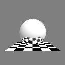
Famous reflective sphere over checkered plane (almost).

Greetings,

Rune

---
Updated January 24: http://rsj.mobilixnet.dk
Containing 3D images, stereograms, tutorials,
The POV Desktop Theme, 350+ raytracing jokes,
miscellaneous other things, and a lot of fun!
Post a reply to this message
Attachments:
Download 'checker3.gif' (2 KB)
Download 'checker2.gif' (1 KB)
Download 'checker1.gif' (1 KB)
Preview of image 'checker3.gif'
Preview of image 'checker2.gif'

Preview of image 'checker1.gif'

|
|
| |
| |
|
|
|
|
| |
| |
|
|
Symbolizing POV-Ray itself,
input for povray (text),
and output from POV-Ray (image).

Greetings,

Rune

---
Updated January 24: http://rsj.mobilixnet.dk
Containing 3D images, stereograms, tutorials,
The POV Desktop Theme, 350+ raytracing jokes,
miscellaneous other things, and a lot of fun!
Post a reply to this message
Attachments:
Download 'povbox3.gif' (2 KB)
Download 'povbox2.gif' (1 KB)
Download 'povbox1.gif' (1 KB)
Preview of image 'povbox3.gif'

Preview of image 'povbox2.gif'

Preview of image 'povbox1.gif'

|
|
| |
| |
|
|
|
|
| |
| |
|
|
Greetings,

Rune

---
Updated January 24: http://rsj.mobilixnet.dk
Containing 3D images, stereograms, tutorials,
The POV Desktop Theme, 350+ raytracing jokes,
miscellaneous other things, and a lot of fun!
Post a reply to this message
Attachments:
Download '2c3l3.gif' (2 KB)
Download '2c3l2.gif' (1 KB)
Download '2c3l1.gif' (1 KB)
Preview of image '2c3l3.gif'

Preview of image '2c3l2.gif'

Preview of image '2c3l1.gif'
|
|
| |
| |
|
|
|
|
| |
| |
|
|
This one made by Remko de Korte.

Greetings,

Rune

---
Updated January 24: http://rsj.mobilixnet.dk
Containing 3D images, stereograms, tutorials,
The POV Desktop Theme, 350+ raytracing jokes,
miscellaneous other things, and a lot of fun!
Post a reply to this message
Attachments:
Download 'shadow3.gif' (2 KB)
Download 'shadow2.gif' (1 KB)
Download 'shadow1.gif' (1 KB)
Preview of image 'shadow3.gif'

Preview of image 'shadow2.gif'

Preview of image 'shadow1.gif'

|
|
| |
| |
|
|
|
|
| |
| |
|
|
"Rune" wrote:
> This one made by Remko de Korte.

Sorry, that should be Remco with "c".

Greetings,

Rune

---
Updated January 24: http://rsj.mobilixnet.dk
Containing 3D images, stereograms, tutorials,
The POV Desktop Theme, 350+ raytracing jokes,
miscellaneous other things, and a lot of fun!
Post a reply to this message
|
|
| |
| |
|
|
|
|
| |
| |
|
|
In article <38cacaed@news.povray.org>, "Rune" <run### [at] inamecom>
wrote:

> Symbolizing POV-Ray itself,
> input for povray (text),
> and output from POV-Ray (image).

I would like to see a color version. This might make a good icon,
especially under systems like Mac OS X(and maybe some/most Linux window
managers?) which will allow larger resolution icons to be used.

--
Chris Huff
e-mail: chr### [at] yahoocom
Web page: http://chrishuff.dhs.org/
Post a reply to this message
|
|
| |
| |
|
|
|
|
| |
| |
|
|
In article <38cacba5@news.povray.org>, "Rune" <run### [at] inamecom>
wrote:

> This one made by Remko de Korte.

I like this one, it has all 3 letters of POV in it. :-)
Again, a color version would be nice, although I am not sure of the best
way to colorize this one...

--
Chris Huff
e-mail: chr### [at] yahoocom
Web page: http://chrishuff.dhs.org/
Post a reply to this message
|
|
| |
| |
|
|
|
|
| |
| |
|
|
Chris Huff wrote in message ...
>In article <38cacaed@news.povray.org>, "Rune" <run### [at] inamecom>
>wrote:
>
>> Symbolizing POV-Ray itself,
>> input for povray (text),
>> and output from POV-Ray (image).
>
>I would like to see a color version. This might make a good icon,
>especially under systems like Mac OS X(and maybe some/most Linux window
>managers?) which will allow larger resolution icons to be used.


The Windows icon file definition allows for high-resolution icons.  I don't
know if Windows itself supports those resolutions, though.

Mark
Post a reply to this message
|
|
| |
| |
|
|
|
|
| |
| |
|
|
Got 98 cents for a dollar?
I think the sphere needs to be lower on that plane so there is more reflection.
I like this one.

Bob

"Rune" <run### [at] inamecom> wrote in message
news:38cacaeb@news.povray.org...
| Famous reflective sphere over checkered plane (almost).
|
| Greetings,
|
| Rune
|
| ---
| Updated January 24: http://rsj.mobilixnet.dk
| Containing 3D images, stereograms, tutorials,
| The POV Desktop Theme, 350+ raytracing jokes,
| miscellaneous other things, and a lot of fun!
|
|
|
|
|
Post a reply to this message
|
|
| |
| |
|
|
|
|
| |
| |
|
|
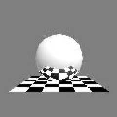
"Bob Hughes" <omn### [at] hotmailcom?subject=PoV-News:> wrote
 > I think the sphere needs to be lower on that plane so there is more
 reflection.
 > I like this one.
 >

 Then you might like one I rejected. I also include one I am working on...
Post a reply to this message
Attachments:
Download 'PovLogo011.jpg' (2 KB)
Download 'PovLogo02.jpg' (3 KB)
Preview of image 'PovLogo011.jpg'
Preview of image 'PovLogo02.jpg'
|
|
| |
| |
|
|
|
|
| |
| |
|
|
David Fontaine <dav### [at] faricynet> wrote:
: They're all smushed! Didn't you change the aspect ratio?

  The aspect ratio is right. The torus _is_ elliptical.
  Note the half-torus of the P-letter.

--
main(i,_){for(_?--i,main(i+2,"FhhQHFIJD|FQTITFN]zRFHhhTBFHhhTBFysdB"[i]
):5;i&&_>1;printf("%s",_-70?_&1?"[]":" ":(_=0,"\n")),_/=2);} /*- Warp -*/
Post a reply to this message
|
|
| |
| |
|
|
|
|
| |
| |
|
|
"Chris Huff" wrote:
> "Rune" wrote:
> > Symbolizing POV-Ray itself,
> > input for povray (text),
> > and output from POV-Ray (image).
>
> I would like to see a color version.

Ok, here you are.

I chose the primary color red, green, and blue.
I tinted them carefully so they had the same "weight".

I also considered the symbolic values of the colors:
The face with the name "POV" is green, symbolizing happiness and hope.
The face with the text is blue, symbolizing intellect and breadth of view.
The face with the image (box) is red, symbolizing excitement and creativity.

I know it's far-fetched, but it's nevertheless a reason to use this
combination instead of any other of the six.

Hope you like it...

> This might make a good icon,
> especially under systems like Mac OS X(and maybe some/most Linux window
> managers?) which will allow larger resolution icons to be used.

Windows also supports large icons. In W95 in the settings for the screen go
to the color settings, choose icon and adjust the size as you please. 32
pixels and 48 pixels are the standards that the icon format supports.

Greetings,

Rune

---
Updated January 24: http://rsj.mobilixnet.dk
Containing 3D images, stereograms, tutorials,
The POV Desktop Theme, 350+ raytracing jokes,
miscellaneous other things, and a lot of fun!
Post a reply to this message
Attachments:
Download 'povbox4.gif' (2 KB)
Download 'povbox3.gif' (1 KB)
Preview of image 'povbox4.gif'

Preview of image 'povbox3.gif'

|
|
| |
| |
|
|
|
|
| |
| |
|
|
In article <38cbc54c@news.povray.org>, "Rune" <run### [at] inamecom>
wrote:

> I chose the primary color red, green, and blue.
> I tinted them carefully so they had the same "weight".
>
> I also considered the symbolic values of the colors:
> The face with the name "POV" is green, symbolizing happiness and hope.
> The face with the text is blue, symbolizing intellect and breadth of
> view.
> The face with the image (box) is red, symbolizing excitement and
> creativity.
>
> I know it's far-fetched, but it's nevertheless a reason to use this
> combination instead of any other of the six.
>
> Hope you like it...

I was actually thinking of having the POV be red, green, and blue, and
having the other parts be red, green, blue, or equal mixes like yellow,
but I like this version.

--
Chris Huff
e-mail: chr### [at] yahoocom
Web page: http://chrishuff.dhs.org/
Post a reply to this message
|
|
| |
| |
|
|
|
|
| |
| |
|
|
Chris Huff wrote:
>
> In article <38cbc54c@news.povray.org>, "Rune" <run### [at] inamecom>
> wrote:
>
> > I chose the primary color red, green, and blue.
> > I tinted them carefully so they had the same "weight".
> >
> > I also considered the symbolic values of the colors:
> > The face with the name "POV" is green, symbolizing happiness and hope.
> > The face with the text is blue, symbolizing intellect and breadth of
> > view.
> > The face with the image (box) is red, symbolizing excitement and
> > creativity.
> >
> > I know it's far-fetched, but it's nevertheless a reason to use this
> > combination instead of any other of the six.
> >
> > Hope you like it...
>
> I was actually thinking of having the POV be red, green, and blue, and
> having the other parts be red, green, blue, or equal mixes like yellow,
> but I like this version.

This looks to me like something a five year old with crayons would do.
A logo for POV-Ray should be much more professional and have a lot of
class.

--
Ken Tyler -  1300+ Povray, Graphics, 3D Rendering, and Raytracing Links:
http://home.pacbell.net/tylereng/index.html http://www.povray.org/links/
Post a reply to this message
|
|
| |
| |
|
|
|
|
| |
| |
|
|
Ken wrote:

> This looks to me like something a five year old with crayons would do.
> A logo for POV-Ray should be much more professional and have a lot of
> class.
>

Oh, you mean like:

http://www.lucent.com/images/logo.gif

or

http://www.transmeta.com/images/crusoelogo.jpg

Sorry. Couldn't resist. But that lucent one is a good one. Reminds me of the
Dilbert strip where they hire the Dogbert consulting company to design them a
logo. He's drinking coffee and by the end thay say something like "so, when
do you make us a logo", he looks under his cup and says "I just did".

--
"My new computer's got the clocks, it rocks
But it was obsolete before I opened the box" - W.A.Y.
Post a reply to this message
|
|
| |
| |
|
|
|
|
| |
| |
|
|
"Ken" wrote:
> This looks to me like something a five year old with crayons would do.
> A logo for POV-Ray should be much more professional and have a lot of
> class.

Sounds like a good idea Ken!

You'll be able to vote for any of the submitted logos and
if they haven't got class enough you can submit your own!

Great isn't it? :-)

Greetings,

Rune

---
Updated January 24: http://rsj.mobilixnet.dk
Containing 3D images, stereograms, tutorials,
The POV Desktop Theme, 350+ raytracing jokes,
miscellaneous other things, and a lot of fun!
Post a reply to this message
|
|
| |
| |
|
|
|
|
| |
| |
|
|
On 10 Mar 2000 05:06:36 -0500, Nieminen Juha wrote:

They don't work, they've got mangled or something.

--
Cheers
Steve              email mailto:sjl### [at] ndirectcouk

%HAV-A-NICEDAY Error not enough coffee  0 pps.

web http://www.ndirect.co.uk/~sjlen/

or  http://start.at/zero-pps

  5:53pm  up  1:39,  3 users,  load average: 1.00, 0.99, 0.91
Post a reply to this message
|
|
| |
| |
|
|
|
|
| |
| |
|
|
Nieminen Juha wrote:

> David Fontaine <dav### [at] faricynet> wrote:
> : They're all smushed! Didn't you change the aspect ratio?
>
>   The aspect ratio is right. The torus _is_ elliptical.
>   Note the half-torus of the P-letter.

oh. Well, I liked it better the old way. :-/

--
___     _______________________________________________
 | \     |_          <dav### [at] faricynet> <ICQ 55354965>
 |_/avid |ontaine        http://www.faricy.net/~davidf/

"The only difference between me and a madman is that I'm not mad." -Dali
Post a reply to this message
|
|
| |
| |
|
|
|
|
| |
| |
|
|
Heh, that speaks volumes.
The sphere is now overwhelming the plane in that one I think.  I had an art
teacher who once said art needs to never be symmetrical and yet still have
balance.

Bob

"Bill DeWitt" <the### [at] earthlinknet> wrote in message
news:38cb96bc@news.povray.org...
| "Bob Hughes" <omn### [at] hotmailcom?subject=PoV-News:> wrote
|  > I think the sphere needs to be lower on that plane so there is more
|  reflection.
|  > I like this one.
|  >
|
|  Then you might like one I rejected. I also include one I am working on...
|
|
|
|
|
|
Post a reply to this message
|
|
| |
| |
|
|
|
|
| |
| |
|
|
David Fontaine <dav### [at] faricynet> wrote:
: oh. Well, I liked it better the old way. :-/

  What old way? I haven't modified it since I made it.

--
main(i,_){for(_?--i,main(i+2,"FhhQHFIJD|FQTITFN]zRFHhhTBFHhhTBFysdB"[i]
):5;i&&_>1;printf("%s",_-70?_&1?"[]":" ":(_=0,"\n")),_/=2);} /*- Warp -*/
Post a reply to this message
|
|
| |
| |
|
|
|
|
| |
| |
|
|
And so you did...
Post a reply to this message
|
|
| |
| |
|
|
From: vaihtoehto
Subject: my logo competition entry (not too late i hope :)
Date: 17 Mar 2000 08:32:29
Message: <38d233ed@news.povray.org>
|
|
|
| |
| |
|
|
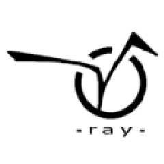
circle is Persistence, joined with Vision. (lame, yes?)

i tried to make it smooth, easy to remember and recognize.

bw -version is not very finished. i was in hurry as i found whole
competition yesterday :)

any comments?

-alt
Post a reply to this message
Attachments:
Download 'vpov128true.png' (6 KB)
Download 'vpov64bwaa.png' (2 KB)
Download 'vpov64bwnoaa.png' (1 KB)
Preview of image 'vpov128true.png'
Preview of image 'vpov64bwaa.png'
Preview of image 'vpov64bwnoaa.png'
|
|
| |
| |
|
|
|
|
| |
| |
|
|
vaihtoehto wrote:
>
> circle is Persistence, joined with Vision. (lame, yes?)

No.  I like it.
Post a reply to this message
|
|
| |
| |
|
|
From: Rune
Subject: Re: my logo competition entry (not too late i hope :)
Date: 17 Mar 2000 15:31:23
Message: <38d2961b@news.povray.org>
|
|
|
| |
| |
|
|
"vaihtoehto" wrote:
> circle is Persistence, joined with Vision. (lame, yes?)
>
> i tried to make it smooth, easy to remember and recognize.
>
> bw -version is not very finished. i was in hurry as i found whole
> competition yesterday :)
>
> any comments?

It's nice!

I'll put it on the webpage soon:

http://rsj.mobilixnet.dk/povlogos/

You say the b/w version isn't very finished.
If you want to improve it you are welcome to send me a new versions in one
of the next couple of days :-)

Greetings,

Rune

---
Updated January 24: http://rsj.mobilixnet.dk
Containing 3D images, stereograms, tutorials,
The POV Desktop Theme, 350+ raytracing jokes,
miscellaneous other things, and a lot of fun!
Post a reply to this message
|
|
| |
| |
|
|
From: TonyB
Subject: Re: my logo competition entry (not too late i hope :)
Date: 17 Mar 2000 20:16:31
Message: <38d2d8ef@news.povray.org>
|
|
|
| |
| |
|
|
I see a lot of potential, but I'll have to see a P to mentally associate it
to POV-Ray. I really dig the "V", it's kinda like the one in Virgin. What do
they make? Games? I forgot.
Post a reply to this message
|
|
| |
| |
|
|
From: Rune
Subject: Re: my logo competition entry (not too late i hope :)
Date: 17 Mar 2000 20:25:22
Message: <38d2db02@news.povray.org>
|
|
|
| |
| |
|
|
"vaihtoehto" wrote:
> circle is Persistence, joined with Vision. (lame, yes?)
>
> i tried to make it smooth, easy to remember and recognize.
>
> any comments?

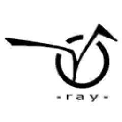
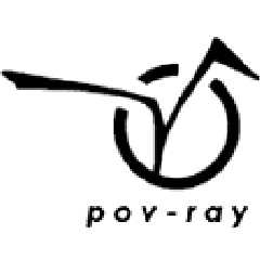
I think your logo is very professional looking!
I think it has more "design" than the others.

However, I have some suggestions.

You say that the logo sort of "means" "persistence of vision".
While that's a nice idea, it is not very easy to tell when you haven't been
told.

I think that doesn't matter, the logo is fine. But the text underneath
saying "ray" suggests that the word "pov" or "persistence of vision" is to
be found in the logo above the text. As I said, one will maybe not find
this, and thus be confused that the first part of "POV-Ray" is missing.

I suggest that you place the whole "pov-ray" underneath the logo. That way
it doesn't require any special knowledge to understand the logo, but if you
have the special knowledge you will see an extra dimension in the logo.

Also, I think the text could be bigger and italic and placed a little
different, but that's just my personal taste.

You could also make the logo slightly bigger because there's some unused
space to the left and right of the logo.

Compare the attached logos...

Any comments?

Greetings,

Rune

---
Updated January 24: http://rsj.mobilixnet.dk
Containing 3D images, stereograms, tutorials,
The POV Desktop Theme, 350+ raytracing jokes,
miscellaneous other things, and a lot of fun!
Post a reply to this message
Attachments:
Download 'original.gif' (2 KB)
Download 'myversion.gif' (2 KB)
Preview of image 'original.gif'
Preview of image 'myversion.gif'
|
|
| |
| |
|
|
From: vaihtoehto
Subject: Re: my logo competition entry (not too late i hope :)
Date: 18 Mar 2000 10:08:31
Message: <38d39bef@news.povray.org>
|
|
|
| |
| |
|
|
Rune wrote:
>You say that the logo sort of "means" "persistence of vision".
>While that's a nice idea, it is not very easy to tell when you haven't been
>told.

yes, i am aware of that. i planned that after a while people would associate
text "persistance of vision" with logo.
and so i avoided text "pov".
but i will try if it looks good with text "pov-ray".


>I think that doesn't matter, the logo is fine. But the text underneath
>saying "ray" suggests that the word "pov" or "persistence of vision" is to
>be found in the logo above the text. As I said, one will maybe not find
>this, and thus be confused that the first part of "POV-Ray" is missing.

i thought there would be some text around the logo mentioning "pov-ray" or
"persistence of vision" and so i didn't included it.

>You could also make the logo slightly bigger because there's some unused
>space to the left and right of the logo.

text is small because logo is fat. it's about contrast.
on low resolutions it get's unclear, though.
i'll try to fix it :)

i just found this news-place and this program does not let me see older
messages.. so i'm not sure what is this competition all about.
could someone kind enough explain?

-alt
Post a reply to this message
|
|
| |
| |
|
|
From: David Fontaine
Subject: Re: my logo competition entry (not too late i hope :)
Date: 18 Mar 2000 16:29:42
Message: <38D3F456.E2F21A8F@faricy.net>
|
|
|
| |
| |
|
|
I like it! But I agree with Rune about the layout.

--
___     _______________________________________________
 | \     |_          <dav### [at] faricynet> <ICQ 55354965>
 |_/avid |ontaine        http://www.faricy.net/~davidf/

"The only difference between me and a madman is that I'm not mad." -Dali
Post a reply to this message
|
|
| |
| |
|
|
From: Rune
Subject: Re: my logo competition entry (not too late i hope :)
Date: 19 Mar 2000 05:41:06
Message: <38d4aec2@news.povray.org>
|
|
|
| |
| |
|
|
> i just found this news-place and this program does not let me see older
> messages.. so i'm not sure what is this competition all about.
> could someone kind enough explain?

This is from my original message:

I think POV-Ray should have a real logo.

Almost all major products, companies, organizations, etc., have their own
logo so they can be easily recognized. It strengthens the product (or
whatever) that they have both a name and a logo. The logo can be seen on the
products, in commercials for the product, on the product's website, maybe in
articles about the product, etc...

POV-Ray doesn't have a logo.

If POV-Ray got a logo it could be placed in the program, users can put it in
the corner of their images if they want to, on the website, in articles
about POV-Ray, plus in desktop themes and other things...

My opinions about logos:

Logos must be concrete. POV-Ray is known for the checkered plane and
reflective sphere. However, that alone doesn't make it POV-RAY's logo. A
logo must be an actual image. A little, very simple image that always look
the same way.

Logos must be simple. I would say a rule of thumb is that the logo must be
easily recognized in black and white (with no shades of gray), and in a very
little resolution.

And now to the point:

I've set up a competition about making the best logo for POV-Ray. It's not
official in any way (I'm not in charge of that), I just thought it would be
fun and interesting. The competition is held in povray.binaries.images. That
is also where you can read about the rules. I thought at some point a survey
could be made, where people could vote for their favorite logo.

Greetings,

Rune

---
Updated March 15: http://rsj.mobilixnet.dk
Containing 3D images, stereograms, tutorials,
The POV Desktop Theme, 350+ raytracing jokes,
miscellaneous other things, and a lot of fun!
Post a reply to this message
|
|
| |
| |
|
|
From: vaihtoehto
Subject: Re: my logo competition entry: new versions
Date: 19 Mar 2000 06:44:30
Message: <38d4bd9e@news.povray.org>
|
|
|
| |
| |
|
|
>If you want to improve it you are welcome to send me a new versions in one
>of the next couple of days :-)

so here you go.. :)

notes:
1.
i tried bigger font, but it draws attention away from logo itself (and looks
ugly too :)

2.
i tried italic, but that looked somewhat crappy and more like a
lufthansa/finnair/whatever logo than persistence of vision raytracer.
propably because computer fonts are often cheap fakes of real world fonts
and their italic versions are done against typographic rules. (or something
like that) so it's not my fault.

3.
i made two versions.
both with slightly altered "Vision".
nobody will see the difference, but i told it anyway :)
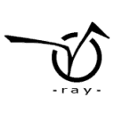
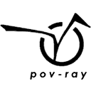
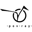
other one says "pov-ray" and the other "ray". i personally like
"ray" -version more because it's cleaner and it has "joke(?)" inside.
instead of reading "pov-ray" people have to figure it out. and so they will
remember it :)

i was thinking that it could be possible to create "house type" (i don't
know english term): same theme (circle and V in my entry) but different
versions. with text "ray" / "pov-ray" / "persistence of Vision raytracer" /
without text at all and so on..
so instead of creating one logo for all purposes could one create several
versions for paper prints / web-pages / start logo etc.

this is how logo-stuff is done in big firms i believe.

comments / suggestions?
-alt
Post a reply to this message
Attachments:
Download 'povray128true.png' (3 KB)
Download 'povray64aa.png' (2 KB)
Download 'povray64noaa.png' (1 KB)
Download 'ray128true.png' (3 KB)
Download 'ray64aa.png' (2 KB)
Download 'ray64noaa.png' (1 KB)
Preview of image 'povray128true.png'
Preview of image 'povray64aa.png'
Preview of image 'povray64noaa.png'
Preview of image 'ray128true.png'

Preview of image 'ray64aa.png'
Preview of image 'ray64noaa.png'
|
|
| |
| |
|
|
|
|
| |
| |
|
|
"vaihtoehto" wrote:
> comments / suggestions?

Yes! :-)

> i tried bigger font, but it draws attention away from logo itself (and
looks
> ugly too :)

How the font should be is a matter of taste. You like it better with a small
font, I like it better with a bigger font, and others probably likes it
better a third way. You say yourself that the text is not a part of the logo
itself, and since the competition is about the logo itself only, I suggest
that you simply submit the logo without text at all.

> i tried italic, but that looked somewhat crappy and more like a
> lufthansa/finnair/whatever logo than persistence of vision raytracer.

A matter of taste.

> i was thinking that it could be possible to create "house type" (i don't
> know english term): same theme (circle and V in my entry) but different
> versions. with text "ray" / "pov-ray" / "persistence of Vision raytracer"
/
> without text at all and so on..
> so instead of creating one logo for all purposes could one create several
> versions for paper prints / web-pages / start logo etc.

Well, the logo itself should always be exactly the same (except for
resolutions etc.), but if the logo was without the text one could place text
next to it as one please. That would in fact work the same way as you
suggests yourself, except that there's a more clear definition of what the
logo is.

What is your opinion?

Greetings,

Rune

---
Updated March 15: http://rsj.mobilixnet.dk
Containing 3D images, stereograms, tutorials,
The POV Desktop Theme, 350+ raytracing jokes,
miscellaneous other things, and a lot of fun!
Post a reply to this message
|
|
| |
| |
|
|
From: vaihtoehto
Subject: Re: my logo competition entry: in need of doctor
Date: 20 Mar 2000 13:49:13
Message: <38d672a9@news.povray.org>
|
|
|
| |
| |
|
|
Rune wrote:
>You say yourself that the text is not a part of the logo
>itself, and since the competition is about the logo itself only, I suggest
>that you simply submit the logo without text at all.

simple yet elegant suggestion :)
still, some text underneath logo itself balances whole picture quite well,
it's unstable without text.

i seem to have some kind of mental problems with making decisions..

anyway, i won't whine anymore about this subject and you could change
pictures on your site to those new ones i posted: ray*.png images with text
"ray".

if you are still interested :)

-alt
Post a reply to this message
|
|
| |
| |
|
|
From: vaihtoehto
Subject: Re: my logo competition entry: new versions
Date: 20 Mar 2000 14:07:45
Message: <38d67701@news.povray.org>
|
|
|
| |
| |
|
|
by the way, thanks for that competition info you posted.
were / are there any rules i should aware of? (he asked, but way too late!
:)
Post a reply to this message
|
|
| |
| |
|
|
From: Rune
Subject: Re: my logo competition entry: in need of doctor
Date: 20 Mar 2000 18:33:44
Message: <38d6b558@news.povray.org>
|
|
|
| |
| |
|
|
"vaihtoehto" wrote:
> Rune wrote:
> >You say yourself that the text is not a part of the logo
> >itself, and since the competition is about the logo itself only, I
suggest
> >that you simply submit the logo without text at all.
>
> simple yet elegant suggestion :)
> still, some text underneath logo itself balances whole picture quite well,
> it's unstable without text.

I have to agree on that one. Still, the final logo, whether with text or
not, must always be the same. That is, if the final logo includes text, then
the logo must always include that text, since it is a part of the logo.

> i seem to have some kind of mental problems with making decisions..
>
> anyway, i won't whine anymore about this subject and you could change
> pictures on your site to those new ones i posted: ray*.png images with
text
> "ray".

Hey, I can include both versions if you like!
Then the voters will be the ones to decide.
While I'm at it I could also include the version of your logo that I made
myself (the one with big ugly italic text), but I feel it's a little like
stealing so I don't know...

> if you are still interested :)

This is not an official competition with real deadlines.
I would like this interesting discussion to take the time it takes. :-)

Greetings,

Rune

---
Updated March 15: http://rsj.mobilixnet.dk
Containing 3D images, stereograms, tutorials,
The POV Desktop Theme, 350+ raytracing jokes,
miscellaneous other things, and a lot of fun!
Post a reply to this message
|
|
| |
| |
|
|
|
|
| |
| |
|
|
"vaihtoehto" wrote:
> by the way, thanks for that competition info you posted.
> were / are there any rules i should aware of? (he asked, but way too late!
> :)

Nah, that was mainly about which resolusions to submit in and you followed
those already.

Greetings,

Rune

---
Updated March 15: http://rsj.mobilixnet.dk
Containing 3D images, stereograms, tutorials,
The POV Desktop Theme, 350+ raytracing jokes,
miscellaneous other things, and a lot of fun!
Post a reply to this message
|
|
| |
| |
|
|
From: vaihtoehto
Subject: Re: my logo competition entry: in need of doctor
Date: 21 Mar 2000 07:33:44
Message: <38d76c28@news.povray.org>
|
|
|
| |
| |
|
|
>I have to agree on that one. Still, the final logo, whether with text or
>not, must always be the same. That is, if the final logo includes text,
then
>the logo must always include that text, since it is a part of the logo.

why?
i mean, it is the logo itself which is important.
(looks too much like virgins logo, btw :) i had to change it slighty if
people vote for it. right now i don't have time for that..)
and the text, whatever it is, is there for only balancing the picture and
giving some extra information.
as long as text looks same,  it doesn't matter if it says "ray" or "pov-ray"
or "dead piglet". (font, range kerning, horizontal scale and so on..)

>Hey, I can include both versions if you like!
>Then the voters will be the ones to decide.

if you want..
but that could get too complex. someone likes the logo but votes for text
and then they get angry and bloodthirsty and come here and..

i *still* like that new "ray" -version most so could you put it on your site
please?:)

-alt
Post a reply to this message
|
|
| |
| |
|
|
|
|
| |
| |
|
|
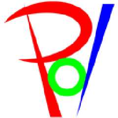
I know I'm probably coming in too late, but I wanted to give it a go too. :)
The image came to me in a "P" shaped bugger that I extracted from my nose
while taking a shower yesterday. Upon seeing it, I started getting ideas.
Today in math class, I doodled it into reality. I just finished it up.
Please let me know what you think.
Post a reply to this message
Attachments:
Download 'color64.png' (3 KB)
Download 'color128.png' (5 KB)
Download 'bw64wtaa.png' (3 KB)
Download 'bw64noaa.png' (2 KB)
Preview of image 'color64.png'
Preview of image 'color128.png'
Preview of image 'bw64wtaa.png'

Preview of image 'bw64noaa.png'
|
|
| |
| |
|
|
|
|
| |
| |
|
|
"TonyB" wrote:
> I know I'm probably coming in too late, but I wanted to give it a go too.
:)

It's not too late. That deadline I came up with is not that strict.

> Please let me know what you think.

It's interesting, but if I didn't know better I would have thought it said
"Pol".

I'll put it on the logo page soon.

Greetings,

Rune

---
Updated March 15: http://rsj.mobilixnet.dk
Containing 3D images, stereograms, tutorials,
The POV Desktop Theme, 350+ raytracing jokes,
miscellaneous other things, and a lot of fun!
Post a reply to this message
|
|
| |
| |
|
|
|
|
| |
| |
|
|
>It's not too late. That deadline I came up with is not that strict.

Excelent.


>It's interesting, but if I didn't know better I would have thought it said
>"Pol".


Hehe, well I guess the problem comes from me wanting the V to be explicit in
the \ that makes the P, forming a \/-like thing. You would have to see it
with the name of the program somewhere to make the direct link. It's kinda
funny how I complained about vaihtoehto's lack of a P only to find people
complaining about my lack of V. Maybe I could bring the P and / closer
together to make it clearer.
Post a reply to this message
|
|
| |
| |
|
|
|
|
| |
| |
|
|
"TonyB" <ben### [at] panamac-comnet> wrote in message
news:38d979a9@news.povray.org...
> Maybe I could bring the P and / closer
> together to make it clearer.

... or make the vertical segment in P bicolor red/blue

I really like this one
Post a reply to this message
|
|
| |
| |
|
|
|
|
| |
| |
|
|
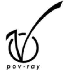
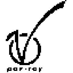
Yet another logo.

As you probably has guessed this one is inspired by Vaihtoehto's logo.

I don't think that the overall design is as nice as Vaihtoehto's logo, but
as I see it, this one has the advantage that it doesn't look like Virgin's
logo at all, and that it says "pov-ray" beneath the logo instead of just
"ray".

What do you think of it?

Greetings,

Rune

---
Updated March 15: http://rsj.mobilixnet.dk
Containing 3D images, stereograms, tutorials,
The POV Desktop Theme, 350+ raytracing jokes,
miscellaneous other things, and a lot of fun!
Post a reply to this message
Attachments:
Download '13d.gif' (2 KB)
Download '13b.gif' (1 KB)
Download '13a.gif' (1 KB)
Preview of image '13d.gif'
Preview of image '13b.gif'

Preview of image '13a.gif'
|
|
| |
| |
|
|
|
|
| |
| |
|
|
"Rune" wrote:
> this one has the advantage that it doesn't look like Virgin's
> logo at all

Arrgh!

I just visited Virgin's website, had a look at their logo, and found out
that the V in my logo looks very much like the V in Virgin's logo indeed!
I had made my logo up from scratch, and then this coincidence...

But then, they can't trademark such a simple shape, now can they?

Greetings,

Rune

---
Updated March 15: http://rsj.mobilixnet.dk
Containing 3D images, stereograms, tutorials,
The POV Desktop Theme, 350+ raytracing jokes,
miscellaneous other things, and a lot of fun!
Post a reply to this message
Attachments:
Download 'virgin.gif' (1 KB)
Preview of image 'virgin.gif'

|
|
| |
| |
|
|
|
|
| |
| |
|
|
It's in your subconscious, Rune. That's where it came from. You've seen it
before. :)

I'll be working on mine this evening, and I'll post an updated version. I
just wish more people would comment on it.
Post a reply to this message
|
|
| |
| |
|
|
|
|
| |
| |
|
|
TonyB-FSU wrote:

> I'll be working on mine this evening, and I'll post an updated version. I
> just wish more people would comment on it.

On what ?

--
Ken Tyler -  1300+ Povray, Graphics, 3D Rendering, and Raytracing Links:
http://home.pacbell.net/tylereng/index.html http://www.povray.org/links/
Post a reply to this message
|
|
| |
| |
|
|
|
|
| |