 |
|
|
|
|
|
| |
| |
|
|
|
|
| |
| |
|
|
Rune
---
Updated January 24: http://rsj.mobilixnet.dk
Containing 3D images, stereograms, tutorials,
The POV Desktop Theme, 350+ raytracing jokes,
miscellaneous other things, and a lot of fun!
Post a reply to this message
Attachments:
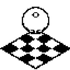
Download 'checker.gif' (1 KB)
Preview of image 'checker.gif'
|
|
| |
| |
|
|
|
|
| |
| |
|
|
Rune
---
Updated January 24: http://rsj.mobilixnet.dk
Containing 3D images, stereograms, tutorials,
The POV Desktop Theme, 350+ raytracing jokes,
miscellaneous other things, and a lot of fun!
Post a reply to this message
Attachments:
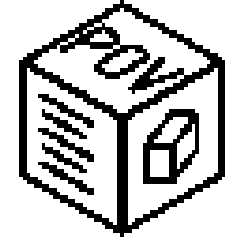
Download 'povbox.gif' (1 KB)
Preview of image 'povbox.gif'
|
|
| |
| |
|
|
|
|
| |
| |
|
|
Maybe if you chopped off the left half of the small circle and extended
the legs of the "V" to be full chords of the large circle...
--
Chris Huff
e-mail: chr### [at] yahoo com
Web page: http://chrishuff.dhs.org/ com
Web page: http://chrishuff.dhs.org/
Post a reply to this message
|
|
| |
| |
|
|
|
|
| |
| |
|
|
On Tue, 22 Feb 2000 15:35:52 -0500, "Bill DeWitt"
<the### [at] earthlinknet> wrote:
>> > I have an idea for this, but I am two days into a -second- render of
>my
>> >IRTC image and I don't want to risk messing it up by opening too much
>> >stuff...
>>
>> What do you mean? I am sure you know you can open multiple copies of
>> POV.
>>
>
> Sure, but I also know that it slows down the rendering and I may not
>have enough time to get this done.
That's a valid enough reason ;)
> I wanted Rune to know that there would probably be more entries in his
>contest -after- the end of the month.
Let's hope so.
Peter Popov
pet### [at] usanet
ICQ: 15002700
Post a reply to this message
|
|
| |
| |
|
|
|
|
| |
| |
|
|
That is kinda neat. Took me a moment to realize it had "RAY" for the bottom
half but I know it had to be something else after "POV".
These sort of visually switching things always cause me trouble trying to see it
both ways; you know, like the faces and drinking-glass type thing where two face
profiles make the outline of a goblet or whatever.
It was the Y under the V that slowed me up in seeing this whole thing right but
once I knew it was POVRAY it looked great.
Bob
"Paul Vanukoff" <van### [at] primenetcom> wrote in message
news:38b29cc8@news.povray.org...
| Here is my idea ... was thinking something art-deco-ish, with primitive
| shapes.
|
| --
| Paul Vanukoff
| van### [at] primenetcom
| http://www.primenet.com/~vanukoff/povray/
|
| "Rune" <run### [at] inamecom> wrote in message
| news:38b1b537@news.povray.org...
| > I think POV-Ray should have a real logo.
| > (For more information, see povray.general)
| >
| > This is a competition of making the best logo for POV-Ray.
| >
| > To participate in the competition, send a reply to this thread with a
| 64x64
| > pixel, 2 color gif image. I know it's a very low resolution, but I think a
| > good logo should be easily recognized even at such a low resolution. You
| may
| > additionally send a color version (16 color gif) if the colors are
| > important. However, the logo should still work nicely in black and white
| > also. (See the attached sample images).
| >
| > There's no "deadline". When it seems that no more logos are to be
| submitted,
| > I thought a survey could be made, where people could vote for their
| favorite
| > logo.
| >
| > (Again, for more information, see povray.general)
| >
| > Greetings,
| >
| > Rune
| >
| > ---
| > Updated January 24: http://rsj.mobilixnet.dk
| > Containing 3D images, stereograms, tutorials,
| > The POV Desktop Theme, 350+ raytracing jokes,
| > miscellaneous other things, and a lot of fun!
| >
| >
| >
| >
| >
| >
|
|
|
Post a reply to this message
|
|
| |
| |
|
|
|
|
| |
| |
|
|
I think it's cool looking
Paul Vanukoff <van### [at] primenetcom> wrote in message
news:38b29cc8@news.povray.org...
> Here is my idea ... was thinking something art-deco-ish, with primitive
> shapes.
>
> --
> Paul Vanukoff
> van### [at] primenetcom
> http://www.primenet.com/~vanukoff/povray/
>
> "Rune" <run### [at] inamecom> wrote in message
> news:38b1b537@news.povray.org...
> > I think POV-Ray should have a real logo.
> > (For more information, see povray.general)
> >
> > This is a competition of making the best logo for POV-Ray.
> >
> > To participate in the competition, send a reply to this thread with a
> 64x64
> > pixel, 2 color gif image. I know it's a very low resolution, but I think
a
> > good logo should be easily recognized even at such a low resolution. You
> may
> > additionally send a color version (16 color gif) if the colors are
> > important. However, the logo should still work nicely in black and white
> > also. (See the attached sample images).
> >
> > There's no "deadline". When it seems that no more logos are to be
> submitted,
> > I thought a survey could be made, where people could vote for their
> favorite
> > logo.
> >
> > (Again, for more information, see povray.general)
> >
> > Greetings,
> >
> > Rune
> >
> > ---
> > Updated January 24: http://rsj.mobilixnet.dk
> > Containing 3D images, stereograms, tutorials,
> > The POV Desktop Theme, 350+ raytracing jokes,
> > miscellaneous other things, and a lot of fun!
> >
> >
> >
> >
> >
> >
>
>
>
Post a reply to this message
|
|
| |
| |
|
|
|
|
| |
|
|


