 |
 |
|
 |
|
 |
|  |
|  |
|
 |
|
 |
|  |
|  |
|
 |
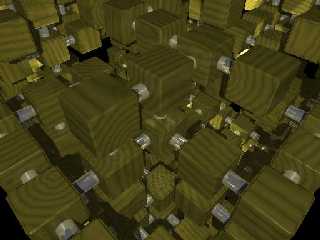
Rendered this on my newly setup Linux box last night. I've added some a few
light sources to the center of the array and increased the gamma. Also fixed
the rod placement algorithm. For some reason, I like the look of the
previous version better. Probably the placement of the boxes and/or the
camera. Maybe the lighting ... ?
--
Paul Vanukoff
van### [at] primenet com com
Post a reply to this message
Attachments:
Download 'PV_RouteredBoxes.jpg' (50 KB)
Preview of image 'PV_RouteredBoxes.jpg'

|
 |
|  |
|  |
|
 |
|
 |
|  |
|  |
|
 |
Paul Vanukoff wrote:
> For some reason, I like the look of the previous version better. Probably the
> placement of the boxes and/or the
> camera. Maybe the lighting ... ?
Well, the details are easier to pick out now. Maybe add something in the scene
behind the camera in the surroundings for the metal rods to reflect? Maybe a
high ambient foggy/glowing plane far below the blocks to replace the internal
lights? Then use a bright area light above/behind the camera that uses
fade_power and fade_distance. Maybe use radiosity?
David
--
Keeper of the family pets.
"You want fish? I got fish. I got fish, and eels, and turtles, and snails, and
frogs, and dragons and cats..."
Post a reply to this message
|
 |
|  |
|  |
|
 |
|
 |
|  |
|  |
|
 |
Looks like one of those horrid math problems that takes ten years to solve
conventionally and some genius devised a method of doing it by drawing colored
circles or something...
--
Homepage: http://www.faricy.net/~davidf/
___ ______________________________
| \ |_ <dav### [at] faricy net>
|_/avid |ontaine <ICQ 55354965> net>
|_/avid |ontaine <ICQ 55354965>
Post a reply to this message
|
 |
|  |
|  |
|
 |
|
 |
|  |
|  |
|
 |
I like that idea. The wood texture seems to straight to me, I think you should play
around with that more. And there are empty
spots in the bottom corners of the image, and at one point inside it... maybe you
should make a sky sphere to fill that space up or
something... I really like it though.
-Slime
Paul Vanukoff <van### [at] primenet com> wrote in message
news:38733b45@news.povray.org...
> Rendered this on my newly setup Linux box last night. I've added some a few
> light sources to the center of the array and increased the gamma. Also fixed
> the rod placement algorithm. For some reason, I like the look of the
> previous version better. Probably the placement of the boxes and/or the
> camera. Maybe the lighting ... ?
>
> --
> Paul Vanukoff
> van### [at] primenet com> wrote in message
news:38733b45@news.povray.org...
> Rendered this on my newly setup Linux box last night. I've added some a few
> light sources to the center of the array and increased the gamma. Also fixed
> the rod placement algorithm. For some reason, I like the look of the
> previous version better. Probably the placement of the boxes and/or the
> camera. Maybe the lighting ... ?
>
> --
> Paul Vanukoff
> van### [at] primenet com
>
>
>
>
> com
>
>
>
>
>
Post a reply to this message
|
 |
|  |
|  |
|
 |
|
 |
|  |


![]()