|
|
|
|
|
|
| |
| |
|
|
|
|
| |
| |
|
|
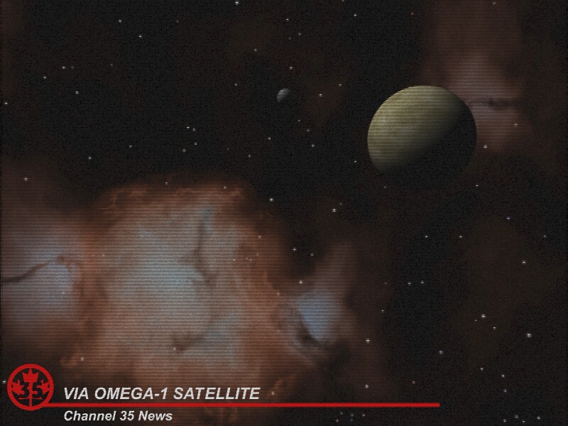
This is a first draft of an image created using a macro I created, based
heavily on Glenn McCarter's interlace code from his Winseat image in the
previous IRTC round. The space image was created with Chris Colefax's galaxy
include. The planet is my own.

The image depicts an image received from a satellite that will be sent out
in the future. It took years for the images to get to earth. But now it is
obvious that it was worth the wait...

Please let me know if you have any ideas on how to improve the image, be it
from the space image point of view, or the TV interlacing effect. I realize
that it is quite likely that by the time these images would get back to us,
we would no longer be using TVs so the interlacing effect may well be
eliminated but humor me on this. :)

Darcy
Post a reply to this message
Attachments:
Download 'omega1.jpg' (188 KB)
Preview of image 'omega1.jpg'
|
|
| |
| |
|
|
|
|
| |
| |
|
|
looks very realistic - i love the interlaced effect - post process??

Rick
Post a reply to this message
|
|
| |
| |
|
|
|
|
| |
| |
|
|
Wonderful love the interlace affect.. I also would like to know how this was
done...?

TV Obsolete Not Likely >>>!!!<<<
How would we replace Americas fav. pastime VR? Or little TV Glasses...

Darcy Johnston wrote:

> This is a first draft of an image created using a macro I created, based
> heavily on Glenn McCarter's interlace code from his Winseat image in the
> previous IRTC round. The space image was created with Chris Colefax's galaxy
> include. The planet is my own.
>
> The image depicts an image received from a satellite that will be sent out
> in the future. It took years for the images to get to earth. But now it is
> obvious that it was worth the wait...
>
> Please let me know if you have any ideas on how to improve the image, be it
> from the space image point of view, or the TV interlacing effect. I realize
> that it is quite likely that by the time these images would get back to us,
> we would no longer be using TVs so the interlacing effect may well be
> eliminated but humor me on this. :)
>
> Darcy
>
>  [Image]
Post a reply to this message
|
|
| |
| |
|
|
|
|
| |
| |
|
|
Wasn't it Darcy Johnston who wrote:
>This is a first draft of an image created using a macro I created, based
>heavily on Glenn McCarter's interlace code from his Winseat image in the
>previous IRTC round. The space image was created with Chris Colefax's galaxy
>include. The planet is my own.
>
>The image depicts an image received from a satellite that will be sent out
>in the future. It took years for the images to get to earth. But now it is
>obvious that it was worth the wait...
>
>Please let me know if you have any ideas on how to improve the image, be it
>from the space image point of view, or the TV interlacing effect. I realize
>that it is quite likely that by the time these images would get back to us,
>we would no longer be using TVs so the interlacing effect may well be
>eliminated but humor me on this. :)

From an astronomical point of view, the light source ought to be much
further from the planet. I'd suggest a distance of about 10000 planetary
diameters. With shorter distances, it's clear that the light rays
reaching the top and bottom of the planet are not parallel.


As regards the TV interlacing, it looks a bit harsh at the moment. I'd
suggest a bit of external post-processing (unless you consider such
things to be beneath you) to perform a slight vertical smoothing. It may
not be easy to find such a facility in an image post-processing program,
but if you have one that allows you to create your own image filters you
can set up one that looks like:-

    0  1  0
    0  4  0
    0  1  0

[In Paintshop Pro 6 use Image:User_Defined_Filters and set up one with
that pattern in the centre and zeroes all round. Set the Division Factor
to 6 and the Bias to zero.]

The strength of the smoothing can be decreased by increasing the number
in the centre, (in Paintshop Pro, adjust the Division Factor to be the
sum of all the values).

--
Mike Williams + #
Gentleman of Leisure
Post a reply to this message
|
|
| |
| |
|
|
|
|
| |
| |
|
|
Fabulous! Looks very much like a snapshot of a TV screen to me. I'm seeing
it here on a 19" monitor with .28 dp at 1600x1200 res. right now so it could
vary a lot on others knowing how lines change so much.
Real believeable anyhow, I love it. Thanks for showing it.
Bob
"Darcy Johnston" <djo### [at] iname comNOSPAM> wrote in message
news:38718a60@news.povray.org...
> This is a first draft of an image created using a macro I created, based
> heavily on Glenn McCarter's interlace code from his Winseat image in the
> previous IRTC round. The space image was created with Chris Colefax's
galaxy
> include. The planet is my own.
>
> The image depicts an image received from a satellite that will be sent out
> in the future. It took years for the images to get to earth. But now it is
> obvious that it was worth the wait...
>
> Please let me know if you have any ideas on how to improve the image, be
it
> from the space image point of view, or the TV interlacing effect. I
realize
> that it is quite likely that by the time these images would get back to
us,
> we would no longer be using TVs so the interlacing effect may well be
> eliminated but humor me on this. :)
>
> Darcy
>
>
>
>
>
Post a reply to this message
|
|
| |
| |
|
|
|
|
| |
| |
|
|
I've had a bit of a play with the TV interlacing code aswell,
I'm thinking of doing a shop full of TVs but having the
interlacing effect over the whole scene.

The space side of it looks good.

--
Cheers
Steve              email mailto:sjl### [at] ndirectcouk

%HAV-A-NICEDAY Error not enough coffee  0 pps.

web http://www.ndirect.co.uk/~sjlen/

or  http://start.at/zero-pps
Post a reply to this message
|
|
| |
| |
|
|
|
|
| |
| |
|
|
> it here on a 19" monitor with .28 dp at 1600x1200 res. right now so it could
> vary a lot on others knowing how lines change so much.

Same thing here, yes, it does look realistic.

--
Homepage: http://www.faricy.net/~davidf/
___     ______________________________
 | \     |_       <dav### [at] faricynet>
 |_/avid |ontaine      <ICQ 55354965>
Post a reply to this message
|
|
| |
| |
|
|
|
|
| |
| |
|
|
ryan mooney <rdm### [at] earthlinknet> wrote in message
news:387064E9.E7315AD9@earthlink.net...
> Wonderful love the interlace affect.. I also would like to know how this
was
> done...?

The interlacing was done using a macro I created, based heavily on Glen's
code. I plan on sharing it once I get a couple fo things worked out to make
it more configurable. I've gotten some ideas from Glen on how I might go
about doing this, but I haven't had alot of time lately. This image has been
sitting on my hard drive for weeks before I got a chance to post it.

Hopefully it won't be weeks before I can post the macro.

Darcy
Post a reply to this message
|
|
| |
| |
|
|
|
|
| |
| |
|
|
Rick <pov### [at] dialpipexcom> wrote in message
news:3871a524@news.povray.org...
> looks very realistic - i love the interlaced effect - post process??

Nope. Macro. I hope to be able to post it soon. When I do, I'll post a
message to thos thread.

Darcy
Post a reply to this message
|
|
| |
| |
|
|
|
|
| |
| |
|
|
Mike Williams <mik### [at] nospamplease> wrote in message
news:jnBvWdA+Ycc4Ew+h### [at] econymdemoncouk...
> From an astronomical point of view, the light source ought to be much
> further from the planet. I'd suggest a distance of about 10000 planetary
> diameters. With shorter distances, it's clear that the light rays
> reaching the top and bottom of the planet are not parallel.

Point taken, I'll have to fix that.

> As regards the TV interlacing, it looks a bit harsh at the moment. I'd
> suggest a bit of external post-processing (unless you consider such
> things to be beneath you) to perform a slight vertical smoothing. It may
> not be easy to find such a facility in an image post-processing program,
> but if you have one that allows you to create your own image filters you
> can set up one that looks like:-
>
>     0  1  0
>     0  4  0
>     0  1  0
>
> [In Paintshop Pro 6 use Image:User_Defined_Filters and set up one with
> that pattern in the centre and zeroes all round. Set the Division Factor
> to 6 and the Bias to zero.]
>
> The strength of the smoothing can be decreased by increasing the number
> in the centre, (in Paintshop Pro, adjust the Division Factor to be the
> sum of all the values).

I don't have PSP6, or at least not yet. But for the most part I like to try
ot do thing completely within POV, not so much because I'm a purist as much
as because I like to see what I can do with it. Thanks just the same for the
suggestion. I may use it yet.

Darcy
Post a reply to this message
|
|
| |
| |
|
|
|
|
| |
| |
|
|
Here on a 23" 2304x1728: looks kind of small...
(he he |0)
--
Regards,
Sander


David Fontaine <dav### [at] faricynet> schreef in berichtnieuws
38727762.A5622937@faricy.net...
> > it here on a 19" monitor with .28 dp at 1600x1200 res. right now so it
could
> > vary a lot on others knowing how lines change so much.
>
> Same thing here, yes, it does look realistic.
>
> --
> Homepage: http://www.faricy.net/~davidf/
> ___     ______________________________
>  | \     |_       <dav### [at] faricynet>
>  |_/avid |ontaine      <ICQ 55354965>
>
>
Post a reply to this message
|
|
| |
| |
|
|
|
|
| |
| |
|
|
Sander wrote:
>
> Here on a 23" 2304x1728: looks kind of small...
> (he he |0)

Aw you poor baby !

--
Ken Tyler -  1300+ Povray, Graphics, 3D Rendering, and Raytracing Links:
http://home.pacbell.net/tylereng/index.html http://www.povray.org/links/
Post a reply to this message
|
|
| |
| |
|
|
|
|
| |
| |
|
|
Hm, you must be better! Fine. I hoped to make someone jealous, but this
seems not to be te way. No no: that is not what I have.

--
Regards,
Sander


Ken <tyl### [at] pacbellnet> schreef in berichtnieuws
3873C85B.B876E262@pacbell.net...
>
>
> Aw you poor baby !
>
> --
> Ken Tyler -  1300+ Povray, Graphics, 3D Rendering, and Raytracing Links:
> http://home.pacbell.net/tylereng/index.html http://www.povray.org/links/
Post a reply to this message
|
|
| |
| |
|
|
|
|
| |
| |
|
|
I searched the 'net a little for large monitors for the fun of it since it
got brought up (by me I think).
Oddly enough the two places I found said maximum resolutions were 1024x768
on a 34" and 512x342 on a 23" Mac one.  Could it be that resolution remains
low on those big ones or I just happened upon a couple oddball webpages?
Just thought that seemed really strange.

Bob

"Sander" <san### [at] stolscom> wrote in message
news:3874aeb3@news.povray.org...
> Hm, you must be better! Fine. I hoped to make someone jealous, but this
> seems not to be te way. No no: that is not what I have.
>
> --
> Regards,
> Sander
>
>
> Ken <tyl### [at] pacbellnet> schreef in berichtnieuws
> 3873C85B.B876E262@pacbell.net...
> >
> >
> > Aw you poor baby !
> >
> > --
> > Ken Tyler -  1300+ Povray, Graphics, 3D Rendering, and Raytracing Links:
> > http://home.pacbell.net/tylereng/index.html http://www.povray.org/links/
>
>
Post a reply to this message
|
|
| |
| |
|
|
|
|
| |
| |
|
|
In article <387591eb@news.povray.org>, "omniVERSE" <inv### [at] aolcom>
wrote:

> I searched the 'net a little for large monitors for the fun of it since
> it
> got brought up (by me I think).
> Oddly enough the two places I found said maximum resolutions were
> 1024x768
> on a 34" and 512x342 on a 23" Mac one.  Could it be that resolution
> remains
> low on those big ones or I just happened upon a couple oddball webpages?


512*342? I think you found a couple monitors that could be classified as
antique. Was it monochrome?
I don't know what the typical resolutions for the newer large monitors
are, though.

--
Chris Huff
e-mail: chr### [at] yahoocom
Web page: http://chrishuff.dhs.org/
Post a reply to this message
|
|
| |
| |
|
|
|
|
| |
| |
|
|
No, web page was dated 1998 and it was color, I almost put the two URLs here
yesterday but decided it probably wasn't important.
The other monitors, the 23" and 34", that web page was also dated 1998 I'm
pretty sure.
Oh, had them in the history:
http://www.nashville.net/%7Egriffin/monitors/PDS00.html
and http://www.m-media.com/sampo-sm.html
Apparently more consistent with the television sort of monitor but for PCs.

Bob

"Chris Huff" <chr### [at] yahoocom> wrote in message
news:chrishuff_99-19B060.06284907012000@news.povray.org...
> In article <387591eb@news.povray.org>, "omniVERSE" <inv### [at] aolcom>
> wrote:
>
> > I searched the 'net a little for large monitors for the fun of it since
> > it
> > got brought up (by me I think).
> > Oddly enough the two places I found said maximum resolutions were
> > 1024x768
> > on a 34" and 512x342 on a 23" Mac one.  Could it be that resolution
> > remains
> > low on those big ones or I just happened upon a couple oddball webpages?
>
>
> 512*342? I think you found a couple monitors that could be classified as
> antique. Was it monochrome?
> I don't know what the typical resolutions for the newer large monitors
> are, though.
>
> --
> Chris Huff
> e-mail: chr### [at] yahoocom
> Web page: http://chrishuff.dhs.org/
Post a reply to this message
|
|
| |
| |
|
|
|
|
| |
| |
|
|
> I don't know what the typical resolutions for the newer large monitors
> are, though.

1600x1200
all the way up to
2000-something x Bla

--
Homepage: http://www.faricy.net/~davidf/
___     ______________________________
 | \     |_       <dav### [at] faricynet>
 |_/avid |ontaine      <ICQ 55354965>
Post a reply to this message
|
|
| |
| |
|
|
|
|
| |
| |
|
|
On Fri, 7 Jan 2000 01:12:48 -0600, "omniVERSE" <inv### [at] aolcom>
wrote:

>I searched the 'net a little for large monitors for the fun of it since it
>got brought up (by me I think).
>Oddly enough the two places I found said maximum resolutions were 1024x768
>on a 34" and 512x342 on a 23" Mac one.  Could it be that resolution remains
>low on those big ones or I just happened upon a couple oddball webpages?
>Just thought that seemed really strange.
>
>Bob

Now that's odd. I used to be able to trick Windows into running at
1600x1200, 43Hz interlaced on my 15" Belinea 105035. Had to fool
around with the settings and eventually switch off PNP because the
darn thing insists on reporting its max res as 1024x768 which it it
isn't. I've run it at 1600x1200 under Linux with no prob but then
again there's no such b.s. as PNP monitor there. I had some success
with old VESA compliant DOS apps such as image viewers (had to type in
the hex VESA mode). The bottomline is, don't believe what you read.
Made the calculations (vsync, hsync etc.) and see if it will support a
given res, then at the store, get an app (even POV-Ray for DOS will
work) and make them test the monitor at this res. In the unlikely
event that the monitor burns, well, it *should* work at all
resolutions allowed by its DACs, and then again, it wasn't your
monitor in the first place ;)

In short, 640x480 is typical for 12", 800x600 for 14" and 1024x768 for
15". For 17" I'd go with 1152x864, then for 19" and 21" try 1280x960
and 1600x1200 for anything bigger use 1600x1200. I am talking 4x3
here, no widescreen or 16x9 stuff, as I have no experience with those.


Peter Popov
pet### [at] usanet
ICQ: 15002700
Post a reply to this message
|
|
| |
| |
|
|
|
|
| |
| |
|
|
> In short, 640x480 is typical for 12", 800x600 for 14" and 1024x768 for
> 15". For 17" I'd go with 1152x864, then for 19" and 21" try 1280x960
> and 1600x1200 for anything bigger use 1600x1200. I am talking 4x3
> here, no widescreen or 16x9 stuff, as I have no experience with those.

Who's stupid idea was it to make a 1280x1024 resolution anyway?

--
Homepage: http://www.faricy.net/~davidf/
___     ______________________________
 | \     |_       <dav### [at] faricynet>
 |_/avid |ontaine      <ICQ 55354965>
Post a reply to this message
|
|
| |
| |
|
|
|
|
| |
| |
|
|
> Now that's odd. I used to be able to trick Windows into running at
> 1600x1200, 43Hz interlaced on my 15" Belinea 105035. Had to fool

Aw! 43Hz is like watching a strobe! I've got a 105076 (don't know the
difference from yours) and would say that the ideal resolution is
1152x864, 76Hz. It's pin sharp in the corners and rock steady.

sig.
Post a reply to this message
|
|
| |
| |
|
|
|
|
| |
| |
|
|
> 1152x864, 76Hz. It's pin sharp in the corners and rock steady.

Hehe, 1152x864 100.2Hz...
Yes, for some reason my monitor is rock steady around this resolution,
but worbles a bit at 1600x1200 and worbles really bad in MS-Dos mode
(whatever resolution that is), although games running at 640x480 or
800x600 are steady so I don't know what the deal is...

--
Homepage: http://www.faricy.net/~davidf/
___     ______________________________
 | \     |_       <dav### [at] faricynet>
 |_/avid |ontaine      <ICQ 55354965>
Post a reply to this message
|
|
| |
| |
|
|
|
|
| |
| |
|
|
I've been using 1600x1200 @ 75Hz for a few weeks, getting eyestrain I think
because of the small fonts I'm stuck with.  Any larger a font size than 125% and
it messes up certain programs by dropping off the text.  Might not be as good on
the eyes (have fluorescent bulb here too) as the 1280x1024 @ 85Hz.
  Since on the subject here I switched down to this and my eyes are already
thanking me.  I just wanted to max out for a while anyway.
I would think your DOS display is always 640x400 unless you change it, don't
know for sure.

Bob

"David Fontaine" <dav### [at] faricynet> wrote in message
news:3878F17F.6778F989@faricy.net...
> > 1152x864, 76Hz. It's pin sharp in the corners and rock steady.
>
> Hehe, 1152x864 100.2Hz...
> Yes, for some reason my monitor is rock steady around this resolution,
> but worbles a bit at 1600x1200 and worbles really bad in MS-Dos mode
> (whatever resolution that is), although games running at 640x480 or
> 800x600 are steady so I don't know what the deal is...
>
Post a reply to this message
|
|
| |
| |
|
|
|
|
| |
| |
|
|
David Fontaine wrote:
>
> > 1152x864, 76Hz. It's pin sharp in the corners and rock steady.
>
> Hehe, 1152x864 100.2Hz...
> Yes, for some reason my monitor is rock steady around this resolution,
> but worbles a bit at 1600x1200 and worbles really bad in MS-Dos mode

Yes, on a 19"! I find 1280x1024 pretty much useless on mine. Not just
because it's running at an unacceptable 60Hz, but because the pixels
ain't well defined.

Talking about sizes: it's a 15" tube, 14" visible. Sort of misleading
marketing there..

sig.
Post a reply to this message
|
|
| |
| |
|
|
|
|
| |
| |
|
|
In article <3879177A.4266037C@stud.ntnu.no>, Sigmund Kyrre Aas
<as### [at] studntnuno> wrote:

> Talking about sizes: it's a 15" tube, 14" visible. Sort of misleading
> marketing there..

I think that for a while Apple was measuring their monitors by the
visible size, but stopped that because people were comparing their
monitors to monitors by other manufacturers by the rated size. Because
Apple used visible size while others used tube size, it made Apple
monitors look even more expensive than they actually were.(because
people would compare an Apple with 14 inch visible to another brand's 14
inch tube with 13 inch visible)

Of course, this might be a myth, but it is interesting. Can anyone
confirm/disprove this?

--
Chris Huff
e-mail: chr### [at] yahoocom
Web page: http://chrishuff.dhs.org/
Post a reply to this message
|
|
| |
| |
|
|
|
|
| |
| |
|
|
> Yes, on a 19"! I find 1280x1024 pretty much useless on mine. Not just
> because it's running at an unacceptable 60Hz, but because the pixels
> ain't well defined.

And it's not 3:4, perhaps most important for certain applications (like
POV...)

--
Homepage: http://www.faricy.net/~davidf/
___     ______________________________
 | \     |_       <dav### [at] faricynet>
 |_/avid |ontaine      <ICQ 55354965>
Post a reply to this message
|
|
| |
| |
|
|
|
|
| |
| |
|
|
>And it's not 3:4, perhaps most important for certain applications (like
>POV...)


Oops! You know I thought it was. I've been running at it since I got my 17"
monitor. It seems OK so far. Have my images been weird lately?
Post a reply to this message
|
|
| |
| |
|
|
|
|
| |
| |
|
|
> Oops! You know I thought it was. I've been running at it since I got my 17"
> monitor. It seems OK so far. Have my images been weird lately?

No. They would only be wierd on your monitor so long as you didn't change the
output ratio in POV...
I noticed it especially when I was looking at some VRML stuff, 'round' objects
appeared squashed or elliptical. So I changed it to 1152x864.

--
Homepage: http://www.faricy.net/~davidf/
___     ______________________________
 | \     |_       <dav### [at] faricynet>
 |_/avid |ontaine      <ICQ 55354965>
Post a reply to this message
|
|
| |
| |
|
|
|
|
| |
| |
|
|
Maybe I'm just lucky or something, but round looks round here. :)
Post a reply to this message
|
|
| |
| |
|
|
|
|
| |
| |
|
|
David Fontaine wrote:

> > 1152x864, 76Hz. It's pin sharp in the corners and rock steady.
>
> Hehe, 1152x864 100.2Hz...
> Yes, for some reason my monitor is rock steady around this resolution,
> but worbles a bit at 1600x1200 and worbles really bad in MS-Dos mode
> (whatever resolution that is),

    DOS = 640x480 at 80x24 but usually 80x25


> although games running at 640x480 or
> 800x600 are steady so I don't know what the deal is...
Post a reply to this message
|
|
| |
| |
|
|
|
|
| |
| |
|
|
On Sun, 09 Jan 2000 21:00:43 +0100, Sigmund Kyrre Aas
<as### [at] studntnuno> wrote:

>Aw! 43Hz is like watching a strobe! I've got a 105076 (don't know the
>difference from yours) and would say that the ideal resolution is
>1152x864, 76Hz. It's pin sharp in the corners and rock steady.
>
>sig.

It's not that bad because it's interlaced so for static images it is
like 86Hz non-interlaced. Interlacing is only seen on fast-moving
objects.

1152x864 is too small for my brother and father. I don't need such a
great res anyway because most of the graphics I do are for the web and
I prefer to work under normal conditions (800x600 for 14", 1024x768
for 15").

105076 complies to more strict emission standards, has a better
anti-glare film and maybe a smaller dot pitch. I'll have to ask the
guys at the store.


Peter Popov
pet### [at] usanet
ICQ: 15002700
Post a reply to this message
|
|
| |
| |
|
|
|
|
| |
| |
|
|
Just to let everyone know that I've posted the macro for the interlacing
effect in p.b.s-f

Enjoy,
Darcy
Post a reply to this message
|
|
| |
| |
|
|
|
|
| |