|
|
|
|
|
|
| |
| |
|
|
|
|
| |
| |
|
|
Hi,

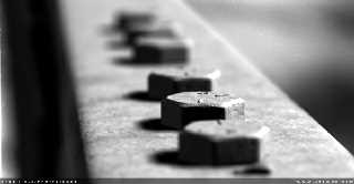
It's been a long while since I posted anything, but as I very recently
FINALLY got a new pc (1Ghz Athlon, 256 Meg DDR etc), I'm POV-ing again.

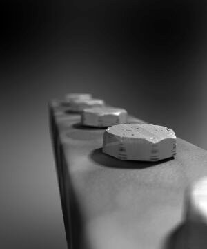
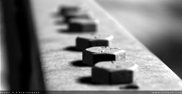
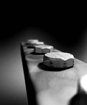
This piece was inspired by a BRAZIL render - maybe some of you have seen it.
If so, you'll be able to see that mine comes nowhere near the
photorealistism of that work. Mine is definitely a WIP. I don't like the
textures, nor can I even approach the contrast from dark to light of the
BRAZIL render (even though that artist mentions using post-processing, I
still feel that my render could be improved. Maybe using radiosity was a bad
idea.)

Anyway, any comments would be welcome.

All the best,

Andy Cocker
Post a reply to this message
Attachments:
Download 'Bolts.jpg' (7 KB)
Preview of image 'Bolts.jpg'

|
|
| |
| |
|
|
|
|
| |
| |
|
|
It looks VERY realistic already!
Add some oil and dirt and it's perfect.

Usually there's an additional thing between the bold and the surface
underneath. But I don't know the english name for that. You know what I
mean, I guess... this disc with a hole in it..... damn, where's my
dictionary?
regards
SY
Post a reply to this message
|
|
| |
| |
|
|
|
|
| |
| |
|
|
Juergen Scharfy wrote:
>
> Usually there's an additional thing between the bold and the surface
> underneath. But I don't know the english name for that. You know what I
> mean, I guess... this disc with a hole in it..... damn, where's my
> dictionary?

Washer.

Deaken
Post a reply to this message
|
|
| |
| |
|
|
|
|
| |
| |
|
|
> Washer.
>
> Deaken

Thanks :-)
Funny name in my opinion.

regards
SY
Post a reply to this message
|
|
| |
| |
|
|
|
|
| |
| |
|
|
"Juergen Scharfy" <sch### [at] surfeu at> wrote in message
news:3c57ddc8$1@news.povray.org...
> > Washer.
> >
> Thanks :-)
> Funny name in my opinion.
Not as funny as blurb. at> wrote in message
news:3c57ddc8$1@news.povray.org...
> > Washer.
> >
> Thanks :-)
> Funny name in my opinion.
Not as funny as blurb.
Post a reply to this message
|
|
| |
| |
|
|
|
|
| |
| |
|
|
> > Funny name in my opinion.
>
> Not as funny as blurb.

*looool*
what is a "blurb"? *g* never heared :)

regards
SY
Post a reply to this message
|
|
| |
| |
|
|
|
|
| |
| |
|
|
Oh, it's a wonderful wod! Just one of its many uses is
blurb, n.
  The summary text on the back of a novel.

Juergen Scharfy wrote:
> *looool*
> what is a "blurb"? *g* never heared :)
>
> regards
> SY

--
signature{
  "Grey Knight" contact{ email "gre### [at] yahoocom" }
  site_of_week{ url "http://digilander.iol.it/jrgpov" }
}
Post a reply to this message
|
|
| |
| |
|
|
|
|
| |
| |
|
|
> This piece was inspired by a BRAZIL render - maybe some of you have seen
it.
> If so, you'll be able to see that mine comes nowhere near the
> photorealistism of that work. Mine is definitely a WIP. I don't like the
> textures, nor can I even approach the contrast from dark to light of the

I refuse to think any other renderer can do better than Pov, so we must find
a solution to this! I've tried to make realistic bolts myself without much
luck.. Hmm.. First of all, could you point me to your reference picture?

As you said, more contrast would be good.. Maybe some more specular
reflection wouldn't be unrealistic because in real life, the dusty look does
not have to be *everywhere* on the bolt.. Some parts are typically quite
shiny, because they have been scratched.

And do I see a line from one end of the bolt to the other, like it's a
screw?  Is that line supposed to be there?  If so, make it deeper.

If you want to keep such a closeup view, I'm afraid blurred reflection will
be necessary.

Regards,
Hugo
Post a reply to this message
|
|
| |
| |
|
|
|
|
| |
| |
|
|
Very nice. The modeling of the bolts is extremely realistic.

Andrew Cocker <mai### [at] mariner9fsnetcouk> wrote in message
news:3c57c561@news.povray.org...
> Hi,
>
Post a reply to this message
|
|
| |
| |
|
|
|
|
| |
| |
|
|
The funniest term I've found so far is *wedgie* (specifically "giving wedgies").
ROTL, I couldn't believe such a word existed for such a thing!

--
#local j=text{ttf"arial""JRG".2,0}#local J=0;#while(J<10)#local R=0;#while
(R<2)#local G=0;#while(G<1)#if(inside(j<R,G.1>))object{j scale.025translate
<R-1G-J/20J/-40+2>pigment{rgb<9J>}}#debug"O"#else#debug" "#end#local G=G+
.025;#end#local R=R+.05;#debug"\n"#end#local J=J+1;#end// JRG

Home: http://digilander.iol.it/jrgpov  //New: Kitchen scene WIP

"Tom Melly" <tom### [at] tomandlucouk> ha scritto nel messaggio
news:3c57e12b$1@news.povray.org...
> "Juergen Scharfy" <sch### [at] surfeuat> wrote in message
> news:3c57ddc8$1@news.povray.org...
> > > Washer.
> > >
> > Thanks :-)
> > Funny name in my opinion.
>
> Not as funny as blurb.
>
>
Post a reply to this message
|
|
| |
| |
|
|
|
|
| |
| |
|
|
On Wed, 30 Jan 2002 23:14:48 +0100, JRG wrote:
> The funniest term I've found so far is *wedgie* (specifically "giving wedgies").
> ROTL, I couldn't believe such a word existed for such a thing!

Here we call it a grundey, I think it sounds better than wegie.

--
#local i=.1;#local I=(i/i)/i;#local l=(i+i)/i;#local ll=(I/i)/l;box{<-ll,
-((I/I)+l),-ll><ll,-l,ll>pigment{checker scale l}finish{ambient((I/l)/I)+
(l/I)}}sphere{<i-i,l-l,(I/l)>l/l pigment{rgb((I/l)/I)}finish{reflection((
I/l)/I)-(l/I)specular(I/l)/I}}light_source{<I-l,I+I,(I-l)/l>l/l} // Steve
Post a reply to this message
|
|
| |
| |
|
|
|
|
| |
| |
|
|
Another word for my personal selfmade dictionary.
Post a reply to this message
|
|
| |
| |
|
|
|
|
| |
| |
|
|
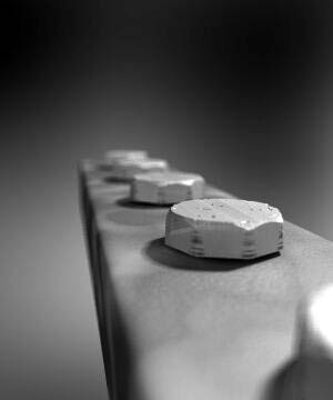
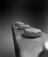
Sent your rendering through Paint Shop Pro 7's automatic contrast
adjustment.  I thought the results were a significant improvement.  The
added contrast brings out the details in the picture.
Post a reply to this message
Attachments:
Download 'Boltspp.jpg' (9 KB)
Preview of image 'Boltspp.jpg'
|
|
| |
| |
|
|
|
|
| |
| |
|
|
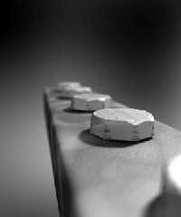
Aww Damn... You beat me too the punch:-) I did the same thing, only in
Photoshop, in my opinion Photoshop does a better job.

"Skip Talbot" <sta### [at] uiucedu> wrote in message
news:3c58e829@news.povray.org...
> Sent your rendering through Paint Shop Pro 7's automatic contrast
> adjustment.  I thought the results were a significant improvement.  The
> added contrast brings out the details in the picture.
>
>
>
Post a reply to this message
Attachments:
Download 'Bolts.jpg' (11 KB)
Preview of image 'Bolts.jpg'
|
|
| |
| |
|
|
|
|
| |
| |
|
|
"Hugo" <hua### [at] post3teledk> wrote in message
news:3c580489$1@news.povray.org...
> I refuse to think any other renderer can do better than Pov, so we must
find
> a solution to this! I've tried to make realistic bolts myself without much
> luck.. Hmm.. First of all, could you point me to your reference picture?

See attatched picture

> As you said, more contrast would be good.. Maybe some more specular
> reflection wouldn't be unrealistic because in real life, the dusty look
does
> not have to be *everywhere* on the bolt.. Some parts are typically quite
> shiny, because they have been scratched.

Specular is turned on, but my textures are all messed up and need reworking.
My 'dirt' looks nothing like dirt.. too smooth (on the block base)

>
> And do I see a line from one end of the bolt to the other, like it's a
> screw?  Is that line supposed to be there?  If so, make it deeper.

That's supposed to be scratches on the surface.. just a scaled normal.

> If you want to keep such a closeup view, I'm afraid blurred reflection
will
> be necessary.

Yes.. good point. I have lost the example code for blurred textures that was
posted recently. I'll try and locate it.

All the best,

Andy Cocker
Post a reply to this message
Attachments:
Download 'bolts_600.jpg' (42 KB)
Preview of image 'bolts_600.jpg'
|
|
| |
| |
|
|
|
|
| |
| |
|
|
> Sent your rendering through Paint Shop Pro 7's automatic contrast
> adjustment.  I thought the results were a significant improvement.  The
> added contrast brings out the details in the picture.

I find that all povray output benefits from that one filter. are we all
doing something wrong, or is povray the maker of washed out images.....


--

Rick

Kitty5 WebDesign - http://Kitty5.com
POV-Ray News & Resources - http://Povray.co.uk
TEL : +44 (01270) 501101 - FAX : +44 (01270) 251105 - ICQ : 15776037

PGP Public Key
http://pgpkeys.mit.edu:11371/pks/lookup?op=get&search=0x231E1CEA
Post a reply to this message
|
|
| |
| |
|
|
|
|
| |
| |
|
|
Minor hue variations in texture/environment/lights would enhance
the image, unless it's supposed to be b&w :) I would try LDRI
lighting. Like in this one: http://www.pp.htv.fi/kkivisal/bolt_nut.gif
Texture is mostly reflective averaged bumps dents normal.

Actually just wrapped this image around a sphere and used
area light. Works well with MegaPOV blurred reflection
and provides some variation in lighting when used with radiosity
and not so reflective objects.
http://www.pp.htv.fi/kkivisal/shop.jpg


_____________
Kari Kivisalo
Post a reply to this message
|
|
| |
| |
|
|
|
|
| |
| |
|
|
Oh... :o)  Your image already looks better than brazil's! The bolts look
more realistic in your version!  The ground does not.. The postprocessing by
Skip Talbert and Thomas Lake are an improvement too, but should be done
internally in Pov for greatest usefulness.

The shadows in brazil's version are too dark...
Looking forward to see your next bolt version!


Regards,
Hugo
Post a reply to this message
|
|
| |
| |
|
|
|
|
| |
| |
|
|
I agree.  What kind of control do you have over that feature in Photoshop?
PSP's control lets you control the bias, strength, and appearance but only
as a few simple radio button options.
Post a reply to this message
|
|
| |
| |
|
|
|
|
| |
| |
|
|
Post a reply to this message
Attachments:
Download 'earth50pp.jpg' (23 KB)
Download 'earth50.jpg' (21 KB)
Preview of image 'earth50pp.jpg'
Preview of image 'earth50.jpg'
|
|
| |
| |
|
|
|
|
| |
| |
|
|
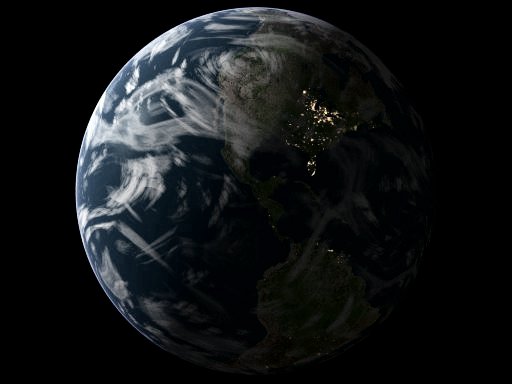
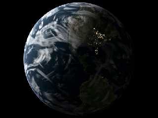
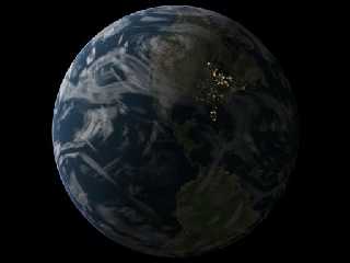
Probably that cursed assumed_gamma 1.0 thing.  ;-)

P.S.
Great renders.

bob h
Post a reply to this message
|
|
| |
| |
|
|
|
|
| |
| |
|
|
They *are* nice aren't they? It took me a few seconds to figure out what
the weird glowy bit was. Must be tired.

I was thinking "gamma problem" too.

--
signature{
  "Grey Knight" contact{ email "gre### [at] yahoocom" }
  site_of_week{ url "http://digilander.iol.it/jrgpov" }
}
Post a reply to this message
|
|
| |
| |
|
|
|
|
| |
| |
|
|
Grey Knight wrote:
>
> I was thinking "gamma problem" too.

The real problem is mismatched contrast ranges. The standard way of
lighting CG produces low contrast scenes and using radiosity amplifies
the effect because it's trying to simulate reality with wrong input
data. One way to deal with it is to use gamma as contrast control:
assumed_gamma 1+(Display_Gamma-1)*Contrast, 0 < Contrast < 1

Some scenes just are low contrast by nature and require transfer curve
editing. Then you dig up the curve editor and twist away until the image
looks right, or hope the automagic adjustment does a good job.


_____________
Kari Kivisalo
Post a reply to this message
|
|
| |
| |
|
|
|
|
| |
| |
|
|
Andrew Cocker <mai### [at] mariner9fsnetcouk> wrote in message
news:3c57c561@news.povray.org...
> Hi,
>
> It's been a long while since I posted anything, but as I very recently
> FINALLY got a new pc (1Ghz Athlon, 256 Meg DDR etc), I'm POV-ing again.
>
> This piece was inspired by a BRAZIL render - maybe some of you have seen it.
> If so, you'll be able to see that mine comes nowhere near the
> photorealistism of that work. Mine is definitely a WIP. I don't like the
> textures, nor can I even approach the contrast from dark to light of the
> BRAZIL render (even though that artist mentions using post-processing, I
> still feel that my render could be improved. Maybe using radiosity was a bad
> idea.)
>
> Anyway, any comments would be welcome.
>
> All the best,
>
> Andy Cocker
>
>
>

Is it just me? Or do your bolts have 8 sides instead of 6?
Is that a locale thing?

--
Tom Bates
Post a reply to this message
|
|
| |
| |
|
|
|
|
| |
| |
|
|
"Tom Bates" <tho### [at] shawca> wrote in message
news:3c59862e@news.povray.org...
> Is it just me? Or do your bolts have 8 sides instead of 6?
> Is that a locale thing?

Oops.. well I just used a height_field made from one of PSP's inbuilt
shapes, and it never dawned on me that it should have just 6 sides. Ah well.

All the best,

Andy Cocker
Post a reply to this message
|
|
| |
| |
|
|
|
|
| |
| |
|
|
I hardly notice any significant difference between both contrasted images.
But I strongly agree that both improves the image a lot.

Fernando.
Post a reply to this message
|
|
| |
| |
|
|
|
|
| |
| |
|
|
> I agree.  What kind of control do you have over that feature in Photoshop?
> PSP's control lets you control the bias, strength, and appearance but only
> as a few simple radio button options.

Well the "autocontrast" feature doesn't allow you any control. But you can
get the same result with very very detailed controls by playing around with
the levels controls. But for the most part autocontrast gets good results.
Post a reply to this message
|
|
| |
| |
|
|
|
|
| |
| |
|
|
You can also get some very nice results with a great deal of control by
playing around with the curves editor in photoshop.
Post a reply to this message
Attachments:
Download 'BoltsCurve2.jpg' (12 KB)
Download 'BoltsCurve1.jpg' (11 KB)
Preview of image 'BoltsCurve2.jpg'

Preview of image 'BoltsCurve1.jpg'

|
|
| |
| |
|
|
|
|
| |
| |
|
|
http://www.pp.htv.fi/kkivisal/bolts.jpg


_____________
Kari Kivisalo
Post a reply to this message
|
|
| |
| |
|
|
|
|
| |
| |
|
|
Neat did you play with the individual colour channels to get this effect?
Post a reply to this message
|
|
| |
| |
|
|
From: Jaime Vives Piqueres
Subject: Re: Bolts (POV image attatched) 30KB
Date: 1 Feb 2002 03:51:31
Message: <3c5a570f@news.povray.org>
|
|
|
| |
| |
|
|
Andrew, sorry if this was not another "brazil challenge", but I've not
resisted to try my old bolt model with such scene.  I wanted to try it with
my new way of making light_sources (very strong and very short ones).

I my self was impressed by the result: IMHO, we all don't really know (yet)
what POV is capable of...

--
Jaime Vives Piqueres

La Persistencia de la Ignorancia
http://www.ignorancia.org
Post a reply to this message
Attachments:
Download 'bolts.jpg' (31 KB)
Preview of image 'bolts.jpg'

|
|
| |
| |
|
|
|
|
| |
| |
|
|
Jaime Vives Piqueres wrote:

> Andrew, sorry if this was not another "brazil challenge", but I've not
> resisted to try my old bolt model with such scene.  I wanted to try it with
> my new way of making light_sources (very strong and very short ones).
>
> I my self was impressed by the result: IMHO, we all don't really know (yet)
> what POV is capable of...
>


THEM ROLLEXES KEEP GETTING AWSOMER AND AWSOMER!!!


--
/*Francois Labreque*/#local a=x+y;#local b=x+a;#local c=a+b;#macro P(F//
/*    flabreque    */L)polygon{5,F,F+z,L+z,L,F pigment{rgb 9}}#end union
/*        @        */{P(0,a)P(a,b)P(b,c)P(2*a,2*b)P(2*b,b+c)P(b+c,<2,3>)
/*   videotron.ca  */}camera{location<6,1.25,-6>look_at a orthographic}
Post a reply to this message
|
|
| |
| |
|
|
|
|
| |
| |
|
|
DAMN that nice!!
Post a reply to this message
|
|
| |
| |
|
|
|
|
| |
| |
|
|
Thomas Lake wrote:
>
> Neat did you play with the individual colour channels to get this effect?

Adjust color balance, shadows -> blue+cyan, highlights -> red+yellow.
And some layer combinations, and various other tweaks. I think the
usual way to do this is to convert to tritone.


_____________
Kari Kivisalo
Post a reply to this message
|
|
| |
| |
|
|
|
|
| |
| |
|
|
> Andrew, sorry if this was not another "brazil challenge", but I've not
> resisted to try my old bolt model with such scene.  I wanted to try it
with
> my new way of making light_sources (very strong and very short ones).
>
> I my self was impressed by the result: IMHO, we all don't really know
(yet)
> what POV is capable of...

Stunning

perhaps we should have a site comparing pov & braz :)


--

Rick

Kitty5 WebDesign - http://Kitty5.com
POV-Ray News & Resources - http://Povray.co.uk
TEL : +44 (01270) 501101 - FAX : +44 (01270) 251105 - ICQ : 15776037

PGP Public Key
http://pgpkeys.mit.edu:11371/pks/lookup?op=get&search=0x231E1CEA
Post a reply to this message
|
|
| |
| |
|
|
|
|
| |
| |
|
|
Damn.. that's SO much better than mine :-(

Well done.

How did you make the bolts, especially the indentations?

Andy

"Jaime Vives Piqueres" <jai### [at] ignoranciaorg> wrote in message
news:3c5a570f@news.povray.org...
> Andrew, sorry if this was not another "brazil challenge", but I've not
> resisted to try my old bolt model with such scene.  I wanted to try it
with
> my new way of making light_sources (very strong and very short ones).
>
> I my self was impressed by the result: IMHO, we all don't really know
(yet)
> what POV is capable of...
>
> --
> Jaime Vives Piqueres
>
> La Persistencia de la Ignorancia
> http://www.ignorancia.org
Post a reply to this message
|
|
| |
| |
|
|
|
|
| |
| |
|
|
Hugo wrote:

> I refuse to think any other renderer can do better than Pov


There is room for some simple quality and speed improvement in POV-Ray.

Example 1 : Brazil does "bokeh", which is the simulation of the way
highlights appear (bigger) in blurry areas, like with a real photograph.
There is a POV-Ray patch (MLPov) that implements a first draft of it,
promising.

Example 2 : Brazil (and most commercial radiosity systems) does NOT
take reflected (and refracted) rays into account when it takes radiosity
samples !!!  Big speedup there, for almost no difference in result (not
a realistic difference, anyway).  If anyone doubts that, I have a
set of images that proves it.
(and the two-step rendering experiences of Jaime and others are
  also in favour of that).

Fabien.
Post a reply to this message
|
|
| |
| |
|
|
|
|
| |
| |
|
|
> Damn.. that's SO much better than mine :-(
>

Hi Andrew,

In my opinion, your bolts are slightly better looking than Jaime's, so don't
be TOO sorry please!  It's true that Jaime's version has some things better
than yours: The contrast is better and the metal plate is better textured.
But your bolts look more dusty = a great thing.. They also have scratches
where they have been touched by ...a tool ... you know (I miss the english
word for it)

Jaime's modelling is presumably done with CSG.. That's technically more
efficient than your heightfield, but in this particular case, it looks too
perfect, so your bolts wins here, too... Anyway, both of you have done a
terrific work!  To merge the results would be perfect.

Regards,
Hugo
Post a reply to this message
|
|
| |
| |
|
|
|
|
| |
| |
|
|
my only complaint is that the blur seems to cut to sharply between not
blurred and blurred. that is, on the bottom bolt atleast.

perhaps though it is just due to where that bolt is placed. like if it had
more of the bolts head in the not-quite-so-blurred part then the blur might
look more gradual.

other than that, it looks stunning

Jaime Vives Piqueres <jai### [at] ignoranciaorg> wrote in message
news:3c5a570f@news.povray.org...
> Andrew, sorry if this was not another "brazil challenge", but I've not
> resisted to try my old bolt model with such scene.  I wanted to try it
with
> my new way of making light_sources (very strong and very short ones).
>
> I my self was impressed by the result: IMHO, we all don't really know
(yet)
> what POV is capable of...
>
> --
> Jaime Vives Piqueres
>
> La Persistencia de la Ignorancia
> http://www.ignorancia.org
Post a reply to this message
|
|
| |
| |
|
|
|
|
| |
| |
|
|
they look like cookies coming out of a conveyer belt...
Or halls, peppermint patty's, some kind of food...

Andrew Cocker wrote:

> Hi,
>
> It's been a long while since I posted anything, but as I very recently
> FINALLY got a new pc (1Ghz Athlon, 256 Meg DDR etc), I'm POV-ing again.
>
> This piece was inspired by a BRAZIL render - maybe some of you have seen it.
> If so, you'll be able to see that mine comes nowhere near the
> photorealistism of that work. Mine is definitely a WIP. I don't like the
> textures, nor can I even approach the contrast from dark to light of the
> BRAZIL render (even though that artist mentions using post-processing, I
> still feel that my render could be improved. Maybe using radiosity was a bad
> idea.)
>
> Anyway, any comments would be welcome.
>
> All the best,
>
> Andy Cocker
>
>  [Image]
Post a reply to this message
|
|
| |
| |
|
|
From: Jaime Vives Piqueres
Subject: Re: Bolts (POV image attatched) 30KB
Date: 2 Feb 2002 05:46:47
Message: <3c5bc397@news.povray.org>
|
|
|
| |
| |
|
|
Andrew Cocker wrote:

> Damn.. that's SO much better than mine :-(
>
> Well done.

  Thanks Andy (and all), but as Hugo said, your is also very well done, and
has some things better. I also like specially your focal blur, mine is
somewhat strange and does not seem to follow the camera zoom.

> How did you make the bolts, especially the indentations?

union{
 intersection{
  union{
   cylinder{<0,-.3,0>,<0,.3,0>,.6}
   torus{.6,.3}
  }
  plane{z,.72}
  plane{z,-.72 inverse}
  plane{x,0 rotate 30*y inverse translate -.82*x}
  plane{x,0 rotate -30*y inverse translate -.82*x}
  plane{x,0 rotate 30*y translate .82*x}
  plane{x,0 rotate -30*y translate .82*x}
 }
 height_field{
  png "hf_bolt"
  smooth
  water_level 0.1
  translate -.5
  scale <1.3,.1,1.3>
  translate <0,.27,0>
 }
}

  The height_field is the nice lettering on the top (which of course says
"POV-RAY"), and is done with The Gimp, puting white letters in circle on
black background and blurring it a bit.

  There are also some facts about the image I forgot to mention:

  + To get the feeling from Brazil, I used a double CD from Joao Gilberto.

  + The image uses Kari rad settings from the cornell box scene, with the
count lowered a bit.

  + The focal blur uses Warp recommendation of variance 0.

  + The metal texture uses an averaged normal (only the normal) from 4
patterns at diferent scales, and a "procedural" image_map "a la Tran".

  + The light is created with my new macro, wich uses basically
fade_distance 1 fade_power 2 and the light color is multiplied by a very
high value (about 3600 for this one).

  + Render time was 7h... !

  I promise to release the light macro this weekend, mainly because I want
some feedback about all my (surely wrong) assumptions creating it.

  Bye...

--
Jaime Vives Piqueres

La Persistencia de la Ignorancia
http://www.ignorancia.org
Post a reply to this message
|
|
| |
| |
|
|
|
|
| |