|
|
|
|
|
|
| |
| |
|
|
|
|
| |
| |
|
|
I don't remember if this has been discussed before, but the new gamma
handling might cause headaches when using color maps and other interpolated
maps. For example, consider this scene:

//global_settings { assumed_gamma 2.2 }
camera { location -z*4 look_at 0 angle 35 }
plane
{ -z,0
  pigment
  { spherical color_map
    { [0 rgb 0]
      [1 rgb 1]
    }
  }
  finish { ambient 1 }
}

  Render it with pov3.7 without and with the assumed_gamma, and you'll see
the clear difference. Even though the mid-gray might technically speaking
be a truly 50% gray, the gradient doesn't still look linear (what is
supposed to be a smooth gradient fading linearly from white in the center
to black in the border looks almost like a sphere).

  The problem is that if one wants to replicate the "non-gamma-corrected"
look of pov3.6 with this specific pigment, there is no way, other than
making the entire scene assume gamma 2.2, which will then affect *all*
colors. You can't insert a "gamma 2.2" anywhere in that color map to make
it work. (And adding "[0.5 rgb 0.5 gamma 2.2]" will obviously not work.
Try it if you want, without the assumed_gamma.)

  I fear that most people will simply learn to always write the magical
line "global_settings { assumed_gamma 2.2 }" at the beginning of every
scene (or whatever will end up being the proper way in the final version),
making the whole gamma correction thing rather moot.

--
                                                          - Warp
Post a reply to this message
|
|
| |
| |
|
|
|
|
| |
| |
|
|
Warp <war### [at] tag povrayorg> wrote:
> I don't remember if this has been discussed before, but the new gamma
> handling might cause headaches when using color maps and other interpolated
> maps.
Here's an actual scene where I used the pattern in question:
http://warp.povusers.org/images/glassblob1.jpg
http://warp.povusers.org/images/glassblob2.jpg
Both of the images were rendered with pov3.7 beta. The difference is
that in the first one I used 'assumed_gamma 2.2', while in the second
one I instead applied 'gamma 2.2' to the individual colors and default
ambient.
The gamma correction doesn't only affect the color gradient on the
floor, but naturally also the shading on the spheres. The end result
is that the second image ends up being much brighter (because the
color gradient on the floor is much brighter) and having much less
saturation/contrast than the first one, making it duller and "washed
out", even after all the used colors are matched with the proper gamma
correction. The transition between the illuminated and dark sides of
the spheres is also much more abrupt (due to gamma correction).
The brightness increase is not necessarily all that problematic, but
the visible reduction in saturation/contrast is. It makes the image much
less vivid. The first image may be significantly darker, but the higher
saturation/contrast makes it vivid and lively.
Obviously it's basically impossible to replicate the first image in
pov3.7 without using 'assumed_gamma 2.2', which will then affect all
colors. This may be a problem for many.
--
- Warp povrayorg> wrote:
> I don't remember if this has been discussed before, but the new gamma
> handling might cause headaches when using color maps and other interpolated
> maps.
Here's an actual scene where I used the pattern in question:
http://warp.povusers.org/images/glassblob1.jpg
http://warp.povusers.org/images/glassblob2.jpg
Both of the images were rendered with pov3.7 beta. The difference is
that in the first one I used 'assumed_gamma 2.2', while in the second
one I instead applied 'gamma 2.2' to the individual colors and default
ambient.
The gamma correction doesn't only affect the color gradient on the
floor, but naturally also the shading on the spheres. The end result
is that the second image ends up being much brighter (because the
color gradient on the floor is much brighter) and having much less
saturation/contrast than the first one, making it duller and "washed
out", even after all the used colors are matched with the proper gamma
correction. The transition between the illuminated and dark sides of
the spheres is also much more abrupt (due to gamma correction).
The brightness increase is not necessarily all that problematic, but
the visible reduction in saturation/contrast is. It makes the image much
less vivid. The first image may be significantly darker, but the higher
saturation/contrast makes it vivid and lively.
Obviously it's basically impossible to replicate the first image in
pov3.7 without using 'assumed_gamma 2.2', which will then affect all
colors. This may be a problem for many.
--
- Warp
Post a reply to this message
|
|
| |
| |
|
|
|
|
| |
| |
|
|
On 19.12.2010 21:09, Warp wrote:
>    I don't remember if this has been discussed before, but the new gamma
> handling might cause headaches when using color maps and other interpolated
> maps.

It has been stated numerous times that assumed_gamma should not be used
for artistic purpose. What you actually want is a non-linear gradient
and there are quite a lot possibilities for this e.g.

pigment {
   spherical
   poly_wave 2
   color_map {
     [0 rgb 0]
     [1 rgb 1]
   }
}

or use a different wave function or write your own function or do
whatever you like but it isn't  - and never was - a good idea to misuse
assumed_gamma for such a purpose.
And you did read the message that assumed_gamma is deprecated?

>    I fear that most people will simply learn to always write the magical
> line "global_settings { assumed_gamma 2.2 }" at the beginning of every
> scene (or whatever will end up being the proper way in the final version),
> making the whole gamma correction thing rather moot.
>

And I'm well aware that a lot of POV-Ray users (among them some of the
most well known) did in past 3.6 times always write
global_setting {assumed_gamma 1.0}
into the scene file. No trouble for them.

-Ive
Post a reply to this message
|
|
| |
| |
|
|
|
|
| |
| |
|
|
Ive <"ive### [at] lilysoftorg"> wrote:
> On 19.12.2010 21:09, Warp wrote:
> >    I don't remember if this has been discussed before, but the new gamma
> > handling might cause headaches when using color maps and other interpolated
> > maps.

> It has been stated numerous times that assumed_gamma should not be used
> for artistic purpose.

  You write as if I didn't know that.

  The problem is: If you wanted the same vivid high-contrast renders as
you get with assumed_gamma 2.2, but without "abusing" it, how do you do
it in pov3.7? Adjusting individual colors is not going to do it because
it doesn't change gradients, shading and other such interpolated values.

> What you actually want is a non-linear gradient
> and there are quite a lot possibilities for this e.g.

> pigment {
>    spherical
>    poly_wave 2
>    color_map {
>      [0 rgb 0]
>      [1 rgb 1]
>    }
> }

  That makes it look closer to the image with assumed_gamma 2.2, but it's
still brighter, for some reason. Compare:

http://warp.povusers.org/images/glassblob1.jpg
http://warp.povusers.org/images/glassblob3.jpg

  (Both rendered with pov3.7, the first one uses assumed_gamma 2.2, in the
second one the individual colors have been adjusted, and the poly_wave
function applied to the color map of the floor.)

  Of course without the poly_wave specifier, that second image looks like
this:

http://warp.povusers.org/images/glassblob2.jpg

  Now tell me, from glassblob2.jpg and glassblob3.jpg, which one of the
circular gradients looks more linear?

  Mind you, on my CRT "rgb 0.5", as rendered by pov3.7 without
"assumed_gamma 2.2" (or "gamma 2.2" specified in the color) *does* give
an almost perfect 50% gray, when compared to a test pattern (of
alternating horizontal black and white lines). However, the circular
pattern in the glassblob2.jpg still looks very non-linear, like most of
the circle was an almost even shade of gray, only very slowly darkening
towards the edges, and then abruptly fading to black.

  The same is true for the colored spheres: The visible area between
the highlight and the shadow looks almost uniformly colored, with only
a very slow darkening towards the far side of the sphere, and then there's
a quite abrupt transition from that color to the dark shade of the
shadowed part of the sphere. In glassblob1.jpg the darkening is much
more pronounced, giving an impression of higher contrast and saturation.

  "assumed_gamma 2.2" might not be intended for artistic purposes, but
can you give an alternative solution to get the same contrast and vivid
saturation of glassblob1.jpg with pov3.7?

  What I fear is that the new gamma handling will be mostly abhorred by
people, and everybody will simply turn it off in all of their scenes.
I know that I will most probably do so, the more I use it.

> And you did read the message that assumed_gamma is deprecated?

  Of course you could also specify "#version 3.6" to get the same effect,
but I'm not sure if it will affect something else as well.

> >    I fear that most people will simply learn to always write the magical
> > line "global_settings { assumed_gamma 2.2 }" at the beginning of every
> > scene (or whatever will end up being the proper way in the final version),
> > making the whole gamma correction thing rather moot.
> >

> And I'm well aware that a lot of POV-Ray users (among them some of the
> most well known) did in past 3.6 times always write
> global_setting {assumed_gamma 1.0}
> into the scene file. No trouble for them.

  If people want some type of behavior from povray, shouldn't that behavior
be officially supported in some way, rather than people being forced to do
it via a deprecated method which is officially frowned upon?

--
                                                          - Warp
Post a reply to this message
|
|
| |
| |
|
|
|
|
| |
| |
|
|
Warp <war### [at] tagpovrayorg> wrote:
> > What you actually want is a non-linear gradient
> > and there are quite a lot possibilities for this e.g.

> > pigment {
> >    spherical
> >    poly_wave 2
> >    color_map {
> >      [0 rgb 0]
> >      [1 rgb 1]
> >    }
> > }

>   That makes it look closer to the image with assumed_gamma 2.2, but it's
> still brighter, for some reason.

  Should have figure out that to match the assumed_gamma 2.2 version,
I should use "poly_wave 2.2", of course. Now the gradient matches, as
it should, but my other points still stand.

--
                                                          - Warp
Post a reply to this message
|
|
| |
| |
|
|
|
|
| |
| |
|
|
Warp <war### [at] tagpovrayorg> wrote:

>   If people want some type of behavior from povray, shouldn't that behavior
> be officially supported in some way, rather than people being forced to do
> it via a deprecated method which is officially frowned upon?
>

Well-said, and I've lately been having the same thoughts. What bothers me isn't
so much the 'new' gamma handling (which I admit I haven't played around with
yet, because I'm still having great fun with v3.6.1--and assumed_gamma 2.2), but
rather the 'dogmatic' (and somewhat condescending) tone of some of the comments
here and elsewhere, concerning the 'right' or 'wrong' way of dealing with gamma.

I think it's presumptuous to assume that I (and undoubtedly others) who use this
2.2 method are simply 'not getting it' or that we're 'abusing' gamma for
artistic purposes simply out of ignorance (or whatever.) Personally, I give this
topic *much* thought--always comparing what I see in real-life to what I see (or
think I should see) on a computer screen and in images that I make. It's an
on-going process for me--and I'm still open to 'correcting' my behavior...but in
the final analysis, it's my *eyes* that I trust, not technical jargon or dogma.
It's one thing to *suggest* to us that we should ween ourselves away from gamma
2.2, for legitimate technical reasons; but it's quite another to *impose* it
upon us, especially when accompanied by an annoying 'I'm right, you're wrong'
attitude. If using anything other than assumed_gamma 1.0 is considered 'abuse
for purely artistic reasons', I say "Guilty as charged!" Happily so.

Yet I readily admit that the updated wiki section on gamma is a wonder to
behold--it's a fantastic resource that really makes me *think* about the issue.
And I may yet see the light ;-)  *IF* my eyes can convince me.

As to the issue of deprecating assumed_gamma 2.2: Given(?) that it's considered
an 'artistic deviation' by some here, then let us have free reign to use it as
such! I would recommend *removing* the deprecated status (with a warning caveat
of some kind, if necessary.) I really see no harm in this philosophy; POV-Ray is
a *great* artistic tool, a 'Swiss army knife' for scene design and rendering.
Why 'deprecate' a still-useful part of the knife? Not every artist works the
same way with the same tools.

Ken
Post a reply to this message
|
|
| |
| |
|
|
|
|
| |
| |
|
|
Am 20.12.2010 12:38, schrieb Kenneth:

> I think it's presumptuous to assume that I (and undoubtedly others) who use this
> 2.2 method are simply 'not getting it' or that we're 'abusing' gamma for
> artistic purposes simply out of ignorance (or whatever.) Personally, I give this
> topic *much* thought--always comparing what I see in real-life to what I see (or
> think I should see) on a computer screen and in images that I make. It's an
> on-going process for me--and I'm still open to 'correcting' my behavior...but in
> the final analysis, it's my *eyes* that I trust, not technical jargon or dogma.

A similar on-going process happens on the other side of the fence, btw.

Fact is, the pre-3.6 gamma handling (which was actually a non-handling,
based on pure naive ignorance of the issue) was physically wrong, with
no way whatsoever to get it right; "assumed_gamma" was an approach to
fix that (and its intentions were no more than that; it always was
intended as a technical tool, not an artistic one).

Fact is also, the 3.6 assumed_gamma mechanism got deprecated not (or at
least not primarily) because it was wrong (it wasn't; it was incomplete,
and the implementation was partially inconsistent, but as a concept it
would have been a step in the right direction) or still allowed for
"abuse", but due to internal architectural changes - the separation into
a "front-end" and a "back-end", which is a necessary step towards
networked rendering (and also greatly helped to implement multithreaded
rendering). The separation between the two ends was deemed to run right
through the assumed_gamma mechanism.


Another fact is that 3.7 gamma handling originally started out as indeed
effectively forcing "assumed_gamma 1.0" on all new scenes, plus a
differentiating between the File_Gamma and Display_Gamma keywords. That
was all 3.7 gamma handling originally did.

Since then, shortcomings of this approach have been identified and
addressed, such as how to deal with gamma pre-corrected input image
files (which are by far the majority), and how to make life easier for
people who prefer to enter colors in gamma pre-corrected format because
it feels more natural.

Other objective or subjective shortcomings have been identified by now
which will /not/ be addressed in 3.7.0 proper:

- Even with the "gamma" keyword, entering gamma pre-corrected colors is
more cumbersome than would be appropriate (my personal opinion is that
they should be just about as easy to enter as linear colors). However,
they /can/ be entered by now using what I deem a pretty good syntax, so
it was decided to not do anything about this for 3.7.0 (which we can
realistically hope to release soon), and postpone the issue to a later
version.

- Gradients have been on my agenda for quite a while already, but I
hadn't found the time to investigate; nor was I aware that more
"natural-feeling" gradients can be achieved using "poly_wave 2.2". While
being more cumbersome than I'd like, again it /can/ be done, and I still
have it on my personal agenda for a later version.

- Spotlights are another topic, but with those I presume that the
tightness parameter provides enough artistic freedom already.

- Likewise, the smoothness of diffuse illumination on curved surfaces
can be enhanced beyond what's typically realistic simply by using the
brilliance keyword. In a similar manner, the appearance of highlights
can be adjusted via the roughness and phong_size parameters.

- Using gamma adjustment to simulate photographic film non-linearity is
also on my agenda, and for this there is indeed no replacement ATM; but
this clearly falls into the category of post-processing steps, for which
POV-Ray currently has a policy of not doing those. (There are currently
signs that this position may be given up, but in that case there will be
a mechanism to which gamma tweaking is just one of many uses.)

What I'm saying here is that the advocates of the old pre-3.6 model are
not forgotten, and some of their points are (and have already been)
taken quite seriously. The direction will not be to retain assumed_gamma
though, but rather to complement the new gamma handling model with
features to easily achieve the effects asked for.


Finally, here is one more fact: For some file formats (like PNG, OpenEXR
and Radiance HDR), it is to the best of my knowledge /impossible/ to
achieve a well-defined behaviour regarding gamma that suits both
technical and artistic use of a single gamma-handling mechanism. Thus we
/need/ a purely technical gamma handling mechanism if we want to support
physical realim at all, and where this does not fit the needs of people
who prefer artistic freedom we need to find other ways to give back that
freedom.
Post a reply to this message
|
|
| |
| |
|
|
|
|
| |
| |
|
|
>    Render it with pov3.7 without and with the assumed_gamma, and you'll see
> the clear difference. Even though the mid-gray might technically speaking
> be a truly 50% gray, the gradient doesn't still look linear (what is
> supposed to be a smooth gradient fading linearly from white in the center
> to black in the border looks almost like a sphere).

The problem is it's mostly just coincidence that the traditional gamma
2.2 better matches the human perception of "brightness" (IIRC it's
nearer 3 than 2.2 for humans) than no gamma (ie 1.0).  This means that
smooth gradients interpolated in gamma 2.2 space will *look* a lot more
"linear" to humans than those interpolated in linear colour space.

There are other colour spaces designed specifically to match the human
response (eg CIELAB), so I think the ideal solution would be for there
to be a keyword to tell POV to use a "human-linear" colour space.  This
would then work regardless of gamma setting (which shouldn't be abused
to get a linear looking gradient, because it will mess up the other
lighting calculations).

Anyway without such a feature, POV should be flexible enough to get what
you want without resorting to messing about with gamma settings.
(assuming your goal is a photorealistic scene, if not by all means
fiddle with gamma if it gives you what you want)
Post a reply to this message
|
|
| |
| |
|
|
|
|
| |
| |
|
|
clipka <ano### [at] anonymousorg> wrote:
> Am 20.12.2010 12:38, schrieb Kenneth:
>
> > Personally, I give this topic *much* thought--always comparing what I see
> > in real-life to what I see (or think I should see) on a computer screen and
> > in images that I make. It's an on-going process for me...

> A similar on-going process happens on the other side of the fence, btw.

No doubt! ;-) It can't be easy, trying to reconcile what might be considered an
'oil and water mix' of different philosophies and requests.
>
> Finally, here is one more fact: For some file formats (like PNG, OpenEXR
> and Radiance HDR), it is to the best of my knowledge /impossible/ to
> achieve a well-defined behaviour regarding gamma that suits both
> technical and artistic use of a single gamma-handling mechanism. Thus we
> /need/ a purely technical gamma handling mechanism if we want to support
> physical realism at all...

Yes, I do see the need for that--having to work by necessity with raw linear
lighting values, AFAIU, and over a *very* large numerical range. (In fact, it's
these particular issues that are driving me toward buying a new high-end camera,
to start experimenting with HDRI in POV-Ray.)

BTW, my ranting screed was most definitely not aimed in your direction, rest
assured. (Sorry if it sounded that way.) Keep those great ideas coming! ;-)

Ken
Post a reply to this message
|
|
| |
| |
|
|
|
|
| |
| |
|
|
clipka <ano### [at] anonymousorg> wrote:
> - Gradients have been on my agenda for quite a while already, but I
> hadn't found the time to investigate; nor was I aware that more
> "natural-feeling" gradients can be achieved using "poly_wave 2.2". While
> being more cumbersome than I'd like, again it /can/ be done, and I still
> have it on my personal agenda for a later version.

  I think that the problem with gradients not looking anywhere even close
to linear by default showcases a more fundamental problem.

  When you specify eg. a color_map, without any fine-tuning parameters,
the *default* result should be a color map that looks linear (eg. when
applied to a gradient pattern). Only if you wanted a non-linear mapping
would you specify parameters such as poly_wave with a value different
from 1.0 (the default value of "poly_wave 1.0" means linear mapping).

  The problem with the current pov3.7 is that such a gradient is not
looking even close to linear, even with monitors where 'rgb 0.5' is
truly 50% bright, as compared to a test pattern. I don't know why this
is so, but it just isn't.

  And it's not just a question of it looking slightly off. Like if you
took an image with a linear gradient created by pov3.6 and looked at it
in different CRT and LCD displays and comparing them to each other
side-by-side, you would probably see slight variations, and you could
make an estimate of which one of them looks the most linear transition,
hence making the others just slightly off. Different people would most
probably choose a different display which they thought produced the most
linear-looking gradient.

  No, it's nothing like that. The gradient produced by pov3.7 is very
*clearly* non-linear looking. It's *way* off. It looks very pronouncedly
logarithmic in nature. If you show the gradients created by pov3.6 and
pov3.7 to any random person, there will be no doubt in their choice (yes,
I have actually tested this with a friend).

  As said, I don't really know *why* this is so. As I have mentioned,
with my CRT a 'rgb 0.5' as produced by pov3.7 by default looks about
50% gray when compared to a test pattern, so *in theory* a linear
gradient produced by pov3.7 should look linear. But it just doesn't.
A linear pattern produced pov3.6 looks significantly more linear (and,
as I also said, it's not just me, as I have actually tested this with
another person, looking at the same images on the same display).

  Anyways, whatever the reason might be, it's undeniable that a problem
exists. What should be producing a linear gradient isn't doing so.

  A suggestion like "use 'poly_wave 2.2' in your color map" is not the
correct solution to the problem. It's simply counter-acting the effects
of the gamma correction. What "poly_wave 2.2" is saying is "make the
color transition pronouncedly non-linear, by a power of 2.2" (which is
quite a significant deviation from linear mapping; just compare the
functions "x" and "x^2.2", which is what this is exactly doing).
A suggestion of "use a non-linear mapping to achieve a linear-looking
gradient" is contradictory and shouldn't be the correct answer. A linear
looking gradient should be *the default*.

  And it's not just color gradients that are affected by this. It's any
transition from one color to another which should look linear. This
happens in surface lighting, shadow borders when using area lights,
and so on and so forth. (Note that surface lighting very rarely looks
literally linear because the cosine of the angle between the surface
normal and the direction of the light seldom changes linearly, but if
you devised such a surface, it *should* in that case look linear, but
with pov3.7 it won't.)

--
                                                          - Warp
Post a reply to this message
|
|
| |
| |
|
|
|
|
| |
| |
|
|
>    As said, I don't really know *why* this is so. As I have mentioned,
> with my CRT a 'rgb 0.5' as produced by pov3.7 by default looks about
> 50% gray when compared to a test pattern, so *in theory* a linear
> gradient produced by pov3.7 should look linear.

No it shouldn't - your eye/brain does not see light in a linear fashion.
  50% actual brightness from something (as measured in cd/m^2 or
whatever) will *not* look half as bright as 100%.  It's no different to
a real scene, light bulbs, or an image on your monitor.  It's just the
way your eye/brain works.

An analogy is hearing, a sound with twice the physical power (in Watts)
does not sound twice as loud to a human.
Post a reply to this message
|
|
| |
| |
|
|
|
|
| |
| |
|
|
scott <sco### [at] scottcom> wrote:
> >    As said, I don't really know *why* this is so. As I have mentioned,
> > with my CRT a 'rgb 0.5' as produced by pov3.7 by default looks about
> > 50% gray when compared to a test pattern, so *in theory* a linear
> > gradient produced by pov3.7 should look linear.

> No it shouldn't - your eye/brain does not see light in a linear fashion.
>   50% actual brightness from something (as measured in cd/m^2 or
> whatever) will *not* look half as bright as 100%.  It's no different to
> a real scene, light bulbs, or an image on your monitor.  It's just the
> way your eye/brain works.

> An analogy is hearing, a sound with twice the physical power (in Watts)
> does not sound twice as loud to a human.

  I suppose the fundamental question would then be: "If I say to povray
to produce a linear gradient, should it produce a gradient which is
linear according to light intensity, or according to the perceived
linearity as seen by people?"

  What I'm getting at is that when people specify a linear gradient,
they expect to get a gradient that *looks* linear (rather than a gradient
that might be linear as measured by some device that measures light
intensity).

  As for whether eg. surface shading looks more realistic with the new
gamma handling or the old one, it would be interesting to see some
actual comparisons with photographs. (Note that I'm *not* saying here
that in my opinion pov3.6 is producing the more closer-to-reality
result while pov3.7 is producing something which is way off. I'm
completely honestly interested in actual comparisons with real-life
photographs, to see which one gets closer, if that would be possible.)

--
                                                          - Warp
Post a reply to this message
|
|
| |
| |
|
|
|
|
| |
| |
|
|
>    I suppose the fundamental question would then be: "If I say to povray
> to produce a linear gradient, should it produce a gradient which is
> linear according to light intensity, or according to the perceived
> linearity as seen by people?"

Agreed, as I wrote already it might be a good idea for an additional
keyword (to be used in colour maps) that specifies whether you want
physical linear interpolation (which will "look" non-linear) or some
other interpolation type suited to the human visual system.  This would
be totally separate to any gamma settings, as it has nothing to do with
gamma.

For grey-scales you can already simply use something like "poly_wave 3"
to get a more natural gradient, but once colours are involved it's going
to look wrong without some more sophisticated interpolation algorithm.

>    As for whether eg. surface shading looks more realistic with the new
> gamma handling or the old one, it would be interesting to see some
> actual comparisons with photographs.

The problem with that kind of test is that you are also testing the
surface lighting equations used in POV (which are a simplification of
real surfaces).  I wasn't aware there was any doubt as to whether the
new gamma was more accurate (you can simply test it with a black/white
checkerboard next to 50% grey).
Post a reply to this message
|
|
| |
| |
|
|
|
|
| |
| |
|
|
Am 21.12.2010 12:00, schrieb scott:

> Agreed, as I wrote already it might be a good idea for an additional
> keyword (to be used in colour maps) that specifies whether you want
> physical linear interpolation (which will "look" non-linear) or some
> other interpolation type suited to the human visual system. This would
> be totally separate to any gamma settings, as it has nothing to do with
> gamma.

Not sure whether I mentioned it here or not, but such a mechanism has
already been on my agenda for a while (it will not make it into 3.7.0
proper though); the syntax would be something along the lines of

   pigment {
     gradient y
     color_map {
       perceptual
       [0.0 rgb 0]
       [0.5 rgb 1]
       [1.0 rgb 0.5]
     }
   }

(The example also showcases the problem with the poly_wave workaround
you mention, which only works for gradients running from [0.0 rgb 0] to
[1.0 Some_Color].)

Pigment maps will need the same mechanism, btw. I also thought about
whether it would make sense in texture maps, but I guess that's too
complicated to implement, for too little gain.

>> As for whether eg. surface shading looks more realistic with the new
>> gamma handling or the old one, it would be interesting to see some
>> actual comparisons with photographs.
>
> The problem with that kind of test is that you are also testing the
> surface lighting equations used in POV (which are a simplification of
> real surfaces). I wasn't aware there was any doubt as to whether the new
> gamma was more accurate (you can simply test it with a black/white
> checkerboard next to 50% grey).

There's also the problem that photographs may be non-linear as well;
digital cameras aren't typically calibrated, and photographic paper has
non-linearities, too.

A typical reference image would be the Cornell Box (see
http://www.graphics.cornell.edu/online/box/).
Post a reply to this message
|
|
| |
| |
|
|
|
|
| |
| |
|
|
> Not sure whether I mentioned it here or not, but such a mechanism has
> already been on my agenda for a while (it will not make it into 3.7.0
> proper though);

OOC did you decide already which algorithm to use for this?  Will it
give more linear looking gradients between different colours too?

 > the syntax would be something along the lines of
>
> pigment {
> gradient y
> color_map {
> perceptual
> [0.0 rgb 0]
> [0.5 rgb 1]
> [1.0 rgb 0.5]
> }
> }

That's exactly the sort of thing I was thinking of.  Maybe Warp will
argue that the default should be "perceptual" though, and we need a
"linear" keyword to revert to the existing behaviour.

> There's also the problem that photographs may be non-linear as well;
> digital cameras aren't typically calibrated, and photographic paper has
> non-linearities, too.

I have no idea how well consumer-grade cameras are made, but my camera
has an option for sRGB or Adobe RGB colour space, so I imagine it can't
be that far off either one when selected.  Photographic film is probably
worse, IDK.
Post a reply to this message
|
|
| |
| |
|
|
|
|
| |
| |
|
|
Am 21.12.2010 14:45, schrieb scott:
>> Not sure whether I mentioned it here or not, but such a mechanism has
>> already been on my agenda for a while (it will not make it into 3.7.0
>> proper though);
>
> OOC did you decide already which algorithm to use for this? Will it give
> more linear looking gradients between different colours too?

I expect so.

When interpolating between two colors, POV-Ray currently computes
something along the lines of:

   q = 1-p;
   result = p * color1 + q * color2;

For a "perceptually linear" gradient, the formula would be changed to:

   q = 1-p;
   temp1 = pow(color1, 1/gamma);
   temp2 = pow(color2, 1/gamma);
   tempR = p * color1 + q * color2;
   result = pow(tempR, gamma);

where gamma would be a value around 2.5.

> That's exactly the sort of thing I was thinking of. Maybe Warp will
> argue that the default should be "perceptual" though, and we need a
> "linear" keyword to revert to the existing behaviour.

... except that he'd even argue that "linear" would be the wrong keyword
for that purpose.

I'll just let him argue then. I'm not reading his newsgroup postings
anyway, as it would ultimately result in the two of us getting mad at
each other. Never put two zealots adhering to contradicting dogmata in
the same room. Fortunately (for me) I'm not in a position of needing to
be heard to get my will.
Post a reply to this message
|
|
| |
| |
|
|
|
|
| |
| |
|
|
scott <sco### [at] scottcom> wrote:
> That's exactly the sort of thing I was thinking of.  Maybe Warp will
> argue that the default should be "perceptual" though, and we need a
> "linear" keyword to revert to the existing behaviour.

  The thing is that most people are used to specifying colors as perceived
by the human eye rather than in watts. For example, doubling the values of
the color components is expected to double the brightness of the color
(iow. eg. 'rgb 0.8' is assumed to be twice as bright as 'rgb 0.4').

  To elaborate, if I have understood correctly, POV-Ray 3.7 has been
changed so that regular color specifications express the power of
luminous radiation (which is called radiant flux, and in physics is
measured in watts) rather than the perceived luminosity as seen by
the human eye. The relation between these two is not linear (but closer
to logarithmic). This means that eg. doubling the radiant flux (ie.
doubling the "wattage") does not correspond to doubling the perceived
luminosity of the color, as seen by the human eye.

  This might correspond more closely to reality when calculating
illumination. For example surfaces reflect a portion of the light they
receive, and this portion is relative to the radiant flux, not to the
perceived brightness. (In other words, if the surface properties and
angle with respect to incoming light is so that it reflects exactly
half of the light it receives, this half is measures in watts, not in
what the human eye perceives as "half bright".) I suppose that at least
in theory this ought to give a more realistic end result for surface
illumination, ie. a result which corresponds more to real life.

  As said, the only problem is that people are accustomed to specifying
colors and color gradients in perceived luminosity, not in watts. This
can and will cause confusion.

  In POV-Ray 3.6 color specifications correspond directly to pixel
component values, and this happens to be close to linear with respect
to the perceived luminosity, and hence 'rgb 0.8' looks about twice as
bright as 'rgb 0.4', and this is what people are accustomed to. Likewise
linear color gradients in POV-Ray 3.6 (which, as said, simply map
directly to pixel values) happen to be close to to perceived linear
brightness, which is also what people are accustomed to.

  "You don't specify perceived brightness anymore, but absolute brightness"
is a rather radical change, and many people will get confused by it,
especially since in most systems (at least those with a gamma of 2.2)
raw pixel values map almost linearly to perceived brightness.

--
                                                          - Warp
Post a reply to this message
|
|
| |
| |
|
|
|
|
| |
| |
|
|
>    "You don't specify perceived brightness anymore, but absolute brightness"
> is a rather radical change, and many people will get confused by it,
> especially since in most systems (at least those with a gamma of 2.2)
> raw pixel values map almost linearly to perceived brightness.

Just tell them to use the srgb keyword, as it uses the same colour space
as the web, MS Office, Paint etc.  rgb should be reserved for use only
when you need to specify the absolute physical brightness.  I can fully
imagine that later on srgb will become more commonly used and then we'll
have questions like "what is the rgb keyword for?".
Post a reply to this message
|
|
| |
| |
|
|
From: Jaap Frank
Subject: Re: Gamma of interpolated colors in color maps
Date: 22 Dec 2010 13:34:07
Message: <4d12449f@news.povray.org>
|
|
|
| |
| |
|
|
>"Warp"  schreef in bericht news:4d10761e@news.povray.org...
>
>The problem with the current pov3.7 is that such a gradient is not
>looking even close to linear, even with monitors where 'rgb 0.5' is
>truly 50% bright, as compared to a test pattern. I don't know why this
>is so, but it just isn't.

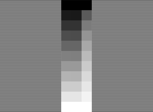
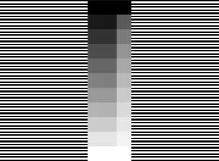
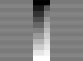
I'm curious Warp. I've shrunk the file you made yourself for the thread
'More Gamma Again' in p.b.i to a very small one. Now you don't have
to see through your eyelids but can simple look at it. For me the 3.6
side is lineair and the 3.7 side absolutely not. How looks this stamp
on your monitor now?
Don't say it's the thrinking technic, because for me it's absolutely
the same for the big and the small one.
If you have windows 7, than put the file on your monitor and you
automatically get a stamp as icon.

Can everybody react on this with which side is for them the right
one, because I'm under the impression that more people see
what I see.

Thanks in advance,

Jaap Frank
Post a reply to this message
Attachments:
Download 'gradient_10_pov.png' (4 KB)
Download 'gradient_pov_mini.png' (1 KB)
Preview of image 'gradient_10_pov.png'
Preview of image 'gradient_pov_mini.png'
|
|
| |
| |
|
|
|
|
| |
| |
|
|
>"Jaap Frank"  schreef in bericht news:4d12449f@news.povray.org...
>
>If you have windows 7, than put the file on your monitor and you
>automatically get a stamp as icon.

This should have been:

If you have windows 7, than put the file on your DESKTOP and you
automatically get a stamp as icon.
Sorry,

Jaap Frank
Post a reply to this message
|
|
| |
| |
|
|
|
|
| |
| |
|
|
Jaap Frank <jjf### [at] casemanl> wrote:
> I'm curious Warp. I've shrunk the file you made yourself for the thread
> 'More Gamma Again' in p.b.i to a very small one. Now you don't have
> to see through your eyelids but can simple look at it. For me the 3.6
> side is lineair and the 3.7 side absolutely not. How looks this stamp
> on your monitor now?

  The purpose of the image was not to show that the gradient is linear,
but that the middle of the gradient corresponds to 50% brightness.

  In the original image there are horizontal lines alternating between
pure black and pure white, hence producing an overall brightness of about
half of pure white. In my monitor this 50% brightness of the sides
corresponds to approximately the middle of the pov3.7 gradient.

  Of course it doesn't *look* 50% bright because the human eye doesn't
perceive the brightness linearly.

  If you scale the image smaller, presumably by averaging pixels, you will
cause the sides to become (128,128,128) (as that's the average between
(0,0,0) and (255,255,255)) which does *not* correspond to 50% brightness.
It corresponds approximately to 50% *perceived* brightness, as seen by
the human eye, at least on monitors with a gamma of 2.2, but it doesn't
correspond to 50% *absolute* brightness, which is what the alternating
lines are producing.

  In my monitor the sides of the scaled-down image look significantly
darker than the sides of the original image.

> Don't say it's the thrinking technic, because for me it's absolutely
> the same for the big and the small one.

  I really can't understand in which situation the gradient produced
by pov3.6 looks linear and, at the same time, the alternating pattern
looks like corresponding to the middle of that pattern. As far as I
understand, if the pattern would look about the same as the middle
of the gradient, the gradient should not look nowhere even close to
linear, or if the gradient looks linear, the pattern should not look
even close to being the same as the middle of the pattern. Unless the
white lines in the pattern are, for whatever unfathomable reason, narrower
than the black lines (hence reducing the overall brightness of the
pattern).

  I don't think it can be that the system is gamma-correcting what it's
showing on screen (so that the pattern would then match the center of
the gradient) because then the gradient would not look linear (it would
look like what pov3.7 produces by default).

--
                                                          - Warp
Post a reply to this message
|
|
| |
| |
|
|
From: clipka
Subject: Re: Gamma of interpolated colors in color maps
Date: 23 Dec 2010 06:51:45
Message: <4d1337d1@news.povray.org>
|
|
|
| |
| |
|
|
Am 22.12.2010 19:34, schrieb Jaap Frank:

> Don't say it's the thrinking technic, because for me it's absolutely the
> same for the big and the small one.

(I guess you mean "shrinking"?)

Theoretically, if your your display is configured properly, the
/background/ of the thumbnail should look different.

> Can everybody react on this with which side is for them the right
> one, because I'm under the impression that more people see what I see.

Let me re-iterate the facts here:

- It is perfectly normal for the left (double-width) strip to /look/
more linear than the right (single-width) one.

- It is also perfectly normal for typical image processing software to
report the "RGB values" or "greyscale values" of the left strip as
near-"linear" (something like (0;0;0), (25;25;25), (51;51;51),
(76,76,76), ... (255;255;255), or 0%, 10%, 20%, ... 100%)

- It is also perfectly normal for typical image processing software to
average the black-and-white striped background to the same value as the
middle swatch in the left strip when creating a scaled-down version of
the image.

- It is however also perfectly normal for the original black-and-white
striped background to look more like the middle swatch in the /right/
strip when squinting your exes.

- The black-and-white stripes of the original-size image background
/inevitably/ generate a physical light intensity exactly halfway between
black and white, i.e. /truly/ 50% white.

=> The left stripe typically /looks/ linear, while the right strip
typically /is/ linear.
Post a reply to this message
|
|
| |
| |
|
|
|
|
| |
| |
|
|
clipka <ano### [at] anonymousorg> wrote:
> => The left stripe typically /looks/ linear, while the right strip
> typically /is/ linear.

  As I have been discussin in length in this thread, the definition of
"linear" is a bit ambiguous.

  You can say that the right strip "is linear" (at least on a monitor with
the traditional gamma of 2.2) in the sense of radiant flux: The physical
amount of light emitted, when measured in watts. In other words, if you
counted the photons that are emitted by the right strip, this amount would
grow (approximately) linearly as we go down the strip.

  However, while it may be linear in a physical sense as described, it's
not linear in a *practical* sense. It's not linear as perceived by the
human eye, nor is it linear when looking at the pixel values.

  The radiant flux approach ought to give more realistic results when
calculating the illumination of surfaces (ie. how much they reflect light,
this "how much" being, precisely, the amount of radiant flux that the
surface emits). However, it poses a practical problem when the user tries
to create things like gradients that *look* linear, as perceived by the
human eye. This practical problem is only aggravated by the fact that most
people are already accustomed to programs handling brightness in terms of
perceived brightness (rather than radiant flux), as well as the fact that
pixel values map almost linearly to perceived brightness as well (at least
on gamma 2.2 monitors).

  This will cause confusion. However, I'm not sure what the best solution
to this would be. (Things like the 'srgb' keyword and 'poly_wave 2.2' for
maps might help, but there are probably still tons of other situations
where such practical problems might arise.)

--
                                                          - Warp
Post a reply to this message
|
|
| |
| |
|
|
From: Jaap Frank
Subject: Re: Gamma of interpolated colors in color maps
Date: 23 Dec 2010 14:55:21
Message: <4d13a929@news.povray.org>
|
|
|
| |
| |
|
|
>clipka <ano### [at] anonymousorg> wrote:
>
>- It is however also perfectly normal for the original black-and-white
>striped background to look more like the middle swatch in the /right/
>strip when squinting your exes.
>
>"Warp"  schreef in bericht news:4d135d05@news.povray.org...
> As I have been discussing in length in this thread, the definition of
>"linear" is a bit ambiguous.

Let me first say I don't want to start a new discussion between
two nonconverging opinions, because that's NOT what I wanted.

On the contrary, I want to understand why I can't get my three
monitors do what Warp and clipka are suggesting:
In principle I should configure  those monitors in such a way that
the right striped side intensity correspond somewhere in the middle
of the right (3.7) strip. I can tell you that's impossible. There is no
way I can reach that.

Ive did send me to

http://www.photoscientia.co.uk/Gamma.htm

to tune my monitors. You get three bloks with colored squares
inside other colored squares and a gray square for three light
intensities.
I've slide my sliders for red, green and blue for hours, but I couldn't
get it right. The result was awfull, the monitor was totally wrong
in color and brightness.
At last I took a fotograph of my daughters wedding and used this
to get the colors right. This fotograph has a lot of colors that I
have in my head to compare with (green from three days fresh leaves,
sandwashed wood of a bridge over a pond and so on). After I made
this the way I remember those colors I went back to this site.
Well, now it was exactly as it should be. What I couldn't do first,
I did in a quarter of an hour with this fotograph.
Further I learned that the monitors are not exactly gamma 2.2, but
about 1.8-2.0  for the dark intensities, about 2.0 around the middle
intensities and around 2.0-2.2 for the high intensities. Maybe this is
the difference between gamma 2.2 and srgb correction.
I'm planning to make a tutorial for it and put it in p.b.tutorials. It will
take about fifteen minutes to tune your monitor.

Jaap:
> Don't say it's the thrinking technic, because for me it's absolutely the
> same for the big and the small one.
Clipka:
> (I guess you mean "shrinking"?)

I missed that one :). Guess it's because Christmas is coming.

Jaap
Post a reply to this message
|
|
| |
| |
|
|
|
|
| |
| |
|
|
Jaap Frank <jjf### [at] casemanl> wrote:
> On the contrary, I want to understand why I can't get my three
> monitors do what Warp and clipka are suggesting:
> In principle I should configure  those monitors in such a way that
> the right striped side intensity correspond somewhere in the middle
> of the right (3.7) strip. I can tell you that's impossible. There is no
> way I can reach that.

  On your monitor, does the pov3.6 gradient on the left look about linear,
while the pov3.7 gradient very non-linear (with most of the shades being
much closer to white than black?

  If you look at the picture from sufficiently far away so that the
patterns on the sides look gray, where would you put them on the pov3.6
gradient?

  If your answer to the first question is that the pov3.6 gradient looks
way more linear than the pov3.7 gradient, and the answer to the second
question is that the pattern looks about the same as the middle of the
pov3.6 gradient, then I'm puzzled, as I don't understand how that is
physically possible.

  An idea comes to mind: Double the size of the image (so that the
horizontal lines on the patterns on the sides become 2 pixels thick),
check that the pattern does indeed alternate between pure white and
pure black, and look at the image from even farther away. Does it still
look the same? Make it 3 times as large as the original (so that the
horizontal lines become 3 pixels thick). Does it still look about the
same brightness?

  I'm wondering if your monitor is blurring or antialiasing the pattern,
causing it to become dimmer. Making the horizontal lines thicker should
remove that possibility.

--
                                                          - Warp
Post a reply to this message
|
|
| |
| |
|
|
From: Jaap Frank
Subject: Re: Gamma of interpolated colors in color maps
Date: 23 Dec 2010 20:17:21
Message: <4d13f4a1@news.povray.org>
|
|
|
| |
| |
|
|
>"Warp"  schreef in bericht news:4d13acbe@news.povray.org...
>
>Jaap Frank <jjf### [at] casemanl> wrote:
>> On the contrary, I want to understand why I can't get my three
>> monitors do what Warp and clipka are suggesting:
>> In principle I should configure  those monitors in such a way that
>> the right striped side intensity correspond somewhere in the middle
>> of the right (3.7) strip. I can tell you that's impossible. There is no
>> way I can reach that.
>
>  On your monitor, does the pov3.6 gradient on the left look about linear,
>while the pov3.7 gradient very non-linear (with most of the shades being
>much closer to white than black?

Yes.

> If you look at the picture from sufficiently far away so that the
>patterns on the sides look gray, where would you put them on the pov3.6
>gradient?
>
>  If your answer to the first question is that the pov3.6 gradient looks
>way more linear than the pov3.7 gradient, and the answer to the second
>question is that the pattern looks about the same as the middle of the
>pov3.6 gradient, then I'm puzzled, as I don't understand how that is
<physically possible.
<
<  An idea comes to mind: Double the size of the image (so that the
<horizontal lines on the patterns on the sides become 2 pixels thick),
<check that the pattern does indeed alternate between pure white and
<pure black, and look at the image from even farther away. Does it still
<look the same? Make it 3 times as large as the original (so that the
<horizontal lines become 3 pixels thick). Does it still look about the
<same brightness?
>
>  I'm wondering if your monitor is blurring or antialiasing the pattern,
>causing it to become dimmer. Making the horizontal lines thicker should
>remove that possibility.
>
>--
>                                                          - Warp

Answers while sitting on my chair, so distance about 75 cm with
squinting eyes OR standing at a distance of about 4,5 m and wearing
my computer spectacles, so blured again (this workes quit good).
The square numbers are counted from above.
Picture enlarged with Paint Shop Pro 6.

Picture |  Light intensity    |   linearity strips
            | square number    |  impression
            |      3.6        3.7     |   3.6                      3.7
-- 0.75
m -------------------------------------------------------------------------------
Stamp  |       5           3       | correct                 quit to light
1:1       |       6           4       | just too dark        quit to light
1:2          not possible
-- 4.5
m ------------------------------------------------------------------------------
1:2       |      7            4/5    | bit too dark         too light
1:3       |      7            5        | bit too dark        bit too light
1:4       |      7            5        | too dark             just too light
1:5       |      7            5        | too dark             just too light

Conclusion: It makes a rather big difference if you are close,
or further away.

Curious about the antialiasing I did put three spectacles on
top of each other and got a very good blow up of my screen
pixels.
With 1:1 the pixels are correct black and white, BUT black
coincide with square number 2, so not totaly black and white
with square number 10, so just not totaly white.
The pixels of the 1:2 until 1:5 pictures were totaly black
and white, so no antialiasing here.

I would say, problem nearly solved. Do the gamma test from a
good distance away from your monitor and blur good.
The linearity of 3.6 looks better then that of 3.7, but 3.6 is just
too dark and 3.7 is too light. Mind that this is for my monitors
which are LCD / TFT monitors.

Jaap
Post a reply to this message
|
|
| |
| |
|
|
|
|
| |
| |
|
|
Jaap Frank <jjf### [at] casemanl> wrote:
> The linearity of 3.6 looks better then that of 3.7

  As has been commented several times, that's to be expected. The 3.7
gradient shouldn't *look* linear because it doesn't use perceived
brightness. 3.6 uses direct pixel values which, in most monitors, map
almost linearly to perceived brightness.

--
                                                          - Warp
Post a reply to this message
|
|
| |
| |
|
|
|
|
| |
| |
|
|
clipka <ano### [at] anonymousorg> wrote:
>    pigment {
>      gradient y
>      color_map {
>        perceptual
>        [0.0 rgb 0]
>        [0.5 rgb 1]
>        [1.0 rgb 0.5]
>      }
>    }

> (The example also showcases the problem with the poly_wave workaround
> you mention, which only works for gradients running from [0.0 rgb 0] to
> [1.0 Some_Color].)

  Now that you mention that, it's actually quite a problem. The
'poly_wave 2.2' indeed only works if you have one single color
transition from 0.0 to 1.0 in your color map (or pigment/texture map),
but doesn't work if there is more than one, as in your example. The
poly_wave function would have to be applied to every individual
transition, rather than the entire map, and this is just not possible.

  As far as I can tell, there is no way in pov3.7 to replicate a pov3.6
color map (in terms of perceptual brightness) other than using the
'assumed_gamma 2.2' backwards compatibility trick, which then affects
*all* colors, not just the color map.

--
                                                          - Warp
Post a reply to this message
|
|
| |
| |
|
|
|
|
| |
| |
|
|
Warp <war### [at] tagpovrayorg> wrote:
>   As far as I can tell, there is no way in pov3.7 to replicate a pov3.6
> color map (in terms of perceptual brightness) other than using the
> 'assumed_gamma 2.2' backwards compatibility trick, which then affects
> *all* colors, not just the color map.

  I'm wondering if what pov3.7 is doing isn't actually backwards.

  What it currently does is, basically, "by default 'rgb 0.5' means 50%
absolute brightness; if you want 50% perceived brightness, use 'srgb 0.5'"
(or whatever will be in the final).

  Perhaps it should be the exact opposite: By default 'rgb 0.5' means 50%
perceived brightness, and if you want 50% of absolute brightness, use ...

  In other words, the "I want a gray shade that matches the black/white
pattern that gives me 50% absolute brightness" should be the special case,
not the default case. The default case should be "I want 50% perceived
brightness".

  Likewise with gradients: The default should be *perceived* linearity,
the absolute linearity being the special case which has to be specified
in a special way.

--
                                                          - Warp
Post a reply to this message
|
|
| |
| |
|
|
|
|
| |
| |
|
|
Warp <war### [at] tagpovrayorg> wrote:
> Warp <war### [at] tagpovrayorg> wrote:
> >   As far as I can tell, there is no way in pov3.7 to replicate a pov3.6
> > color map (in terms of perceptual brightness) other than using the
> > 'assumed_gamma 2.2' backwards compatibility trick, which then affects
> > *all* colors, not just the color map.
>
>   I'm wondering if what pov3.7 is doing isn't actually backwards.
>
>   What it currently does is, basically, "by default 'rgb 0.5' means 50%
> absolute brightness; if you want 50% perceived brightness, use 'srgb 0.5'"
> (or whatever will be in the final).
>
>   Perhaps it should be the exact opposite: By default 'rgb 0.5' means 50%
> perceived brightness, and if you want 50% of absolute brightness, use ...
>
>   In other words, the "I want a gray shade that matches the black/white
> pattern that gives me 50% absolute brightness" should be the special case,
> not the default case. The default case should be "I want 50% perceived
> brightness".
>
>   Likewise with gradients: The default should be *perceived* linearity,
> the absolute linearity being the special case which has to be specified
> in a special way.

I sort of agree, but I think perhaps a more general solution would be even more
useful; allow the user to specify the colourspace in which the interpolation is
working. So you can specify a linear coourspace, or a sRGB colourspace, or a
specific gamma, or (actually quite usefully) HSV or L*ab or some other non-RGB
one.

>                                                           - Warp

Cheers,
Edouard.
Post a reply to this message
|
|
| |
| |
|
|
|
|
| |
| |
|
|
"Edouard" <pov### [at] edouardinfo> wrote:
> Warp <war### [at] tagpovrayorg> wrote:
> >   Likewise with gradients: The default should be *perceived* linearity,
> > the absolute linearity being the special case which has to be specified
> > in a special way.
>
> I sort of agree, but I think perhaps a more general solution would be even more
> useful; allow the user to specify the colourspace in which the interpolation is
> working. So you can specify a linear coourspace, or a sRGB colourspace, or a
> specific gamma, or (actually quite usefully) HSV or L*ab or some other non-RGB
> one.
>
> >                                                           - Warp
>
> Cheers,
> Edouard.

Christ, now we're (almost) getting into the territory of how I want to implement
true "specify your spectrum" lighting/pigments...  :-D

(Granted, that _would_ pretty well obviate this whole argument because if you're
stating the spectrum, obviously you're stating it in [fake-unitized] radiant
flux at various wavelengths, but it's also enough work to try and implement that
I doubt it'd be finished before we were staring down the barrels of POV-Ray
5.0...)
Post a reply to this message
|
|
| |
| |
|
|
|
|
| |
| |
|
|
>> OOC did you decide already which algorithm to use for this? Will it give
>> more linear looking gradients between different colours too?
>
> I expect so.
>
> When interpolating between two colors, POV-Ray currently computes
> something along the lines of:
>
> q = 1-p;
> result = p * color1 + q * color2;
>
> For a "perceptually linear" gradient, the formula would be changed to:
>
> q = 1-p;
> temp1 = pow(color1, 1/gamma);
> temp2 = pow(color2, 1/gamma);
> tempR = p * color1 + q * color2;
> result = pow(tempR, gamma);
>
> where gamma would be a value around 2.5.

OOC why 2.5?  CIELAB uses a value of 3 to computer the "lightness".

Whilst that will be great for greys, it might not work so well for
colours.  For example if you take a gradient between dark green and dark
blue, or between purple and orange, I actually think the 3.7 "physically
linear" method gives a more perceptually linear result currently.
Post a reply to this message
|
|
| |
| |
|
|
|
|
| |
| |
|
|
Le 04/01/2011 14:19, scott a écrit :
>>> OOC did you decide already which algorithm to use for this? Will it give
>>> more linear looking gradients between different colours too?
>>
>> I expect so.
>>
>> When interpolating between two colors, POV-Ray currently computes
>> something along the lines of:
>>
>> q = 1-p;
>> result = p * color1 + q * color2;
>>
>> For a "perceptually linear" gradient, the formula would be changed to:
>>
>> q = 1-p;
>> temp1 = pow(color1, 1/gamma);
>> temp2 = pow(color2, 1/gamma);
>> tempR = p * color1 + q * color2;
>> result = pow(tempR, gamma);
>>
>> where gamma would be a value around 2.5.
>
> OOC why 2.5?  CIELAB uses a value of 3 to computer the "lightness".

Just asking a question now:
Why should the interpolation be done in rgb colour space ?
(whatever the gamma used, it would still be a line in a rgb(gamma) space).

Well, may be the word "always" is missing from the question.

(I have been playing a bit with interpolated colors in blobs: rgb, xyv,
xyl, hsv & hsl... not always the same results, but I'm lacking a good
showcase so far).

Interpolating between "red 1" and "green 1", should it always go via a
"yellow 0.5" ? Tuning the gamma in previous formula allow to shift that
a bit, but wouldn't a different color space be simpler and better
instead ? (as an option of the map)

How do you expect to interpolate between "green 1" & "magenta 1"
(opposite rgb value, but both fully saturated : should interpolated be
not saturated ?) ?
Post a reply to this message
|
|
| |
| |
|
|
|
|
| |
| |
|
|
> Interpolating between "red 1" and "green 1", should it always go via a
> "yellow 0.5" ? Tuning the gamma in previous formula allow to shift that
> a bit, but wouldn't a different color space be simpler and better
> instead ? (as an option of the map)

The problem is if you tune the gamma for that, you'll end up needing a
different gamma value for every pair of colours to give the perceptually
linear result you want.

There are colour spaces designed specifically so that equal distances
equate to equal difference perceptions, one of these could be used
instead of rgb (just for the interpolations, if some keyword like
"perceptual" is specified) and it would give correct results for any
possible input colours.

 > How do you expect to interpolate between "green 1"&  "magenta 1"
 > (opposite rgb value, but both fully saturated : should interpolated be
 > not saturated ?) ?

Green and magenta is a good example of a gradient that looks much better
in 3.7 compared to 3.6 IMO.
Post a reply to this message
|
|
| |
| |
|
|
|
|
| |
| |
|
|
Am 04.01.2011 16:25, schrieb scott:

> There are colour spaces designed specifically so that equal distances
> equate to equal difference perceptions, one of these could be used
> instead of rgb (just for the interpolations, if some keyword like
> "perceptual" is specified) and it would give correct results for any
> possible input colours.

I guess you're making a good point there, for why the way I'm aiming for
is the right way to go: Making linear color space the default and fixing
the places where it leads to noticeably unpleasant results. Because
after all, I'm convinced that those places have always been problematic,
but haven't been recognized as such because it wasn't that obvious as
with a linear color space.

So yes, you've convinced me that we need to leave RGB space there. Maybe
color map interpolation is a good place to start introducing color space
handling into the POV-Ray code.
Post a reply to this message
|
|
| |
| |
|
|
|
|
| |
| |
|
|
Am 04.01.2011 14:19, schrieb scott:

>> For a "perceptually linear" gradient, the formula would be changed to:
>>
>> q = 1-p;
>> temp1 = pow(color1, 1/gamma);
>> temp2 = pow(color2, 1/gamma);
>> tempR = p * color1 + q * color2;
>> result = pow(tempR, gamma);
>>
>> where gamma would be a value around 2.5.
>
> OOC why 2.5? CIELAB uses a value of 3 to computer the "lightness".

Maybe this is just CIE's way of avoiding potential trouble if someone
tries to feed negative values into the formula for converting from CIE
XYZ to L*a*b*.

Note that for instance Hunter Lab uses a gamma of 2.0.
Post a reply to this message
|
|
| |
| |
|
|
|
|
| |
|
|