"Bald Eagle" <cre### [at] netscape net> wrote:
> "Mike Miller" <mil### [at] gmail net> wrote:
> "Mike Miller" <mil### [at] gmail com> wrote:
> > POV rendering of Weird World Cover - take 1. Rendered in 2 passes for composting
> > and art effects in Photoshop. Posterized edges to push this closer to an
> > illustration. Scene file posted.
> > Miller
>
> "Weird World" now, is any magazine or newspaper. All of which are far more
> expensive than 10 cents, and suitable for composting.
>
> This is all looking really good - and a lot less creepy than that Jack in the
> Box.
>
> - BW
Thanks.
yes, less creepy. :)
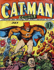
I'm hoping to do a series of these fake pulp covers once I get enough props
together. I'm look at some examples of mastheads that combine the price, issue #
date, and sometimes a headline. ....minus the commie killing theme. haha.
Mike com> wrote:
> > POV rendering of Weird World Cover - take 1. Rendered in 2 passes for composting
> > and art effects in Photoshop. Posterized edges to push this closer to an
> > illustration. Scene file posted.
> > Miller
>
> "Weird World" now, is any magazine or newspaper. All of which are far more
> expensive than 10 cents, and suitable for composting.
>
> This is all looking really good - and a lot less creepy than that Jack in the
> Box.
>
> - BW
Thanks.
yes, less creepy. :)
I'm hoping to do a series of these fake pulp covers once I get enough props
together. I'm look at some examples of mastheads that combine the price, issue #
date, and sometimes a headline. ....minus the commie killing theme. haha.
Mike
Post a reply to this message
Attachments:
Download 'cat-man.jpg' (361 KB)
Preview of image 'cat-man.jpg'

|


![]()