> Nor me. Very interesting.
> But maybe that is why I use multiple media.
See the link in my previous post: it is documented and it does make sense :)
> Not to my eye. ;)
> If you look at them using the df3 viewer Ooswa*. They are distinctly
> different.
Oh that's really nice of you showing the Ooswa renders (I did not install it
because of lack of time). These files are actually different because I applied
a color map (from Python's matplotlib [afmhot]) before I exported them. Of
course the color map is not uniform in R, G and B (this would only be true
for a gray scale, right?).
> Great image BTW
>
Thank you very much :) May I post the final render and code somehow in the end?
(Maybe with reduced resolution due to the 5MB limit? Or do you collect large
renders somewhere?)
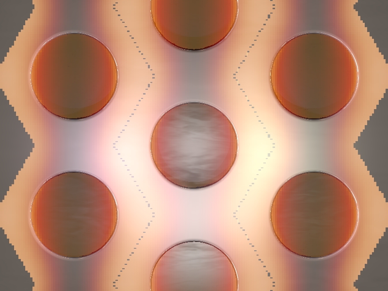
Another point: the artifacts at the field unit cell borders are a bit
annoying... The staircasing of the data at the tilted border of the hexagonal
cell may be unavoidable in the end... See the attached render for a clear
view of the problem. Is their any trick to "glue" the df3-data at these sides,
so that no doubled or missing values arise? (What does the `sampling` statement
in the related media sections do? Could higher values fix this? What about the
interpolation? It is turned off in the attached image. A value of 1 (linear)
gives better results than 2 and 3!)
Post a reply to this message
Attachments:
Download 'phc_and_excitation_enhancement.png' (282 KB)
Preview of image 'phc_and_excitation_enhancement.png'
|