|
 |
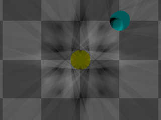
Another. This has two 4X6 area lights, both with area_illumination and circular.
One light uses +3 for color, other -3 and rotated around same plane so they sort
of mesh together. Reason for the positive and negative "colors" is to display
the pattern better.
As you can see, they have differing shadow patterns due to not being truly
circular as was already mentioned. Or evenly spaced, however you want to
describe this.
I can only imagine this being of consequence for such close proximity objects,
as seen by the 2 spheres. One at corner where square array would have a point of
light, other in center.
And probably for very large area lights. A lot is going to depend on array
numbers, I'm sure.
I was about to say equally large numbers for points in the array might be better
but, aside from the performance hit render time-wise, considering the unevenness
of spacing maybe that would just enhance the diagonal concentration (heh, if
wasn't "circular". Whatever.) as was shown in those first pictures.
Bob
Post a reply to this message
Attachments:
Download 'area_light-coverage4x6circular2.jpg' (25 KB)
Preview of image 'area_light-coverage4x6circular2.jpg'

|
 |


![]()