|
 |
When trying to model water with media absorption a few years ago, I noticed that
deep water always trended toward the exact hue of the blue phosphor. I
suspected very strongly that this was not just a coincidence.
Further testing with both media absorption and fade_color confirmed my
suspicion. With tricolor rendering, transparent objects with colored interiors
show a bias towards the most prominent primary color. For example, yellow
materials with even a slightly orange fade_color tend strongly towards red, and
materials with a chartreuse or aqua fade_color tend strongly toward phosphor
green.
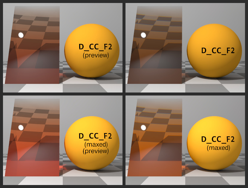
I finally got around to testing how spectral rendering would mitigate this
problem. I used Ive's SpectralRender package, available at lilysoft.org. The
glass objects on the left side of each render are wedge shaped, 2 POV units deep
at the base and zero thickness at the apex. They use variations on the
following material:
__________________________________________________________
pigment { rgbf 1 }
finish
{ reflection { 0 1 fresnel } conserve_energy
specular albedo 0.05 roughness 0.00001
}
interior
{ IOR_Spectral (IOR_Glass_BK7)
fade_power 1001
fade_distance 0.4
fade_color C_Spectral (D_CC_F2)
}
photons { target collect off reflection on refraction on }
__________________________________________________________
The sphere on the right side of each render is pigmented with the same color as
the fade_color of the glass, using finish { diffuse 1 }.
The scene is illuminated with a D65 lamp. The assumed_gamma is set to 1.
The upper left image uses preview mode, which just reverts to regular RGB
rendering. The auburn hue of the glass is noticeably redder than the yellowish
orange of the sphere. The bias is nearly eliminated in the spectrally rendered
image at the upper left.
The bias in the upper left image isn't nearly as strong as in the tests I did
years ago, but more recent testing revealed that the bias is less strong for
fade_colors at less than full strength (that is, fade_colors whose value is less
than 1.0 when converted to HSV). As with most (all?) natural surfaces, there is
no wavelength which is reflected 100% by swatch D_CC_F2. In the bottom row
images, the color was boosted until the maximum channel value was 1.0. For the
lower left preview, the color was scaled such that the HSV value was 1.0.
Essentially, the material is 100% transparent to red (aside from Fresnel effects
at the surface). For the lower right spectral render, wavelength array was
scaled such that the highest array element was 1.0.
The red bias in the lower left image is much stronger.
Post a reply to this message
Attachments:
Download 'primary_unbias-montage.jpg' (104 KB)
Preview of image 'primary_unbias-montage.jpg'
|
|