"Tek" <tek### [at] evilsuperbrain com> wrote:
> Personally I think that looks pretty cool. Nice soft lighting :)
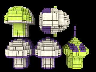
Thanks! This version shows the objects better, but it's not an "action" shot.
These colors aren't authentic but I like them better. The border around the
mushrooms has also been improved. The lighting is all radiosity; without
radiosity the structure of the blocks is lost. I love radiosity!
Regards,
Dave Blandston com> wrote:
> Personally I think that looks pretty cool. Nice soft lighting :)
Thanks! This version shows the objects better, but it's not an "action" shot.
These colors aren't authentic but I like them better. The border around the
mushrooms has also been improved. The lighting is all radiosity; without
radiosity the structure of the blocks is lost. I love radiosity!
Regards,
Dave Blandston
Post a reply to this message
Attachments:
Download 'shrooms.png' (460 KB)
Preview of image 'shrooms.png'

|


![]()