|
 |
....to say the least. :(
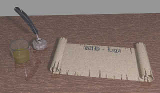
Please, can someone advice me in finding the proper setting for this image.
The content of the glass should be whisky.... But I just cant get the color
right, or the proper "shine-thru". :/
And, besides, my pictures always have like a dull filter. *boo-hoo*
Any hints on what one should remember to avoid this?
This is the setting for the glass. Yep, it's the one from the documentation
atm:
-------------------
// A simple water glass made with a difference:
#declare MyGlass=
difference
{ cone { <0,0,0>,1,<0,5,0>,1.2 }
cone { <0,.1,0>,.9,<0,5.1,0>,1.1 }
material { M_Glass3 }
}
#declare MyGlassWithWater=
union
{ object { MyGlass }
intersection
{ cone { <0,.1,0>,.9,<0,5.1,0>,1.1 }
plane { y,2 }
scale .999
pigment { color rgbft <0.3647,0.2862,0.0156,0.5,0.5> }
normal {ripples 0.5 scale <0.25,0.5,0.25> }
// finish {Phong_Glossy}
}
}
object {MyGlassWithWater scale <5,2,5> translate <-25,-5.4,9> }
-----------
Post a reply to this message
Attachments:
Download 'whligarullraal.jpg' (74 KB)
Preview of image 'whligarullraal.jpg'

|
 |


![]()