|
 |
"stm31415" <sam### [at] cs com> wrote:
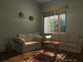
> It is the 'normal on' that is killing your time. Use a faint fill light to
> bring out textures, and turn of normals in radiosity. When I use it, I try
> to make radiosity ground objects with interesting shadows, and softer
> lighting, rather than make the whle lighting of the image. Under the table,
> for instace, I see no progressively darkening shadow on the carpet, which
> would occur in rea life - or even much contrast on the table itself. Are
> all your objects' ambients 0?
> Contrast seems the thing that, to me, this image needs. I find no deep
> darkenss anywhere in this lighting, even under things. I always struggle
> with this, but I think one has to give up some of the detail that took so
> long to get to give the whole composition the right feel.
>
> The modelling is quite nice, by the way. This is looking quite good.
stm31415 , in old scene,"ambient_light rgb 0" I changed all texture's
ambients to zero. And in the global settings, ambient: "ambient_light rgb
1"
It's probably better. com> wrote:
> It is the 'normal on' that is killing your time. Use a faint fill light to
> bring out textures, and turn of normals in radiosity. When I use it, I try
> to make radiosity ground objects with interesting shadows, and softer
> lighting, rather than make the whle lighting of the image. Under the table,
> for instace, I see no progressively darkening shadow on the carpet, which
> would occur in rea life - or even much contrast on the table itself. Are
> all your objects' ambients 0?
> Contrast seems the thing that, to me, this image needs. I find no deep
> darkenss anywhere in this lighting, even under things. I always struggle
> with this, but I think one has to give up some of the detail that took so
> long to get to give the whole composition the right feel.
>
> The modelling is quite nice, by the way. This is looking quite good.
stm31415 , in old scene,"ambient_light rgb 0" I changed all texture's
ambients to zero. And in the global settings, ambient: "ambient_light rgb
1"
It's probably better.
Post a reply to this message
Attachments:
Download 'indoor8.jpg' (279 KB)
Preview of image 'indoor8.jpg'

|
 |


![]()