|
 |
"Stefan Persson" <azy### [at] hotmail com> wrote:
> You are coming along well, I think.
>
> Just some C&C
> Negative:
> * I think the light source looks missplaced. Wouldn't the
> lightsource be above the counter?
>
> * GI? I don't know.. try to soften the shadows first.
>
> * Turn down the reflection in the Stainless steel. I think
> it looks a bit unrealistic high.
>
> *Try adding more light sources, dimmed and with
> shadows off to help illuminate the scene. This is mucho
> faster than GI (Radiosity).
>
> Positive:
> I love the texture of the counter. :)
> In fact, I think except for the reflection mentioned above,
> the textures looks very good.
>
> Looking forward to the next version.
>
> Stefan
Stefan, I was changed lights. ok.
Alain <ele### [at] netscape com> wrote:
> You are coming along well, I think.
>
> Just some C&C
> Negative:
> * I think the light source looks missplaced. Wouldn't the
> lightsource be above the counter?
>
> * GI? I don't know.. try to soften the shadows first.
>
> * Turn down the reflection in the Stainless steel. I think
> it looks a bit unrealistic high.
>
> *Try adding more light sources, dimmed and with
> shadows off to help illuminate the scene. This is mucho
> faster than GI (Radiosity).
>
> Positive:
> I love the texture of the counter. :)
> In fact, I think except for the reflection mentioned above,
> the textures looks very good.
>
> Looking forward to the next version.
>
> Stefan
Stefan, I was changed lights. ok.
Alain <ele### [at] netscape net> wrote:
> Using area_light will increase the realistic aspect by bluring the shadows. Using
adaptive is a
> must, it realy does improve rendering speed. Optimum aray size are 5, 9, 17, 33, 65,
129,... Start
> with adaptive 0 and increase if you get artefacts: light where there sould be none,
shadow where
> there should be light.
> Using more than one light may also help.
> You can try radiosity, just add radiosity{} in the #glabal_settings block to enable
radiosity with
> all default values. You can then try different tweaks, look at the documentation.
>
> --
> Alain
> -------------------------------------------------
> I used to have an open mind but my brains kept falling out.
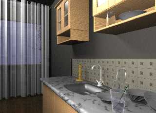
Alain, I used in the new version, one area light and two point light without
shadow. I increased resolution (640x480, Antialias_Threshold=0.1) This
render quality better then previous. I dont use Radiosity, becouse it will
be slowness. This render time : 3h 37 m. I will post two images : The firt
is natural . The second is applied sharpen (image editor). Can we make with
the povray render like second..
Hasan... net> wrote:
> Using area_light will increase the realistic aspect by bluring the shadows. Using
adaptive is a
> must, it realy does improve rendering speed. Optimum aray size are 5, 9, 17, 33, 65,
129,... Start
> with adaptive 0 and increase if you get artefacts: light where there sould be none,
shadow where
> there should be light.
> Using more than one light may also help.
> You can try radiosity, just add radiosity{} in the #glabal_settings block to enable
radiosity with
> all default values. You can then try different tweaks, look at the documentation.
>
> --
> Alain
> -------------------------------------------------
> I used to have an open mind but my brains kept falling out.
Alain, I used in the new version, one area light and two point light without
shadow. I increased resolution (640x480, Antialias_Threshold=0.1) This
render quality better then previous. I dont use Radiosity, becouse it will
be slowness. This render time : 3h 37 m. I will post two images : The firt
is natural . The second is applied sharpen (image editor). Can we make with
the povray render like second..
Hasan...
Post a reply to this message
Attachments:
Download 'kitchen3.jpg' (218 KB)
Preview of image 'kitchen3.jpg'

|
 |


![]()