|
 |
"Lonnie" <lon### [at] yahoo com> wrote:
> 56 hour render time on this, 46 minutes just for the photon map - a record.
> I used a saved photon map from a much smaller test render. It's hard to
> experiment when the render speed drops under 1 PPS.
I think a few us here can relate to that, Lonnie. :)
> My biggest mistake was not
> setting the finish of the background/foreground to ambient 0 and letting
> the sky sphere light it, which, combined with the media, led to a washed
> out appearance.
Nonzero ambient backgrounds with radiosity are generally a no-no for that
reason, but I like the mood it creates in this image.
>The projected caustics were a suprise at this resolution.
> In small test renders they looked quite soft, not at all like the hot-spots
> you see here.
They look nice, though. The spectra look fairly smooth. How many levels of
dispersion are you using? I think the disc of tiny bright points near the
centre of the Arkenstone's shadow is an area lights artefact/bug.
>I hand bounded the sphere with a sphere the same size the
> visible one was cut from, but did so after I had applied the texture, which
> may have hurt rather than helped the render time.
I generally apply bounding to untextured shapes (because the bounding object
must be untextured anyway), but I don't think doing it your way will affect
rendering speed at all.
>Also, I neglected to enable media in radiosity.
This would give lovely coloured beams through the media, but it will also
slow things down even more.
> Radiosity has so many contols to tweak I am beginning to believe I should
> start with it first, and get the scene to look right before adding media
> and photons.
I'm pretty much a novice with media, so I'll keep quiet on that aspect, but
I agree that it's best to get radiosity looking approximately right before
adding photons, since using radiosity generally affects the overall
lighting of a scene more than using photons does.
> I'm planning to use this as the center sphere of an armillary I am
> designing. Comments?
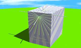
It should look brilliant! Have you done any other sundials? A few months
back I modified the sundial example scene to work for both Hemispheres, and
added a little bit of decoration as well as East & West dial faces.
Sundial renderings need very high antialias to get smooth, accurate shadows.
The scene below is intended to be accurate, but not photorealistic by any
stretch of the imagination. :) com> wrote:
> 56 hour render time on this, 46 minutes just for the photon map - a record.
> I used a saved photon map from a much smaller test render. It's hard to
> experiment when the render speed drops under 1 PPS.
I think a few us here can relate to that, Lonnie. :)
> My biggest mistake was not
> setting the finish of the background/foreground to ambient 0 and letting
> the sky sphere light it, which, combined with the media, led to a washed
> out appearance.
Nonzero ambient backgrounds with radiosity are generally a no-no for that
reason, but I like the mood it creates in this image.
>The projected caustics were a suprise at this resolution.
> In small test renders they looked quite soft, not at all like the hot-spots
> you see here.
They look nice, though. The spectra look fairly smooth. How many levels of
dispersion are you using? I think the disc of tiny bright points near the
centre of the Arkenstone's shadow is an area lights artefact/bug.
>I hand bounded the sphere with a sphere the same size the
> visible one was cut from, but did so after I had applied the texture, which
> may have hurt rather than helped the render time.
I generally apply bounding to untextured shapes (because the bounding object
must be untextured anyway), but I don't think doing it your way will affect
rendering speed at all.
>Also, I neglected to enable media in radiosity.
This would give lovely coloured beams through the media, but it will also
slow things down even more.
> Radiosity has so many contols to tweak I am beginning to believe I should
> start with it first, and get the scene to look right before adding media
> and photons.
I'm pretty much a novice with media, so I'll keep quiet on that aspect, but
I agree that it's best to get radiosity looking approximately right before
adding photons, since using radiosity generally affects the overall
lighting of a scene more than using photons does.
> I'm planning to use this as the center sphere of an armillary I am
> designing. Comments?
It should look brilliant! Have you done any other sundials? A few months
back I modified the sundial example scene to work for both Hemispheres, and
added a little bit of decoration as well as East & West dial faces.
Sundial renderings need very high antialias to get smooth, accurate shadows.
The scene below is intended to be accurate, but not photorealistic by any
stretch of the imagination. :)
Post a reply to this message
Attachments:
Download 'sundialf1.jpg' (97 KB)
Preview of image 'sundialf1.jpg'

|
 |


![]()