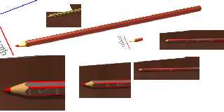
I'm using the pregiven resolutions and AA. (0.3)
The background shouldn't be the reason. It's a high contrast, but there are
too much stairs at the _edges_.
The texture itself does what it should (mathematically).
I have added a collection. The edges aren't nice.
Greetings
Dieter
(There is some unimportant reflection at some red pens.)
"Slime" <fak### [at] email address> wrote:
> > I do attach a small picture which shows what I mean.
> > The edges are really bad at the pen's main part. (On the right in the
> > picture:)
>
> It looks about right to me. Because of your texture_map, not all of the side
> of the pencil is fully red, but the "corners" of the side *are* fully red
> because they're farther out (beyond the 0.94 area). Since the "corners" are
> at the top and bottom of the pencil in the image, the bright redness may be
> the reason you're not happy with the result.
>
> What quality of AA'ing are you using? (What are your command line settings?)
> You could up the sample count of AA'ed pixels with +R4 to see if that helps.
>
> Finally, what's the source code for the plane or background beneath the
> objects?
>
> - Slime
> [ http://www.slimeland.com/ ] address> wrote:
> > I do attach a small picture which shows what I mean.
> > The edges are really bad at the pen's main part. (On the right in the
> > picture:)
>
> It looks about right to me. Because of your texture_map, not all of the side
> of the pencil is fully red, but the "corners" of the side *are* fully red
> because they're farther out (beyond the 0.94 area). Since the "corners" are
> at the top and bottom of the pencil in the image, the bright redness may be
> the reason you're not happy with the result.
>
> What quality of AA'ing are you using? (What are your command line settings?)
> You could up the sample count of AA'ed pixels with +R4 to see if that helps.
>
> Finally, what's the source code for the plane or background beneath the
> objects?
>
> - Slime
> [ http://www.slimeland.com/ ]
Post a reply to this message
Attachments:
Download 'pensc.jpg' (52 KB)
Preview of image 'pensc.jpg'

|


![]()