|
|
|
|
|
|
| |
| |
|
|
|
|
| |
| |
|
|
On 9/28/2010 6:57 AM, Invisible wrote:
> OK, here's a great one:
>
> Does anybody know how to make it so that images show up normal size on a
> web page, but shrink to fit the paper when the page is printed out?
>
> (Yes, I realise that printing a web page is 92% guaranteed to fail in
> all possible cases...)
>
Google CSS Media. That should at least get you started.
--
~Mike
Post a reply to this message
|
|
| |
| |
|
|
|
|
| |
| |
|
|
On 28/09/2010 01:23 PM, Mike Raiford wrote:
> Google CSS Media. That should at least get you started.
OK, so adding
@media print
{
img {max-width: 100%;}
}
causes all images to be scaled to fit the width of the paper.
Unfortunately the image height remains completely unchanged, wildly
distorting the image aspect ratio. (!)
You'd think there would be an option for "preserve aspect ratio", but as
far as I can tell, there isn't...
Post a reply to this message
|
|
| |
| |
|
|
|
|
| |
| |
|
|
Le 28/09/2010 15:55, Invisible a écrit :
> On 28/09/2010 01:23 PM, Mike Raiford wrote:
>
>> Google CSS Media. That should at least get you started.
>
> OK, so adding
>
> @media print
> {
> img {max-width: 100%;}
> }
>
> causes all images to be scaled to fit the width of the paper.
> Unfortunately the image height remains completely unchanged, wildly
> distorting the image aspect ratio. (!)
>
> You'd think there would be an option for "preserve aspect ratio", but as
> far as I can tell, there isn't...
I get a pleasant result (at least in preview from Firefow) with
img {max-width: 17cm; max-height: 24cm; background: white ;color:#000; }
inside a <link rel="stylesheet" href="../style/print.css"
type="text/css" media="print" />
Beware of transparent images, background is a good idea!
You might want to take care of page-break after title:
h1 { page-break-after:avoid}
h2 { page-break-after:avoid}
h3 { page-break-after:avoid}
h4 { page-break-after:avoid}
/* up to your usual depth */
At least it try to give some clue to the paging engine.
As well as printing the actual URL of link (because on paper, a printed
visual of link is useless):
a:link:after, a:visited:after{ content: " (" attr(href) ") ";
font-size: 90% }
--
A: Because it messes up the order in which people normally read text.<br/>
Q: Why is it such a bad thing?<br/>
A: Top-posting.<br/>
Q: What is the most annoying thing on usenet and in e-mail?
Post a reply to this message
|
|
| |
| |
|
|
|
|
| |
| |
|
|
>> OK, so adding
>>
>> @media print
>> {
>> img {max-width: 100%;}
>> }
>>
>> causes all images to be scaled to fit the width of the paper.
>> Unfortunately the image height remains completely unchanged, wildly
>> distorting the image aspect ratio. (!)
>
> I get a pleasant result (at least in preview from Firefow) with
> img {max-width: 17cm; max-height: 24cm; background: white ;color:#000; }
This requires you to know what the dimensions of the paper are, and what
the correct aspect ratio of every image is. I'd prefer it if there were
some way to have the browser scale images in proportion, but I'm not
seeing any way of doing that.
> You might want to take care of page-break after title:
> h1 { page-break-after:avoid}
> h2 { page-break-after:avoid}
>
> At least it try to give some clue to the paging engine.
Isn't that part of the default CSS rules anyway? Certainly the
pagination looks fairly plausible right now.
> As well as printing the actual URL of link (because on paper, a printed
> visual of link is useless):
>
> a:link:after, a:visited:after{ content: " (" attr(href) ") ";
> font-size: 90% }
That's true - not that the correct document I'm working on contains any
links...
Post a reply to this message
|
|
| |
| |
|
|
|
|
| |
| |
|
|
nemesis wrote:
> Invisible escreveu:
>> On 22/09/2010 06:04 PM, nemesis wrote:
>>
>>> document.write is not part of DOM:
>>
>> I know that.
>>
>>> you can see it simply writes new
>>> content to the page, doesn't work by manipulating trees and nodes as in
>>> DOM. It's a relic from pre-standardized Netscape days..., like the blink
>>> tag... :p
>>
>> Well, that's very nice, but as far as I can see, there's no equivalent
>> way of doing what document.write does.
>
> what? like:
Maybe like outputting mismatched tags to the browser? What's the equivalent of
document.write("<table>")
?
--
Darren New, San Diego CA, USA (PST)
Quoth the raven:
Need S'Mores!
Post a reply to this message
|
|
| |
| |
|
|
|
|
| |
| |
|
|
Le 28/09/2010 16:44, Invisible a écrit :
>>> OK, so adding
>>>
>>> @media print
>>> {
>>> img {max-width: 100%;}
>>> }
>>>
>>> causes all images to be scaled to fit the width of the paper.
>>> Unfortunately the image height remains completely unchanged, wildly
>>> distorting the image aspect ratio. (!)
>>
>> I get a pleasant result (at least in preview from Firefow) with
>> img {max-width: 17cm; max-height: 24cm; background: white ;color:#000; }
>
> This requires you to know what the dimensions of the paper are, and what
> the correct aspect ratio of every image is.
Yes and No.
Notice we set max-*, not width & height... so the max-* does not define
any ratio: in firefox preview, at worst one of the max is inforced (and
the other dimension remains lower) if the number of pixel reach the
dimension... If the picture is smaller, it is not expanded.
(Problem: we do not have access to the DPI either!)
the problem with "100%" is that it is relative to the container... an
absolute size would be better: I used "cm" but you can search for some
units more appropriate (hint: CSS3 vm/vh/vW ?) (viewport...)
--
A: Because it messes up the order in which people normally read text.<br/>
Q: Why is it such a bad thing?<br/>
A: Top-posting.<br/>
Q: What is the most annoying thing on usenet and in e-mail?
Post a reply to this message
|
|
| |
| |
|
|
|
|
| |
| |
|
|
>>> I get a pleasant result (at least in preview from Firefow) with
>>> img {max-width: 17cm; max-height: 24cm; background: white ;color:#000; }
>>
>> This requires you to know what the dimensions of the paper are, and what
>> the correct aspect ratio of every image is.
>
> Yes and No.
> Notice we set max-*, not width& height... so the max-* does not define
> any ratio: in firefox preview, at worst one of the max is inforced (and
> the other dimension remains lower) if the number of pixel reach the
> dimension... If the picture is smaller, it is not expanded.
> (Problem: we do not have access to the DPI either!)
Yes. And I had *hoped* that by setting only the maximum width, Firefox
would figure out that the height should be similarly adjusted. But no...
> the problem with "100%" is that it is relative to the container... an
> absolute size would be better: I used "cm" but you can search for some
> units more appropriate (hint: CSS3 vm/vh/vW ?) (viewport...)
Yes. And if the container is the entire page, it means that the image
ends up the exact right size for whatever size of paper you happen to be
using (which I cannot know ahead of time).
Post a reply to this message
|
|
| |
| |
|
|
|
|
| |
| |
|
|
And lo On Tue, 28 Sep 2010 14:55:18 +0100, Invisible <voi### [at] dev null> did
spake thusly:
> On 28/09/2010 01:23 PM, Mike Raiford wrote:
>
>> Google CSS Media. That should at least get you started.
>
> OK, so adding
>
> @media print
> {
> img {max-width: 100%;}
> }
>
> causes all images to be scaled to fit the width of the paper.
> Unfortunately the image height remains completely unchanged, wildly
> distorting the image aspect ratio. (!)
>
> You'd think there would be an option for "preserve aspect ratio", but as
> far as I can tell, there isn't...
Not sure what you're trying to do as
img {width: 20%;}
@media print {img {width: 100%;}}
Takes a 50% screen width image and fills the width of my print preview up
whilst retaining the proportions of the height. Modifying the print style
width adjusts to the page and the height shifts accordingly. This works in
Firefox, Opera, and hey Chrome doesn't have a preview... nope that printed
out fine.
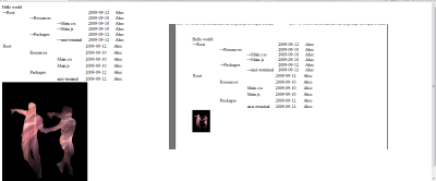
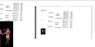
The attachment is for a width of 20% and 10% respectively.
--
Phil Cook
--
I once tried to be apathetic, but I just couldn't be bothered
http://flipc.blogspot.com null> did
spake thusly:
> On 28/09/2010 01:23 PM, Mike Raiford wrote:
>
>> Google CSS Media. That should at least get you started.
>
> OK, so adding
>
> @media print
> {
> img {max-width: 100%;}
> }
>
> causes all images to be scaled to fit the width of the paper.
> Unfortunately the image height remains completely unchanged, wildly
> distorting the image aspect ratio. (!)
>
> You'd think there would be an option for "preserve aspect ratio", but as
> far as I can tell, there isn't...
Not sure what you're trying to do as
img {width: 20%;}
@media print {img {width: 100%;}}
Takes a 50% screen width image and fills the width of my print preview up
whilst retaining the proportions of the height. Modifying the print style
width adjusts to the page and the height shifts accordingly. This works in
Firefox, Opera, and hey Chrome doesn't have a preview... nope that printed
out fine.
The attachment is for a width of 20% and 10% respectively.
--
Phil Cook
--
I once tried to be apathetic, but I just couldn't be bothered
http://flipc.blogspot.com
Post a reply to this message
Attachments:
Download 'printwidth.png' (19 KB)
Preview of image 'printwidth.png'
|
|
| |
| |
|
|
|
|
| |
