 |
 |
|
 |
|
 |
|  |
|  |
|
 |
|
 |
|  |
|  |
|
 |
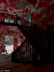
Getting nearer a final render. A large one to be able to assess the details.
Output render in exr format; postprocessed in IC for luminosity balance;
this copy as jpg.
Now as Cathy's World #13.
Thomas
Post a reply to this message
Attachments:
Download 'urbex_12.jpg' (487 KB)
Preview of image 'urbex_12.jpg'

|
 |
|  |
|  |
|
 |
|
 |
|  |
|  |
|
 |
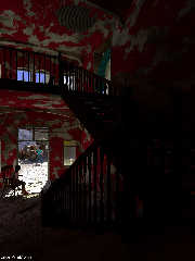
What do you think? This is a jpg copy of the original exr render,
without post-processing. Somehow, I prefer this although it is a bit too
dark.
Thomas
Post a reply to this message
Attachments:
Download 'urbex_12.jpg' (314 KB)
Preview of image 'urbex_12.jpg'

|
 |
|  |
|  |
|
 |
|
 |
|  |
|  |
|
 |
Am 08.08.2014 16:10, schrieb Thomas de Groot:
> What do you think? This is a jpg copy of the original exr render,
> without post-processing. Somehow, I prefer this although it is a bit too
> dark.
I prefer this one, too. I love images that play with light & darkness.
Post a reply to this message
|
 |
|  |
|  |
|
 |
|
 |
|  |
|  |
|
 |
Le 14-08-08 10:10, Thomas de Groot a écrit :
> What do you think? This is a jpg copy of the original exr render,
> without post-processing. Somehow, I prefer this although it is a bit too
> dark.
>
> Thomas
The very dark areas make the bright areas look brighter and beter, even
if I need to push the brightness of my monitor to the max. I think that
it beter show the often oppresive feeling you may have in this kind of
settin.
Post a reply to this message
|
 |
|  |
|  |
|
 |
|
 |
|  |
|  |
|
 |
On 8-8-2014 16:26, clipka wrote:
> Am 08.08.2014 16:10, schrieb Thomas de Groot:
>> What do you think? This is a jpg copy of the original exr render,
>> without post-processing. Somehow, I prefer this although it is a bit too
>> dark.
>
> I prefer this one, too. I love images that play with light & darkness.
>
Yes, me too. Additionally, the post processing flattens out the colour
contrast. I shall play a bit more with that last aspect but just as an
experiment not towards a 'final' image.
Thomas
Post a reply to this message
|
 |
|  |
|  |
|
 |
|
 |
|  |
|  |
|
 |
On 9-8-2014 1:38, Alain wrote:
> Le 14-08-08 10:10, Thomas de Groot a écrit :
>> What do you think? This is a jpg copy of the original exr render,
>> without post-processing. Somehow, I prefer this although it is a bit too
>> dark.
>>
>> Thomas
>
> The very dark areas make the bright areas look brighter and beter, even
> if I need to push the brightness of my monitor to the max. I think that
> it beter show the often oppresive feeling you may have in this kind of
> settin.
Yes, I agree.
Thomas
Post a reply to this message
|
 |
|  |
|  |
|
 |
|
 |
|  |
|  |
|
 |
On 09/08/2014 08:09, Thomas de Groot wrote:
> On 8-8-2014 16:26, clipka wrote:
>> Am 08.08.2014 16:10, schrieb Thomas de Groot:
>>> What do you think? This is a jpg copy of the original exr render,
>>> without post-processing. Somehow, I prefer this although it is a bit too
>>> dark.
>>
>> I prefer this one, too. I love images that play with light & darkness.
>>
>
> Yes, me too. Additionally, the post processing flattens out the colour
> contrast. I shall play a bit more with that last aspect but just as an
> experiment not towards a 'final' image.
>
I would be tempted to use a fill light on the stairs just to bring out
some detail. I would not know how to do that with radiosity. Would using
a diffuse reflective object do it. The way that photographers would use
a white sheet in RL?
--
Regards
Stephen
Post a reply to this message
|
 |
|  |
|  |
|
 |
|
 |
|  |
|  |
|
 |
On 9-8-2014 10:40, Stephen wrote:
> I would be tempted to use a fill light on the stairs just to bring out
> some detail. I would not know how to do that with radiosity. Would using
> a diffuse reflective object do it. The way that photographers would use
> a white sheet in RL?
>
During testing I have used a shadowless light over the stairs. I am
thinking about a couple of things: a diffuse reflective screen is one
but may be too 'diffuse' to be effective; a skylight high in the wall
above the stairs is another. I am not too willing to use a direct light,
even an area one, as that would be counter to the state of the building ;-)
Thomas
Post a reply to this message
|
 |
|  |
|  |
|
 |
|
 |
|  |
|  |
|
 |
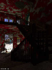
I believe I have a nice compromise now. I added a screen, simulating a
skylight in the upper wall of the staircase. With a bit of emission.
Thomas
Post a reply to this message
Attachments:
Download 'urbex_final3.jpg' (336 KB)
Preview of image 'urbex_final3.jpg'

|
 |
|  |
|  |
|
 |
|
 |
|  |
|  |
|
 |
On 8/8/2014 7:10 AM, Thomas de Groot wrote:
> What do you think? This is a jpg copy of the original exr render,
> without post-processing. Somehow, I prefer this although it is a bit too
> dark.
>
> Thomas
Hmm. Haven't commented on this prior, but.. the walls are too
artificial. While its a good look, walls don't peel quite like that,
which I think if the problem. There would be color differences in the
paint itself, lighted in "protected" spots, and discolored in others.
Their might be bleed through of texture from individual panels (if wall
board), or other materials, where the same disruptions that peeled the
paint has warped the underlying material. Also, more protected areas may
be less patchy, due to be less exposed to the conditions that caused the
peel, and others might have much bigger patches missing, due to being
more exposed to the same.
It doesn't "look" uniform, but... its too obviously algorithmic. Too
"cleanly" non-uniformly damaged. If you get what I mean.
Its one of the things that bugs me about this stuff, and why I never
dove that far into it over the years, instead of just once in a while.
POVRay textures are good, when you can't see, in the scale, the
repetitiveness of them, but not so good in scenes like this, but.. on
the other hand, I suck even more at "painting" believable details, using
a static, non-generated texture. lol
--
Commander Vimes: "You take a bunch of people who don't seem any
different from you and me, but when you add them all together you get
this sort of huge raving maniac with national borders and an anthem."
Post a reply to this message
|
 |
|  |
|  |
|
 |
|
 |
|  |


![]()