 |
 |
|
 |
|
 |
|  |
|  |
|
 |
|
 |
|  |
|  |
|
 |
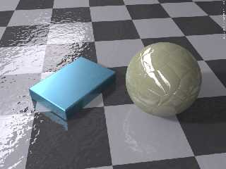
This was just a quick test of the blurred reflection texture which Nemesis
posted a little bit ago.
I was interested in a) how subtle I could make it, and b) how it looked with
HDR lighting.
Thanks to Nemesis for the idea and to Jaime Vives Piqueres from whom I stole
the sphere texture.
Post a reply to this message
Attachments:
Download 'nemesis_blur_test.png' (592 KB)
Preview of image 'nemesis_blur_test.png'

|
 |
|  |
|  |
|
 |
|
 |
|  |
|  |
|
 |
hmm? i take it the blurred reflection is on the blue box? The effect is
barely visible, perhaps because the box is so short. I wonder how would
the ball look with it... :) hey, you know with some code tweaking you can
apply JVP's texture to the averaged blurred texture as well, so it's a
composed texture. Should look nice. It's nice right now.
but, is that megapov?! doesn't it come with blurred reflections anyway?
Post a reply to this message
|
 |
|  |
|  |
|
 |
|
 |
|  |
|  |
|
 |
"nemesis" <nam### [at] gmail com> wrote:
> hmm? i take it the blurred reflection is on the blue box? The effect is
> barely visible, perhaps because the box is so short.
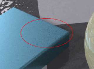
Yeah, it is barely visible. I just wanted to see how it would look as a very
subtle effect - not as the main course. I also wanted to see how it would
react to HDR lighting, which is why the main surface is on the top. I see
something that may be artifacting on the top right corner of the box, but
that might just be a reflection from a dark portion of the hdr map.
>I wonder how would the ball look with it... :) hey, you know with some code
>tweaking you can apply JVP's texture to
the averaged blurred texture as well, so >it's a composed texture. Should look nice.
It's nice right now.
>
> but, is that megapov?! doesn't it come with blurred reflections anyway?
Yes, MPov comes with blurred reflections, but I wanted to see how your
texture looks.
I think that it looks quite nice. I did some other tests where the blurring
was far more evident and it holds up well. com> wrote:
> hmm? i take it the blurred reflection is on the blue box? The effect is
> barely visible, perhaps because the box is so short.
Yeah, it is barely visible. I just wanted to see how it would look as a very
subtle effect - not as the main course. I also wanted to see how it would
react to HDR lighting, which is why the main surface is on the top. I see
something that may be artifacting on the top right corner of the box, but
that might just be a reflection from a dark portion of the hdr map.
>I wonder how would the ball look with it... :) hey, you know with some code
>tweaking you can apply JVP's texture to
the averaged blurred texture as well, so >it's a composed texture. Should look nice.
It's nice right now.
>
> but, is that megapov?! doesn't it come with blurred reflections anyway?
Yes, MPov comes with blurred reflections, but I wanted to see how your
texture looks.
I think that it looks quite nice. I did some other tests where the blurring
was far more evident and it holds up well.
Post a reply to this message
Attachments:
Download 'blur_artifact.png' (72 KB)
Preview of image 'blur_artifact.png'

|
 |
|  |
|  |
|
 |
|
 |
|  |
|  |
|
 |
"Billy R." <nomail@nomail> wrote:
> I see
> something that may be artifacting on the top right corner of the box, but
> that might just be a reflection from a dark portion of the hdr map.
I don't believe those artifacts will go away even with very strong
supersampling method 2 antialiasing... you can always try in a super big
resolution and heavy AA, though :P
> I think that it looks quite nice. I did some other tests where the blurring
> was far more evident and it holds up well.
hmm, glad to know. :)
Post a reply to this message
|
 |
|  |
|  |
|
 |
From: Sven Littkowski
Subject: Re: Blurred Metal Reflection Test - ala Nemesis
Date: 24 Nov 2006 16:43:50
Message: <45676796@news.povray.org>
|
|
 |
|  |
|  |
|
 |
Nice try, Billy Boy!
The only thing I would suggest to change, is the reflection itself. At the
current version, it looks like the underground is one big part only printed
in different colors - the reflection continues from tile to tile.
But if these are supposed to be real tiles, the bumpy reflection should have
its own pattern for each tile. Means, you do not create a checker ground and
add that nice bumpy surface, but you create many flat boxes besides each
other each with its bumpy reflection. Important is, that the individual
bumpy reflections stop at the borders of each tile, and continue in a
different manner with the next tile.
Hmm, my English is not so good, sorry. Did you get what i wanted to express?
I like your scene, go on with it!
Greetings,
Sven
Post a reply to this message
|
 |
|  |
|  |
|
 |
|
 |
|  |
|  |
|
 |
"Sven Littkowski" <sven [] jamaica-focus [] com> wrote:
> Nice try, Billy Boy!
>
> The only thing I would suggest to change, is the reflection itself. At the
> current version, it looks like the underground is one big part only printed
> in different colors - the reflection continues from tile to tile.
>
> But if these are supposed to be real tiles, the bumpy reflection should have
> its own pattern for each tile. Means, you do not create a checker ground and
> add that nice bumpy surface, but you create many flat boxes besides each
> other each with its bumpy reflection. Important is, that the individual
> bumpy reflections stop at the borders of each tile, and continue in a
> different manner with the next tile.
If a surface normal is sufficient for his purposes, then a matrix of boxes
is unnecessary. Discontinuous bump patterns can be effected with a 4-part
tiled texture, which can be built up with checker and gradient. As long as
no adjacent tiles carry the same sub-texture, the continuity won't be
evident.
Post a reply to this message
|
 |
|  |
|  |
|
 |
|
 |
|  |


![]()