 |
 |
|
 |
|
 |
|  |
|  |
|
 |
|
 |
|  |
|  |
|
 |
Yup.. as seen b4, with a few more details added!
New skies, better moon, bit more buildings..
And(!) ...being the new user that I am, I just realized that AA0.3 in NO way
is the limit for anti-aliasing.. hehehe.. =) So the image is also a bit
smoother.. (too smooth?)
Anywayz..
Please post ur comments / questions / sugegstions / etc...
//RH
------------------
What kinda noise annoys an oyster?
A noisy noise annoys an oyster!
Post a reply to this message
Attachments:
Download 'castlevania.jpg' (305 KB)
Preview of image 'castlevania.jpg'

|
 |
|  |
|  |
|
 |
|
 |
|  |
|  |
|
 |
My only suggestion so far is that I'd like
to see more contrast. Specially on the
castle. More dramatic.. more dark corners..
more spooky.. :)
Stefan
"RusHHouR" <gee### [at] mail nu> skrev i meddelandet
news:web.435a7eee3a9749d147d3ae5e0@news.povray.org...
> Yup.. as seen b4, with a few more details added!
> New skies, better moon, bit more buildings..
>
> And(!) ...being the new user that I am, I just realized that AA0.3 in NO
> way
> is the limit for anti-aliasing.. hehehe.. =) So the image is also a bit
> smoother.. (too smooth?)
>
> Anywayz..
>
> Please post ur comments / questions / sugegstions / etc...
>
> //RH
>
> ------------------
> What kinda noise annoys an oyster?
> A noisy noise annoys an oyster!
>
-------------------------------------------------------------------------------- nu> skrev i meddelandet
news:web.435a7eee3a9749d147d3ae5e0@news.povray.org...
> Yup.. as seen b4, with a few more details added!
> New skies, better moon, bit more buildings..
>
> And(!) ...being the new user that I am, I just realized that AA0.3 in NO
> way
> is the limit for anti-aliasing.. hehehe.. =) So the image is also a bit
> smoother.. (too smooth?)
>
> Anywayz..
>
> Please post ur comments / questions / sugegstions / etc...
>
> //RH
>
> ------------------
> What kinda noise annoys an oyster?
> A noisy noise annoys an oyster!
>
--------------------------------------------------------------------------------
Post a reply to this message
|
 |
|  |
|  |
|
 |
|
 |
|  |
|  |
|
 |
"Stefan Persson" <azy### [at] hotmail com> wrote:
> My only suggestion so far is that I'd like
> to see more contrast. Specially on the
> castle. More dramatic.. more dark corners..
> more spooky.. :)
>
> Stefan
>
I agree!
And..
....is there any way you can recommend on doing just that?
//Heja Sverige! com> wrote:
> My only suggestion so far is that I'd like
> to see more contrast. Specially on the
> castle. More dramatic.. more dark corners..
> more spooky.. :)
>
> Stefan
>
I agree!
And..
....is there any way you can recommend on doing just that?
//Heja Sverige!
Post a reply to this message
|
 |
|  |
|  |
|
 |
|
 |
|  |
|  |
|
 |
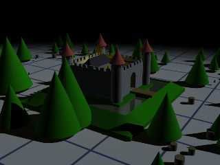
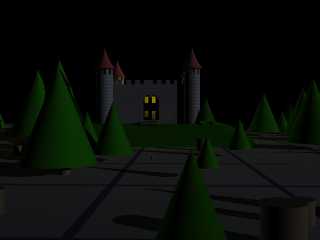
Well.... I tried out one little scene..
I was thinking:
1 parallell light for main lightning
1 faint fill light to ease up the shadows just a bit
The first main light is slightly dimmed. I guess that depends on
the conditions you want if you want that or not.
The fill light has approx half the strength of the main light.
Both of them has a slight blue tint to them.
And.. if it was me.. I would postprocess it a bit too
with bringing up the contrast in *place your favourite
pixel pushing program here*. :)
In the second image I moved the lights a bit
to keep the shadows. Both of them are just quick and dirty.
Hmm.. I think there's a Draculas Castle contest going on
on CGTalk.com. Perhaps you can get som inspiration there?
"RusHHouR" <gee### [at] mail nu> skrev i meddelandet
news:web.435ccee3f8a6eddf47d3ae5e0@news.povray.org...
> "Stefan Persson" <azy### [at] hotmail nu> skrev i meddelandet
news:web.435ccee3f8a6eddf47d3ae5e0@news.povray.org...
> "Stefan Persson" <azy### [at] hotmail com> wrote:
>> My only suggestion so far is that I'd like
>> to see more contrast. Specially on the
>> castle. More dramatic.. more dark corners..
>> more spooky.. :)
>>
>> Stefan
>>
> I agree!
>
> And..
>
> ....is there any way you can recommend on doing just that?
>
> //Heja Sverige!
>
> com> wrote:
>> My only suggestion so far is that I'd like
>> to see more contrast. Specially on the
>> castle. More dramatic.. more dark corners..
>> more spooky.. :)
>>
>> Stefan
>>
> I agree!
>
> And..
>
> ....is there any way you can recommend on doing just that?
>
> //Heja Sverige!
>
>
Post a reply to this message
Attachments:
Download 'castle_test_1.jpg' (130 KB)
Download 'castle_test_2.jpg' (77 KB)
Preview of image 'castle_test_1.jpg'

Preview of image 'castle_test_2.jpg'

|
 |
|  |
|  |
|
 |
|
 |
|  |
|  |
|
 |
Great! Thanks for the advice!
I'll give it a shot.
And I'll be sure to check CGTalk out.
//RH
Post a reply to this message
|
 |
|  |
|  |
|
 |
|
 |
|  |
|  |
|
 |
"Stefan Persson" <azy### [at] hotmail com> schreef in bericht
news:435c643e$1@news.povray.org...
> My only suggestion so far is that I'd like
> to see more contrast. Specially on the
> castle. More dramatic.. more dark corners..
> more spooky.. :)
>
I agree with Stefan.
What is the finish{ambient} setting of the castle textures? It should be 0
or very, very low. It looks like they are much higher.
Thomas com> schreef in bericht
news:435c643e$1@news.povray.org...
> My only suggestion so far is that I'd like
> to see more contrast. Specially on the
> castle. More dramatic.. more dark corners..
> more spooky.. :)
>
I agree with Stefan.
What is the finish{ambient} setting of the castle textures? It should be 0
or very, very low. It looks like they are much higher.
Thomas
Post a reply to this message
|
 |
|  |
|  |
|
 |
|
 |
|  |
|  |
|
 |
Yup.. have now dimmed light a bit and used parallel light..
Sure is moore spooky this way, than it was before when the castle was
"glowing in the dark" or something.. Also lowered wall texture from 0.1 to
0.001, hehe..
Posting one before pixelpushing and one after pixelpushing.. =)
What buggs me now is the grainy looking front walls.. the texture is
repeating itself, as a result of my laziness... unfortunatly..
Hopefully I'll find the time to correct this and add the last windows.. and
then finalize this one..
Image before pixelpushed:
Post a reply to this message
Attachments:
Download 'castlevania2.jpg' (297 KB)
Preview of image 'castlevania2.jpg'

|
 |
|  |
|  |
|
 |
|
 |
|  |
|  |
|
 |
And...
....image after pixelpushed:
Post a reply to this message
Attachments:
Download 'castlevania1.jpg' (336 KB)
Preview of image 'castlevania1.jpg'

|
 |
|  |
|  |
|
 |
|
 |
|  |


![]()