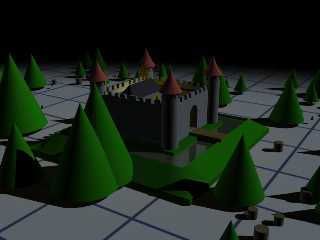
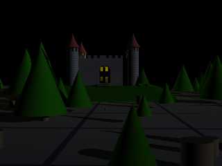
Well.... I tried out one little scene..
I was thinking:
1 parallell light for main lightning
1 faint fill light to ease up the shadows just a bit
The first main light is slightly dimmed. I guess that depends on
the conditions you want if you want that or not.
The fill light has approx half the strength of the main light.
Both of them has a slight blue tint to them.
And.. if it was me.. I would postprocess it a bit too
with bringing up the contrast in *place your favourite
pixel pushing program here*. :)
In the second image I moved the lights a bit
to keep the shadows. Both of them are just quick and dirty.
Hmm.. I think there's a Draculas Castle contest going on
on CGTalk.com. Perhaps you can get som inspiration there?
"RusHHouR" <gee### [at] mail nu> skrev i meddelandet
news:web.435ccee3f8a6eddf47d3ae5e0@news.povray.org...
> "Stefan Persson" <azy### [at] hotmail nu> skrev i meddelandet
news:web.435ccee3f8a6eddf47d3ae5e0@news.povray.org...
> "Stefan Persson" <azy### [at] hotmail com> wrote:
>> My only suggestion so far is that I'd like
>> to see more contrast. Specially on the
>> castle. More dramatic.. more dark corners..
>> more spooky.. :)
>>
>> Stefan
>>
> I agree!
>
> And..
>
> ....is there any way you can recommend on doing just that?
>
> //Heja Sverige!
>
> com> wrote:
>> My only suggestion so far is that I'd like
>> to see more contrast. Specially on the
>> castle. More dramatic.. more dark corners..
>> more spooky.. :)
>>
>> Stefan
>>
> I agree!
>
> And..
>
> ....is there any way you can recommend on doing just that?
>
> //Heja Sverige!
>
>
Post a reply to this message
Attachments:
Download 'castle_test_1.jpg' (130 KB)
Download 'castle_test_2.jpg' (77 KB)
Preview of image 'castle_test_1.jpg'

Preview of image 'castle_test_2.jpg'

|


![]()