 |
 |
|
 |
|
 |
|  |
|  |
|
 |
|
 |
|  |
|  |
|
 |
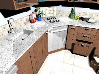
My first working.
Post a reply to this message
Attachments:
Download 'mutfak_2.jpg' (246 KB)
Preview of image 'mutfak_2.jpg'

|
 |
|  |
|  |
|
 |
|
 |
|  |
|  |
|
 |
Hasan3 wrote:
> My first working.
>
>
> ------------------------------------------------------------------------
>
Quite impressive, though I've never heard of a marble sink before.
Also, there's too much reflection in a few places. Specifically, the
door of the oven? I've also never seen a counter that goes over the
stove, the counter would usually be cut to accept it, and there would
have to be a minimum of three inches of air space on all sides. (But
this is my fanatical sense of detail here.) and maybe the floor. I'd
also reccommend taking down the highlights on the counter a little bit.
Finally, the lighting seems a tad harsh,; fact, toning down the light
may take care of the hilighting problem.
Otherwise, it looks great. Much better than anything I could have come
up with the first time.
Regards,
A.D.B.
Post a reply to this message
|
 |
|  |
|  |
|
 |
|
 |
|  |
|  |
|
 |
A nice impressive stage there.:) I think that the sink probably should
be a different texture from the countertop though. Possibly a brushed
aluminum texture.The room also look extemely bright too. It would
probably look great with more indirect lighting + radiosity.Is this
based on a real life kitchen?
If you really want to get carried away, you could add just a bit of
disorder or dirtiness. Maybe a bottle of dishwahing liquid behind the
sink with a sponge and some steel wool? Perhaps also slightly blurring
the reflection on the surface of the range? All in all, it is a very
nice scene. Cheers.
Post a reply to this message
|
 |
|  |
|  |
|
 |
|
 |
|  |
|  |
|
 |
Firstly for a first attempt this is excellent!
The modelling is very good, some of the textures could be a lot better
(especially the marble top, try adding more layers or slightly increasing
the omega/lambda settings for the turbulence). Also try adding some
dirt/smudges to the final layer but you have to keep these subtle. The main
problem I think is the lighting. However, I doubt anyone has used radiosity
in their first image.
Add radiosity and maybe a slightly less white light and this would be a good
100th image.
(Unless by first working you mean WIP in which case you probably know all
the above..:-o)
Post a reply to this message
|
 |
|  |
|  |
|
 |
|
 |
|  |
|  |
|
 |
On Wed, 24 Aug 2005 18:43:50 EDT, "Hasan3" <PRO### [at] Yahoo com> wrote:
>My first working.
When adjusting the gamma a colleague at work said "You mean that's not
a photograph"
Nice one! com> wrote:
>My first working.
When adjusting the gamma a colleague at work said "You mean that's not
a photograph"
Nice one!
Post a reply to this message
|
 |
|  |
|  |
|
 |
|
 |
|  |
|  |
|
 |
>to Anthony D Baye, Halbert, s day, Stephen McAvoy
>Thanks for your suggestions.
I must probably work very much:)
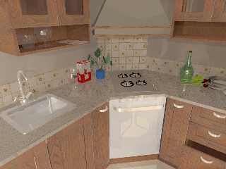
I tested the different Ligt System at following (with radiosity) :
Post a reply to this message
Attachments:
Download 'kitchen3.jpg' (214 KB)
Preview of image 'kitchen3.jpg'

|
 |
|  |
|  |
|
 |
|
 |
|  |
|  |
|
 |
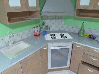
And other test:
Radiosity ranges:
-----------------------------------------------------
//TurkCIZIM POV-RAY Export
global_settings {
assumed_gamma 1
radiosity {
count 50 error_bound 0.9
}
}
Light Sytem :
-----------------------------------------------------
#include "CIE.inc"
#include "lightsys.inc"
#include "lightsys_constants.inc"
#include "espd_lightsys.inc"
#default {finish {ambient 0 diffuse 1}}
// -----------------------------------------------------
CIE_ColorSystemWhitepoint(Beta_ColSys, Blackbody2Whitepoint(Kt_Indoor_Film))
#declare Lightsys_Brightness = 1.0;
object {
Light(
EmissiveSpectrum(ES_Sunlight),
Lm_GE_Inc_100w,
x*25, z*25, 17, 17, on
)
translate <50,231.43803189694,-83>
}
-----------------------------------------------------------------
What can I do for the realistic scene?
Result Image:
Post a reply to this message
Attachments:
Download 'kitchen4.jpg' (222 KB)
Preview of image 'kitchen4.jpg'

|
 |
|  |
|  |
|
 |
|
 |
|  |
|  |
|
 |
Hasan3 wrote:
> And other test:
> Radiosity ranges:
> -----------------------------------------------------
> //TurkCIZIM POV-RAY Export
> global_settings {
> assumed_gamma 1
> radiosity {
> count 50 error_bound 0.9
> }
>
> }
>
>
> Light Sytem :
> -----------------------------------------------------
> #include "CIE.inc"
> #include "lightsys.inc"
> #include "lightsys_constants.inc"
> #include "espd_lightsys.inc"
>
>
> #default {finish {ambient 0 diffuse 1}}
>
> // -----------------------------------------------------
> CIE_ColorSystemWhitepoint(Beta_ColSys, Blackbody2Whitepoint(Kt_Indoor_Film))
>
> #declare Lightsys_Brightness = 1.0;
>
> object {
> Light(
> EmissiveSpectrum(ES_Sunlight),
> Lm_GE_Inc_100w,
> x*25, z*25, 17, 17, on
> )
> translate <50,231.43803189694,-83>
> }
>
> -----------------------------------------------------------------
>
> What can I do for the realistic scene?
> Result Image:
>
>
>
> ------------------------------------------------------------------------
>
This is a great deal better than the original image! Although... Are
you using a blue light source? (I can't say this would have been my
choice.) I like the last version you posted better, though the light
could be a little brighter.
I do like how you put a window in the oven door, but methinks it should
be a little smaller, vertically. That, of course, is a purely aesthetic
decision.
You also might consider multiple light sources. (Under cabinet
flourescent fixtures, etc.)
Keep up the good work.
Regards,
A.D.B.
Post a reply to this message
|
 |
|  |
|  |
|
 |
|
 |
|  |
|  |
|
 |
Anthony D. Baye wrote:
> Hasan3 wrote:
>
>> And other test:
>> Radiosity ranges:
>> -----------------------------------------------------
>> //TurkCIZIM POV-RAY Export
>> global_settings {
>> assumed_gamma 1
>> radiosity {
>> count 50 error_bound 0.9
>> }
>>
>> }
>>
>>
>> Light Sytem :
>> -----------------------------------------------------
>> #include "CIE.inc"
>> #include "lightsys.inc"
>> #include "lightsys_constants.inc"
>> #include "espd_lightsys.inc"
>>
>>
>> #default {finish {ambient 0 diffuse 1}}
>>
>> // -----------------------------------------------------
>> CIE_ColorSystemWhitepoint(Beta_ColSys,
>> Blackbody2Whitepoint(Kt_Indoor_Film))
>>
>> #declare Lightsys_Brightness = 1.0;
>>
>> object {
>> Light(
>> EmissiveSpectrum(ES_Sunlight),
>> Lm_GE_Inc_100w,
>> x*25, z*25, 17, 17, on
>> )
>> translate <50,231.43803189694,-83>
>> }
>>
>> -----------------------------------------------------------------
>>
>> What can I do for the realistic scene?
>> Result Image:
>>
>>
>>
>> ------------------------------------------------------------------------
>>
> This is a great deal better than the original image! Although...
> Are you using a blue light source? (I can't say this would have been my
> choice.) I like the last version you posted better, though the light
> could be a little brighter.
Just realized that my screen was tilted. It actually seems bright
enough. I'd probably still experiment to see how it looked with
multiple light sources though.
A.D.B.
>
> I do like how you put a window in the oven door, but methinks it
> should be a little smaller, vertically. That, of course, is a purely
> aesthetic decision.
>
> You also might consider multiple light sources. (Under cabinet
> flourescent fixtures, etc.)
>
> Keep up the good work.
>
> Regards,
>
> A.D.B.
Post a reply to this message
|
 |
|  |
|  |
|
 |
|
 |
|  |
|  |
|
 |
Hasan3 nous apporta ses lumieres en ce 2005-08-25 19:27:
Those two are a quantum leap from the original! LOT beter.
Alain
Post a reply to this message
|
 |
|  |
|  |
|
 |
|
 |
|  |


![]()