|
 |
While working on my next scene something wasn't behaving in the way I
expected, big suprise.
So as I try and do, I isolated out in a separate file those components I
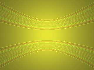
wanted to test and started fiddling. Things started to look odd, damn
followed by ooo!
Then looking at the code I thought: "There's not much there I wonder if I
can make this shorter". So the result is as attached.
Now can anyone guess how I did this with 252 characters and no textures,
non-default finishes or normals just pigments, objects and lights :)
To be honest I'm still working out why it does this, I just thought it
looked funky. On the plus side I've found out in better detail how some
objects work
--
Phil Cook
--
All thoughts and comments are my own unless otherwise stated and I am
happy to be proven wrong.
Post a reply to this message
Attachments:
Download 'mytest.jpg' (52 KB)
Preview of image 'mytest.jpg'

|
 |
|
 |
On Fri, 30 Apr 2004 14:20:09 +0100, Phil Cook
<phi### [at] nospamdeckingdeals co co uk> wrote:
#macro S(P,T)light_source{y*0.99 rgb 0.2}sphere{0,2 pigment{P filter 1
transmit 0.6}translate y*0.1*T no_image}#end#declare
U=union{S(rgb<1,1,0>,4)S(blue 1,3)S(green 1,2)S(red 1,1)translate
z*10}object{U}object{U scale y*-1}plane{-z,-17 pigment{rgb 1}}
So can anyone shorten this? And does anyone know exactly why it does this
:)
Changing the position of the light_source y is fun as is using merge
instead of union. As I've no_image(d) the sphere; difference makes them
show up although for some reason I get a "Warning: Camera is inside a
non-hollow object..." which as the radius 2 spheres are translated z*10
and the camera is at 0 and I'm not inside the plane object, I find odd.
--
Phil Cook
--
All thoughts and comments are my own unless otherwise stated and I am
happy to be proven wrong. uk> wrote:
#macro S(P,T)light_source{y*0.99 rgb 0.2}sphere{0,2 pigment{P filter 1
transmit 0.6}translate y*0.1*T no_image}#end#declare
U=union{S(rgb<1,1,0>,4)S(blue 1,3)S(green 1,2)S(red 1,1)translate
z*10}object{U}object{U scale y*-1}plane{-z,-17 pigment{rgb 1}}
So can anyone shorten this? And does anyone know exactly why it does this
:)
Changing the position of the light_source y is fun as is using merge
instead of union. As I've no_image(d) the sphere; difference makes them
show up although for some reason I get a "Warning: Camera is inside a
non-hollow object..." which as the radius 2 spheres are translated z*10
and the camera is at 0 and I'm not inside the plane object, I find odd.
--
Phil Cook
--
All thoughts and comments are my own unless otherwise stated and I am
happy to be proven wrong.
Post a reply to this message
|
 |


![]()