 |
 |
|
 |
|
 |
|  |
|  |
|
 |
|
 |
|  |
|  |
|
 |
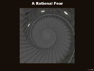
More on the vertigo theme...
Post a reply to this message
Attachments:
Download 'RationalFear1024x768_20031030.jpg' (116 KB)
Preview of image 'RationalFear1024x768_20031030.jpg'

|
 |
|  |
|  |
|
 |
|
 |
|  |
|  |
|
 |
yup, that'd do it.
Image is a bit large for what's shown tho, isn't it?
A.D.B
Darren Hewson wrote:
> More on the vertigo theme...
>
> [Image]
Post a reply to this message
|
 |
|  |
|  |
|
 |
|
 |
|  |
|  |
|
 |
Yep, it probably is, I'll pay a bit more attention to that...
Cheers
"Anthony D. Baye" <ban### [at] Rapidnet com> wrote in message
news:3FA11B42.1F680EA8@Rapidnet.com...
> yup, that'd do it.
>
> Image is a bit large for what's shown tho, isn't it?
>
> A.D.B
>
> Darren Hewson wrote:
>
> > More on the vertigo theme...
> >
> > [Image]
> com> wrote in message
news:3FA11B42.1F680EA8@Rapidnet.com...
> yup, that'd do it.
>
> Image is a bit large for what's shown tho, isn't it?
>
> A.D.B
>
> Darren Hewson wrote:
>
> > More on the vertigo theme...
> >
> > [Image]
>
Post a reply to this message
|
 |
|  |
|  |
|
 |
|
 |
|  |
|  |
|
 |
In article <3fa1082c@news.povray.org>,
"Darren Hewson" <dar### [at] hotmail com> wrote:
> More on the vertigo theme...
Very flat...the shading has very little contrast. It looks like the
scene is mainly lit with ambient lighting. I suggest you set ambient to
zero in all the textures that aren't supposed to be glowing, and use
radiosity.
--
Christopher James Huff <cja### [at] earthlink com> wrote:
> More on the vertigo theme...
Very flat...the shading has very little contrast. It looks like the
scene is mainly lit with ambient lighting. I suggest you set ambient to
zero in all the textures that aren't supposed to be glowing, and use
radiosity.
--
Christopher James Huff <cja### [at] earthlink net>
http://home.earthlink.net/~cjameshuff/
POV-Ray TAG: chr### [at] tag net>
http://home.earthlink.net/~cjameshuff/
POV-Ray TAG: chr### [at] tag povray povray org
http://tag.povray.org/ org
http://tag.povray.org/
Post a reply to this message
|
 |
|  |
|  |
|
 |
|
 |
|  |
|  |
|
 |
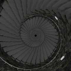
Nope, there is no ambient lighting in the scene, all ambients are set to
zero already.
However there was fog in the bottom of the shaft, this was causing a loss of
contrast all over the scene (must have been a small but noticeable trace
even though the camera is a long distance away from the fog) . I've removed
the fog and the result is attached.
"Christopher James Huff" <cja### [at] earthlink net> wrote in message
news:cja### [at] netplex net> wrote in message
news:cja### [at] netplex aussie aussie org...
> In article <3fa1082c@news.povray.org>,
> "Darren Hewson" <dar### [at] hotmail org...
> In article <3fa1082c@news.povray.org>,
> "Darren Hewson" <dar### [at] hotmail com> wrote:
>
> > More on the vertigo theme...
>
> Very flat...the shading has very little contrast. It looks like the
> scene is mainly lit with ambient lighting. I suggest you set ambient to
> zero in all the textures that aren't supposed to be glowing, and use
> radiosity.
>
> --
> Christopher James Huff <cja### [at] earthlink com> wrote:
>
> > More on the vertigo theme...
>
> Very flat...the shading has very little contrast. It looks like the
> scene is mainly lit with ambient lighting. I suggest you set ambient to
> zero in all the textures that aren't supposed to be glowing, and use
> radiosity.
>
> --
> Christopher James Huff <cja### [at] earthlink net>
> http://home.earthlink.net/~cjameshuff/
> POV-Ray TAG: chr### [at] tag net>
> http://home.earthlink.net/~cjameshuff/
> POV-Ray TAG: chr### [at] tag povray povray org
> http://tag.povray.org/ org
> http://tag.povray.org/
Post a reply to this message
Attachments:
Download 'RationalFear600x600_20031031.jpg' (72 KB)
Preview of image 'RationalFear600x600_20031031.jpg'

|
 |
|  |
|  |
|
 |
|
 |
|  |
|  |
|
 |
In article <3fa206ea@news.povray.org>,
"Darren Hewson" <dar### [at] hotmail com> wrote:
> Nope, there is no ambient lighting in the scene, all ambients are set to
> zero already.
>
> However there was fog in the bottom of the shaft, this was causing a loss of
> contrast all over the scene (must have been a small but noticeable trace
> even though the camera is a long distance away from the fog) . I've removed
> the fog and the result is attached.
Hmm, it still looks very flat, and much too evenly lit for the lighting.
And though I see dark areas on the stairs, the railing looks like it is
glowing. One thing that would help is some granularity and variation in
the stair pigment, to make the edges more distinct. And...are you using
light fading? That would help. Scattering media, too...fog won't give a
very realistic result in an area with so many shadows.
Also, shouldn't the steps be more perpendicular to their anchor point in
the walls? Though this offset does give an interesting visual effect.
--
Christopher James Huff <cja### [at] earthlink com> wrote:
> Nope, there is no ambient lighting in the scene, all ambients are set to
> zero already.
>
> However there was fog in the bottom of the shaft, this was causing a loss of
> contrast all over the scene (must have been a small but noticeable trace
> even though the camera is a long distance away from the fog) . I've removed
> the fog and the result is attached.
Hmm, it still looks very flat, and much too evenly lit for the lighting.
And though I see dark areas on the stairs, the railing looks like it is
glowing. One thing that would help is some granularity and variation in
the stair pigment, to make the edges more distinct. And...are you using
light fading? That would help. Scattering media, too...fog won't give a
very realistic result in an area with so many shadows.
Also, shouldn't the steps be more perpendicular to their anchor point in
the walls? Though this offset does give an interesting visual effect.
--
Christopher James Huff <cja### [at] earthlink net>
http://home.earthlink.net/~cjameshuff/
POV-Ray TAG: chr### [at] tag net>
http://home.earthlink.net/~cjameshuff/
POV-Ray TAG: chr### [at] tag povray povray org
http://tag.povray.org/ org
http://tag.povray.org/
Post a reply to this message
|
 |
|  |
|  |
|
 |
|
 |
|  |
|  |
|
 |
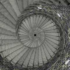
Hey, thanks for the feedback, it made me look at this image again and I
ended up doing quite a bit of work on the textures and lighting. I
brightened things up a bit too.
Cheers
"Christopher James Huff" <cja### [at] earthlink net> wrote in message
news:cja### [at] netplex net> wrote in message
news:cja### [at] netplex aussie aussie org...
> In article <3fa206ea@news.povray.org>,
> "Darren Hewson" <dar### [at] hotmail org...
> In article <3fa206ea@news.povray.org>,
> "Darren Hewson" <dar### [at] hotmail com> wrote:
>
> > Nope, there is no ambient lighting in the scene, all ambients are set to
> > zero already.
> >
> > However there was fog in the bottom of the shaft, this was causing a
loss of
> > contrast all over the scene (must have been a small but noticeable trace
> > even though the camera is a long distance away from the fog) . I've
removed
> > the fog and the result is attached.
>
> Hmm, it still looks very flat, and much too evenly lit for the lighting.
> And though I see dark areas on the stairs, the railing looks like it is
> glowing. One thing that would help is some granularity and variation in
> the stair pigment, to make the edges more distinct. And...are you using
> light fading? That would help. Scattering media, too...fog won't give a
> very realistic result in an area with so many shadows.
>
> Also, shouldn't the steps be more perpendicular to their anchor point in
> the walls? Though this offset does give an interesting visual effect.
>
> --
> Christopher James Huff <cja### [at] earthlink com> wrote:
>
> > Nope, there is no ambient lighting in the scene, all ambients are set to
> > zero already.
> >
> > However there was fog in the bottom of the shaft, this was causing a
loss of
> > contrast all over the scene (must have been a small but noticeable trace
> > even though the camera is a long distance away from the fog) . I've
removed
> > the fog and the result is attached.
>
> Hmm, it still looks very flat, and much too evenly lit for the lighting.
> And though I see dark areas on the stairs, the railing looks like it is
> glowing. One thing that would help is some granularity and variation in
> the stair pigment, to make the edges more distinct. And...are you using
> light fading? That would help. Scattering media, too...fog won't give a
> very realistic result in an area with so many shadows.
>
> Also, shouldn't the steps be more perpendicular to their anchor point in
> the walls? Though this offset does give an interesting visual effect.
>
> --
> Christopher James Huff <cja### [at] earthlink net>
> http://home.earthlink.net/~cjameshuff/
> POV-Ray TAG: chr### [at] tag net>
> http://home.earthlink.net/~cjameshuff/
> POV-Ray TAG: chr### [at] tag povray povray org
> http://tag.povray.org/ org
> http://tag.povray.org/
Post a reply to this message
Attachments:
Download 'RationalFear600x600_20031107.jpg' (111 KB)
Preview of image 'RationalFear600x600_20031107.jpg'

|
 |
|  |
|  |
|
 |
|
 |
|  |
|  |
|
 |
> Hey, thanks for the feedback, it made me look at this image again and I
> ended up doing quite a bit of work on the textures and lighting. I
> brightened things up a bit too.
Very nice image.
Something however has been bugging me and at first it wasn't obvious to me
but then I recalled a school trip to a shot tower many years ago.
There was a similar view from the top with a rounded basin at the bottom.
Perhaps the hint of something at the bottom that would feel very solid if
you fell off?
Anyway it did have a rail and supports that ran up the middle of the tower
to hold up the inner edge of the steps. Otherwise you would find that the
steps may crack and break if walked near to the inner edge. If you follow
what I mean?? Also I agree that perhaps a scattered media or something
would be good? I mean there is usually dust and stuff floating around in
the atmosphere of such a building and that tends to add to the effect.
Another thing I remember from my trip was that the stairs had a worn pattern
where most people walked... (that tended to be towards the wall as people
don't generally like to look over the edge. :)
---
Outgoing mail is certified Virus Free.
Checked by AVG anti-virus system (http://www.grisoft.com).
Version: 6.0.536 / Virus Database: 331 - Release Date: 3/11/03
Post a reply to this message
|
 |
|  |
|  |
|
 |
|
 |
|  |
|  |
|
 |
In article <3fab544a@news.povray.org>,
"Darren Hewson" <dar### [at] hotmail com> wrote:
> Hey, thanks for the feedback, it made me look at this image again and I
> ended up doing quite a bit of work on the textures and lighting. I
> brightened things up a bit too.
Depth is much improved. It looks a bit stark though...I'd expect it to
be much more gloomy. The light fixtures look much too dim for the light
they're giving off. Have you tried distance fading for the lights? And
some scattering media for a more murky atmosphere...media shouldn't wipe
out the depth like fog.
The wall stones look shiny, are they supposed to be wet? They also look
fairly fresh-surfaced, I'd expect some dullness and grime. And I still
don't like the handrail...it looks thin and fragile now. I'd also expect
it to be black iron, maybe with brass or copper fittings, not what looks
like aluminum or uncorroded steel.
--
Christopher James Huff <cja### [at] earthlink com> wrote:
> Hey, thanks for the feedback, it made me look at this image again and I
> ended up doing quite a bit of work on the textures and lighting. I
> brightened things up a bit too.
Depth is much improved. It looks a bit stark though...I'd expect it to
be much more gloomy. The light fixtures look much too dim for the light
they're giving off. Have you tried distance fading for the lights? And
some scattering media for a more murky atmosphere...media shouldn't wipe
out the depth like fog.
The wall stones look shiny, are they supposed to be wet? They also look
fairly fresh-surfaced, I'd expect some dullness and grime. And I still
don't like the handrail...it looks thin and fragile now. I'd also expect
it to be black iron, maybe with brass or copper fittings, not what looks
like aluminum or uncorroded steel.
--
Christopher James Huff <cja### [at] earthlink net>
http://home.earthlink.net/~cjameshuff/
POV-Ray TAG: chr### [at] tag net>
http://home.earthlink.net/~cjameshuff/
POV-Ray TAG: chr### [at] tag povray povray org
http://tag.povray.org/ org
http://tag.povray.org/
Post a reply to this message
|
 |
|  |
|  |
|
 |
|
 |
|  |


![]()