 |
 |
|
 |
|
 |
|  |
|  |
|
 |
|
 |
|  |
|  |
|
 |
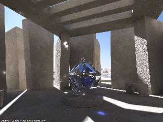
I have been experimenting with procedural concrete textures recently.
It is somewhat difficult to create something that looks good both in
direct and indirect lighting as well as in different render sizes. This
image shows a variant more suited for indirect light.
The 'thing' in the middle is modelled in Wings, i just started using it
more intensively and it seems such abstract geometric shapes are
something that can be made quite well with it.
Christoph
--
POV-Ray tutorials, include files, Sim-POV,
HCR-Edit and more: http://www.tu-bs.de/~y0013390/
Last updated 06 Jul. 2004 _____./\/^>_*_<^\/\.______
Post a reply to this message
Attachments:
Download 'concrete3_a.jpg' (185 KB)
Preview of image 'concrete3_a.jpg'

|
 |
|  |
|  |
|
 |
|
 |
|  |
|  |
|
 |
"Christoph Hormann" <chr### [at] gmx de> wrote in message
news:ce3odt$vnj$1@chho.imagico.de...
>
> I have been experimenting with procedural concrete textures recently.
> It is somewhat difficult to create something that looks good both in
> direct and indirect lighting as well as in different render sizes. This
> image shows a variant more suited for indirect light.
>
I think it looks great. I've tried similar things, but like you said, it
always ends up looking good under some lighting conditions, and bad under
others. But I've never attempted a surface that complex. Nice work!
--
Jeremy
www.beantoad.com de> wrote in message
news:ce3odt$vnj$1@chho.imagico.de...
>
> I have been experimenting with procedural concrete textures recently.
> It is somewhat difficult to create something that looks good both in
> direct and indirect lighting as well as in different render sizes. This
> image shows a variant more suited for indirect light.
>
I think it looks great. I've tried similar things, but like you said, it
always ends up looking good under some lighting conditions, and bad under
others. But I've never attempted a surface that complex. Nice work!
--
Jeremy
www.beantoad.com
Post a reply to this message
|
 |
|  |
|  |
|
 |
|
 |
|  |
|  |
|
 |
Christoph Hormann wrote:
Close. I think that shape is wrong. When looking at the all-shadowed
portions, the concrete looks great. The portions of the wall which show
the chunkiness are those that are a bit off to my eye.
I have for a long time considered trying this myself. Partly in order to
make a picture inspired long ago by your 'water tunnel' image.
Unfortunately, I do not have a monitor right now at home which is
capable of this type of texture work.
-Shay
Post a reply to this message
|
 |
|  |
|  |
|
 |
|
 |
|  |
|  |
|
 |
Shay wrote:
>
> Close. I think that shape is wrong. When looking at the all-shadowed
> portions, the concrete looks great. The portions of the wall which show
> the chunkiness are those that are a bit off to my eye.
I am not quite sure what you are talking about. If you are referring to
the sunlit parts looking not so much like concrete - this is exactly
what i meant, it is next to impossible to make both look good.
Christoph
--
POV-Ray tutorials, include files, Sim-POV,
HCR-Edit and more: http://www.tu-bs.de/~y0013390/
Last updated 06 Jul. 2004 _____./\/^>_*_<^\/\.______
Post a reply to this message
|
 |
|  |
|  |
|
 |
|
 |
|  |
|  |
|
 |
Jeremy M. Praay wrote:
>
> I think it looks great. I've tried similar things, but like you said, it
> always ends up looking good under some lighting conditions, and bad under
> others. But I've never attempted a surface that complex. Nice work!
>
Thanks.
Christoph
--
POV-Ray tutorials, include files, Sim-POV,
HCR-Edit and more: http://www.tu-bs.de/~y0013390/
Last updated 06 Jul. 2004 _____./\/^>_*_<^\/\.______
Post a reply to this message
|
 |
|  |
|  |
|
 |
|
 |
|  |
|  |
|
 |
Christoph Hormann wrote:
> Shay wrote:
>
>>
>> Close. I think that shape is wrong. When looking at the all-shadowed
>> portions, the concrete looks great. The portions of the wall which
>> show the chunkiness are those that are a bit off to my eye.
>
>
> I am not quite sure what you are talking about. If you are referring to
> the sunlit parts looking not so much like concrete - this is exactly
> what i meant, it is next to impossible to make both look good.
>
> Christoph
>
I am talking about the bump map or surface displacement you used. It
does not look correct for concrete, so the concrete looks off in the lit
areas even though the pigments are correct. Smooth concrete might look
more accurate.
http://www.amherst.edu/~gfdumas/images/concrete.jpg
-Shay
Post a reply to this message
|
 |
|  |
|  |
|
 |
|
 |
|  |


![]()