 |
 |
|
 |
|
 |
|  |
|  |
|
 |
|
 |
|  |
|  |
|
 |
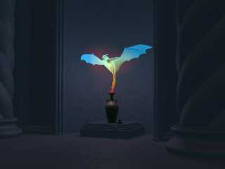
Something a bit different, playing with aoi and emission. I know I said in my
previous images that I was going back to basics, but I finally succumbed and
employed radiosity again. You just can't do this kind of thing (easily) any
other way.
Cheers,
Simon
http://www.landofthefirst.com/
Post a reply to this message
Attachments:
Download 'opened.png' (2084 KB)
Preview of image 'opened.png'

|
 |
|  |
|  |
|
 |
|
 |
|  |
|  |
|
 |
On 6/5/2017 12:42 PM, Simon J. Cambridge wrote:
> Something a bit different, playing with aoi and emission. I know I said in my
> previous images that I was going back to basics, but I finally succumbed and
> employed radiosity again. You just can't do this kind of thing (easily) any
> other way.
I like it. :)
--
Regards
Stephen
Post a reply to this message
|
 |
|  |
|  |
|
 |
|
 |
|  |
|  |
|
 |
Am 05.06.2017 um 13:42 schrieb Simon J. Cambridge:
> Something a bit different, playing with aoi and emission. I know I said in my
> previous images that I was going back to basics, but I finally succumbed and
> employed radiosity again. You just can't do this kind of thing (easily) any
> other way.
Love it.
Post a reply to this message
|
 |
|  |
|  |
|
 |
|
 |
|  |
|  |
|
 |
> Something a bit different, playing with aoi and emission. I know I said in my
> previous images that I was going back to basics, but I finally succumbed and
> employed radiosity again. You just can't do this kind of thing (easily) any
> other way.
>
> Cheers,
>
> Simon
>
> http://www.landofthefirst.com/
>
Fantastic.
Post a reply to this message
|
 |
|  |
|  |
|
 |
|
 |
|  |
|  |
|
 |
On 5-6-2017 13:42, Simon J. Cambridge wrote:
> Something a bit different, playing with aoi and emission. I know I said in my
> previous images that I was going back to basics, but I finally succumbed and
> employed radiosity again. You just can't do this kind of thing (easily) any
> other way.
>
> Cheers,
>
> Simon
>
> http://www.landofthefirst.com/
>
I love that indeed!
One piece of disorientation though: The scene is large but the jar feels
small (because of the stopper) while it is not...
--
Thomas
Post a reply to this message
|
 |
|  |
|  |
|
 |
|
 |
|  |
|  |
|
 |
Simon J. Cambridge wrote on 05/06/2017 13:42:
> Something a bit different, playing with aoi and emission. I know I said in my
> previous images that I was going back to basics, but I finally succumbed and
> employed radiosity again. You just can't do this kind of thing (easily) any
> other way.
>
> Cheers,
>
> Simon
>
> http://www.landofthefirst.com/
>
Very nice!
Paolo
Post a reply to this message
|
 |
|  |
|  |
|
 |
|
 |
|  |
|  |
|
 |
"Simon J. Cambridge" <nomail@nomail> wrote:
> Something a bit different, playing with aoi and emission. I know I said in my
> previous images that I was going back to basics, but I finally succumbed and
> employed radiosity again. You just can't do this kind of thing (easily) any
> other way.
>
> Cheers,
>
> Simon
>
> http://www.landofthefirst.com/
Very cool !
I think it would look slightly richer with lower emission balanced with a small
background light and double illuminate in the wings ! ;-)
Post a reply to this message
|
 |
|  |
|  |
|
 |
|
 |
|  |
|  |
|
 |
Thanks everybody! All comments gratefully received. (Thomas: I am still messing
about with the vase but, like everything else I do, tinkering never seems to
improve anything.)
"Mr" <nomail@nomail> wrote:
> "Simon J. Cambridge" <nomail@nomail> wrote:
> > Something a bit different, playing with aoi and emission. I know I said in my
> > previous images that I was going back to basics, but I finally succumbed and
> > employed radiosity again. You just can't do this kind of thing (easily) any
> > other way.
> >
> > Cheers,
> >
> > Simon
> >
> > http://www.landofthefirst.com/
>
> Very cool !
> I think it would look slightly richer with lower emission balanced with a small
> background light and double illuminate in the wings ! ;-)
I am not sure a background light would work (but I shall give it a go, though)
and it was intended that the wings should fade a little. There are two area
lights in play, one red and one light blue. The light blue is in the
(shadowless) torso and the red at the mouth of the vase. Four pigments (aoi)
make up the body and are arranged spherically from the mouth of the vase.
I also tried varying the stone, (pillars, edging, flags, etc) but I didn't like
the outcome.
Cheers,
Simon.
Post a reply to this message
|
 |
|  |
|  |
|
 |
|
 |
|  |


![]()