 |
 |
|
 |
|
 |
|  |
|  |
|
 |
|
 |
|  |
|  |
|
 |
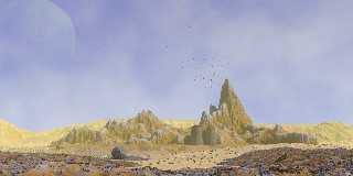
An image loosely inspired by C.J. Cherryh's trilogy The Faded Sun.
In total, three different height_fields have been used. The central
height_field (with the peak) itself consists of a union of three copies,
each scaled differently along the y-axis, in order to show more
differentiation in the different levels, especially the peaks and the
sub-horizontal surfaces.
Proximity patterns used for the landscape textures.
--
Thomas
Post a reply to this message
Attachments:
Download 'the lookout_final.png' (752 KB)
Preview of image 'the lookout_final.png'

|
 |
|  |
|  |
|
 |
|
 |
|  |
|  |
|
 |
Nice! I especially like the foreground darker landscape and its rocks.
I *still* haven't tried using a proximity pattern; it's on my (long) to-do list.
Post a reply to this message
|
 |
|  |
|  |
|
 |
|
 |
|  |
|  |
|
 |
Thomas de Groot <tho### [at] degroot org> wrote:
> An image loosely inspired by C.J. Cherryh's trilogy The Faded Sun.
>
> In total, three different height_fields have been used. The central
> height_field (with the peak) itself consists of a union of three copies,
> each scaled differently along the y-axis, in order to show more
> differentiation in the different levels, especially the peaks and the
> sub-horizontal surfaces.
>
> Proximity patterns used for the landscape textures.
Makes it a good dry parched land, yet hinting at water someplace.
As with most pictures posted here I look at least twice, which is why I noticed
the lizard the 2nd time. At least I'm guessing that's a lizard. The avian flock
was taking all my attention away from it.
Bob org> wrote:
> An image loosely inspired by C.J. Cherryh's trilogy The Faded Sun.
>
> In total, three different height_fields have been used. The central
> height_field (with the peak) itself consists of a union of three copies,
> each scaled differently along the y-axis, in order to show more
> differentiation in the different levels, especially the peaks and the
> sub-horizontal surfaces.
>
> Proximity patterns used for the landscape textures.
Makes it a good dry parched land, yet hinting at water someplace.
As with most pictures posted here I look at least twice, which is why I noticed
the lizard the 2nd time. At least I'm guessing that's a lizard. The avian flock
was taking all my attention away from it.
Bob
Post a reply to this message
|
 |
|  |
|  |
|
 |
|
 |
|  |
|  |
|
 |
On 13-5-2017 14:37, omniverse wrote:
> Thomas de Groot <tho### [at] degroot org> wrote:
>> An image loosely inspired by C.J. Cherryh's trilogy The Faded Sun.
>>
>> In total, three different height_fields have been used. The central
>> height_field (with the peak) itself consists of a union of three copies,
>> each scaled differently along the y-axis, in order to show more
>> differentiation in the different levels, especially the peaks and the
>> sub-horizontal surfaces.
>>
>> Proximity patterns used for the landscape textures.
>
> Makes it a good dry parched land, yet hinting at water someplace.
>
> As with most pictures posted here I look at least twice, which is why I noticed
> the lizard the 2nd time. At least I'm guessing that's a lizard. The avian flock
> was taking all my attention away from it.
>
> Bob
>
Have you seen the film 'Turner', about the famous painter? There is a
scene where Turner shows his "Hannibal crossing the Alps" to a visitor
and his father asks the visitor: "Have you seen the elephant?"
http://www.tate.org.uk/art/artworks/turner-snow-storm-hannibal-and-his-army-crossing-the-alps-n00490
--
Thomas org> wrote:
>> An image loosely inspired by C.J. Cherryh's trilogy The Faded Sun.
>>
>> In total, three different height_fields have been used. The central
>> height_field (with the peak) itself consists of a union of three copies,
>> each scaled differently along the y-axis, in order to show more
>> differentiation in the different levels, especially the peaks and the
>> sub-horizontal surfaces.
>>
>> Proximity patterns used for the landscape textures.
>
> Makes it a good dry parched land, yet hinting at water someplace.
>
> As with most pictures posted here I look at least twice, which is why I noticed
> the lizard the 2nd time. At least I'm guessing that's a lizard. The avian flock
> was taking all my attention away from it.
>
> Bob
>
Have you seen the film 'Turner', about the famous painter? There is a
scene where Turner shows his "Hannibal crossing the Alps" to a visitor
and his father asks the visitor: "Have you seen the elephant?"
http://www.tate.org.uk/art/artworks/turner-snow-storm-hannibal-and-his-army-crossing-the-alps-n00490
--
Thomas
Post a reply to this message
|
 |
|  |
|  |
|
 |
|
 |
|  |
|  |
|
 |
On 13-5-2017 13:59, Kenneth wrote:
> Nice! I especially like the foreground darker landscape and its rocks.
>
> I *still* haven't tried using a proximity pattern; it's on my (long) to-do list.
>
I use Edouard Poor's method as one of the more comprehensible.
--
Thomas
Post a reply to this message
|
 |
|  |
|  |
|
 |
|
 |
|  |
|  |
|
 |
On 13-5-2017 13:59, Kenneth wrote:
> Nice! I especially like the foreground darker landscape and its rocks.
>
I forgot to add that this effect is for the most part the result of the
atmospheric media applied, as the landscape textures are very similar to
each other.
--
Thomas
Post a reply to this message
|
 |
|  |
|  |
|
 |
|
 |
|  |


![]()