 |
 |
|
 |
|
 |
|  |
|  |
|
 |
|
 |
|  |
|  |
|
 |
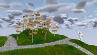
Reworked the clouds, the camera-angle, the path and the focal point.
Now I still need to take care of a proper background, or do something
different for the gradient from horizon to clouds, and update the
figure. I'm buying a MacBook Pro on Monday (probably) and the Modelling
Software I use runs on it, so... :-)
Anyways, comments and suggestions, as always, welcome! :-)
Regards,
Tim
--
aka "Tim Nikias"
Homepage: <http://www.nolights.de>
Post a reply to this message
Attachments:
Download 'lostguy_16.jpg' (87 KB)
Preview of image 'lostguy_16.jpg'

|
 |
|  |
|  |
|
 |
|
 |
|  |
|  |
|
 |
Tim Nikias wrote:
> Reworked the clouds, the camera-angle, the path and the focal point.
> Anyways, comments and suggestions, as always, welcome! :-)
Perfect! :D
I really like this version. The clouds are really good - not realistic but
fits perfectly to the half model / half real style.
The paths are fine too. You can see four, but there might be a lot more on
the other side. They don't follow a redial pattern but go out seemingly at
random. It looks very natural and conveys the meaning fine.
I don't know if the rest of the improvement is just the texture (objects?)
of the path, but the image as a whole works much better now. :)
Rune
--
http://runevision.com
Post a reply to this message
|
 |
|  |
|  |
|
 |
|
 |
|  |
|  |
|
 |
Rune wrote:
> Tim Nikias wrote:
>> Reworked the clouds, the camera-angle, the path and the focal point.
>
>> Anyways, comments and suggestions, as always, welcome! :-)
>
> Perfect! :D
Ooooh, thanks! :-)
> I really like this version. The clouds are really good - not realistic but
> fits perfectly to the half model / half real style.
My oppinion as well. I'll probably still check to see what I end up with
if I still dabble at them a little, but I like them much better than the
first ones.
> The paths are fine too. You can see four, but there might be a lot more on
> the other side. They don't follow a redial pattern but go out seemingly at
> random. It looks very natural and conveys the meaning fine.
Handpainted JPEG to guide the script where to place grass and where
stones...
> I don't know if the rest of the improvement is just the texture (objects?)
> of the path, but the image as a whole works much better now. :)
Thanks! The path is actually made up of a couple thousand spheres,
squished and rotated to lie on the ground (using basically the same code
from the grass, and just placing stones instead of the grass). Adds a
distinct touch to the edge where the path ends and the dirt/grass starts
which I like.
Onward to the next changes! ;-)
Regards,
Tim
--
aka "Tim Nikias"
Homepage: <http://www.nolights.de>
Post a reply to this message
|
 |
|  |
|  |
|
 |
|
 |
|  |
|  |
|
 |
> Handpainted JPEG to guide the script where to place grass and where
> stones...
JPEG doesn't sound optimal for this, better use a lossless format?
Seems to work though, nice image ;)
Post a reply to this message
|
 |
|  |
|  |
|
 |
|
 |
|  |
|  |
|
 |
Christian Froeschlin wrote:
>> Handpainted JPEG to guide the script where to place grass and where
>> stones...
>
> JPEG doesn't sound optimal for this, better use a lossless format?
Why, do you see any obvious problems with an almost non-compressed JPEG
here? ;-) Otherwise though, I know of the difficulties lossy formats
come along with.
> Seems to work though, nice image ;)
Thank you!
--
aka "Tim Nikias"
Homepage: <http://www.nolights.de>
Post a reply to this message
|
 |
|  |
|  |
|
 |
|
 |
|  |
|  |
|
 |
> Why, do you see any obvious problems with an almost non-compressed JPEG
> here? ;-)
No, but if I have to create some source image manually then I wouldn't
dream of throwing away even a single pixel of my incompentent labours,
not to mention that errors accumulate with every modification ;)
Post a reply to this message
|
 |
|  |
|  |
|
 |
|
 |
|  |


![]()