 |
 |
|
 |
|
 |
|  |
|  |
|
 |
|
 |
|  |
|  |
|
 |
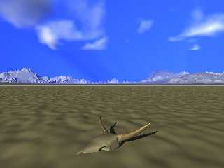
Hmm,
I need some rocks, some sparse vegetation, and some vertibrae possibly
ribs...
The mountains bother me a bit. Though the media is giving the desired
haze effect.... Maybe after I get the proper texture on the mountains.
Comments, suggestions ... criticism?
Post a reply to this message
Attachments:
Download 'desert-wip1.jpg' (44 KB)
Preview of image 'desert-wip1.jpg'

|
 |
|  |
|  |
|
 |
|
 |
|  |
|  |
|
 |
Michael Raiford wrote:
> Hmm,
>
> I need some rocks, some sparse vegetation, and some vertibrae possibly
> ribs...
>
> The mountains bother me a bit. Though the media is giving the desired
> haze effect.... Maybe after I get the proper texture on the mountains.
>
> Comments, suggestions ... criticism?
>
>
> ------------------------------------------------------------------------
>
Coming along nicely. More scrub as you say. It would be a very unusual
topography, would it not, that would be so sandy and so flat at the same
time? If sand, then drifts. If flat, then more clay than sand. Or salt
lake? I could be wrong. Anyway I would buy the flat idea,in general,
if there was some slight vegetation. Of course it goes without saying
that you need more texture to carry the foreground. Would like to see
some good texture work on the skull especially. Don't forget you can
save your Wings mesh with different texture assigments, say for the
horns, and they will show up in your mesh2 texture list. Then you can
manually texture them to get differing effects.
Also the composition is a bit odd with the skull being so dead center
yet relatively small. Not sure if it's good or bad, but noticeble.
Like the way tourists frame shots.
Post a reply to this message
|
 |
|  |
|  |
|
 |
|
 |
|  |
|  |
|
 |
Yes, those additions would improve the image.
How about more of a gradient in the sky, it looks just a little too blue.
Maybe a dark blue on the top and more of a greyish light blue on the bottom?
I know media atmospheres are quite hard to control. I'm having the same
problem right now with my desert scene. I think I can away with using a
ground fog though.
In addition to rocks and vegetation, the actual ground texture itself is
going to need some more detail. What are you using right now, a plane with
a normal? How about an isosurface with some noise/turbulence on it, or at
least another smaller normal on the plane?
Skip
Post a reply to this message
|
 |
|  |
|  |
|
 |
From: Michael Raiford
Subject: Re: Desert WIP, First concept rendering
Date: 25 Jul 2004 22:59:27
Message: <4104738f@news.povray.org>
|
|
 |
|  |
|  |
|
 |
Jim Charter wrote:
> Coming along nicely. More scrub as you say. It would be a very unusual
> topography, would it not, that would be so sandy and so flat at the same
> time? If sand, then drifts. If flat, then more clay than sand. Or salt
Yep, this is one thing I would like to address is adding just a bit more
relief to the sand... some dunes, but I'm having a tough grasp at the
ridged_mf function... Mountains will some somewhat like the contenental
divide,.. snowcapped, a bit darker in color.
> lake? I could be wrong. Anyway I would buy the flat idea,in general,
> if there was some slight vegetation. Of course it goes without saying
I'm thinking POVTree may be able to generate some scraggly bushes, maybe
some mesquite trees...
> that you need more texture to carry the foreground. Would like to see
> some good texture work on the skull especially. Don't forget you can
> save your Wings mesh with different texture assigments, say for the
> horns, and they will show up in your mesh2 texture list. Then you can
Yes ;) I do have separate textures for the horns and the skull itself.
I'm curious to know whether Wings saves any UV_Mapping information, if
so, this would make texturing the horns easy.. I have an idea that I
want to carry forward.
> manually texture them to get differing effects.
> Also the composition is a bit odd with the skull being so dead center
> yet relatively small. Not sure if it's good or bad, but noticeble. Like
> the way tourists frame shots.
Yeah, after I posted the image, I studied it a bit, and I think I'll
move the skull somewhere... I need to add a few more bones.. ribcage and
such, just a few (something died...Maybe bits were taken away by
coyotes... )
I'd like to keep the focal area pretty much flat, maybe increase some of
the parameters the further down the z-axis to give the appearance of
dunes in the background, before the mountains.
The main idea here is this dead animal has been here for a while and is
half-buried in the sand, now.
Radiosity and a blue ambient sphere may add some coolness to the
shadows, as well. The light's color has been warmed up by the media in
the sky, the skull isn't nearly as yellow as it appears at the moment.
Post a reply to this message
|
 |
|  |
|  |
|
 |
From: Michael Raiford
Subject: Re: Desert WIP, First concept rendering
Date: 25 Jul 2004 23:06:19
Message: <4104752b@news.povray.org>
|
|
 |
|  |
|  |
|
 |
Skip Talbot wrote:
> Yes, those additions would improve the image.
>
> How about more of a gradient in the sky, it looks just a little too blue.
> Maybe a dark blue on the top and more of a greyish light blue on the bottom?
> I know media atmospheres are quite hard to control. I'm having the same
> problem right now with my desert scene. I think I can away with using a
> ground fog though.
>
> In addition to rocks and vegetation, the actual ground texture itself is
> going to need some more detail. What are you using right now, a plane with
> a normal? How about an isosurface with some noise/turbulence on it, or at
> least another smaller normal on the plane?
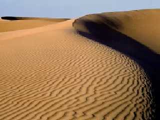
Believe it or not... it IS an isosurface! This is one of the things I am
having difficulty with... I want some flatness in the foreground, but
some relief to it as well, But I can't figure out how to get the desired
effect.
I want something like ripples in the sand... Like the attached image...
>
> Skip
>
>
Post a reply to this message
Attachments:
Download 'desert sand.jpg' (18 KB)
Preview of image 'desert sand.jpg'

|
 |
|  |
|  |
|
 |
|
 |
|  |
|  |
|
 |
If you are trying to do dunes, keep playing with that ridged_mf function.
You could trying using a leopard scaled heavily in one diretion for the
ripples with a little turublence maybe. The flatness you are trying to
achieve though looks like a crackle pattern might be better suited.
Something like a dried out lake bed. Than we can see more of your skull
model too.
Skip
Post a reply to this message
|
 |
|  |
|  |
|
 |
|
 |
|  |
|  |
|
 |
Michael Raiford wrote:
>
> Yep, this is one thing I would like to address is adding just a bit more
> relief to the sand... some dunes, but I'm having a tough grasp at the
> ridged_mf function...
Ridged_mf isn't the only option. You can use a simple gradient, say
gradient x, then manipulate the wave_form type and pigment_map (assuming
of course you are working from a pigment function) to get the peaking
effect. There are other patterns and functions that also lend themselves
to this. Perhaps even the effect of being convex on one side of the
ridge on concave on the other could be done with the pigment map. Worth
a quick look see I'd say.
>
> Yes ;) I do have separate textures for the horns and the skull itself.
> I'm curious to know whether Wings saves any UV_Mapping information, if
> so, this would make texturing the horns easy.. I have an idea that I
> want to carry forward.
>
Wings has its AutoUV functionality which works pretty well for the sort
of simple mapping you have got there. Though it is something of a
moving target, it being under heavy development and continual revision
lately. It is, and has always been, heavily automated so you don't get
the manual control that you do with UVmapper. I have found I rely on
UVmapper lately because I am more familiar with it. But in the past
AutoUV has worked pretty well. It would be totally adequate for the
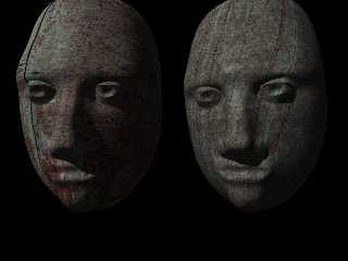
distance from the subject you are working with. The attached image is
an early effort of mine to use AutoUV in Wings. The head on the left
has an image_map applied with the UV data Wings generated. You can see
some artifacting on the lips. ( I am certain I could improve on that
now. On right was an attempt to duplicate the result with procedural
texturing)
Post a reply to this message
Attachments:
Download 'head07.jpg' (38 KB)
Preview of image 'head07.jpg'

|
 |
|  |
|  |
|
 |
|
 |
|  |
|  |
|
 |
"Michael Raiford" <mra### [at] hotmail com> wrote in message
news:410460c3@news.povray.org...
> Hmm,
>
> I need some rocks, some sparse vegetation, and some vertibrae
possibly
> ribs...
Well, the ribs should easy enough to do... a bit of backbone too?
;)
>
> The mountains bother me a bit. Though the media is giving the
desired
> haze effect.... Maybe after I get the proper texture on the
mountains.
>
> Comments, suggestions ... criticism?
The skull's looking good apart from the 'square' sides behind the
mouth. Maybe adjust those points/lines/faces in that area so that
there's an indent/depression each side?
Take a look here, I don't know what skulls these are, but amazingly,
these are in Wales:
(halfway down) http://www.glamorganwalks.com/whatsnew.htm
Looking forward to the finished image. :)
~Steve~
>
>
----------------------------------------------------------------------
---------- com> wrote in message
news:410460c3@news.povray.org...
> Hmm,
>
> I need some rocks, some sparse vegetation, and some vertibrae
possibly
> ribs...
Well, the ribs should easy enough to do... a bit of backbone too?
;)
>
> The mountains bother me a bit. Though the media is giving the
desired
> haze effect.... Maybe after I get the proper texture on the
mountains.
>
> Comments, suggestions ... criticism?
The skull's looking good apart from the 'square' sides behind the
mouth. Maybe adjust those points/lines/faces in that area so that
there's an indent/depression each side?
Take a look here, I don't know what skulls these are, but amazingly,
these are in Wales:
(halfway down) http://www.glamorganwalks.com/whatsnew.htm
Looking forward to the finished image. :)
~Steve~
>
>
----------------------------------------------------------------------
----------
Post a reply to this message
|
 |
|  |
|  |
|
 |
|
 |
|  |
|
 |


![]()