|
|
|
|
|
|
| |
| |
|
|
|
|
| |
| |
|
|
>I really like this one, it's by far my first choice of all the logos I've
>seen so far. I'm not sure what to improve, but I'm sure there's something,
>so keep trying :-)
Alright! :)
Post a reply to this message
|
|
| |
| |
|
|
|
|
| |
| |
|
|
>Well, this is the kind of logo I would vote for. Simplicity is there.
This makes me feel good enough to dance! :)
Post a reply to this message
|
|
| |
| |
|
|
|
|
| |
| |
|
|
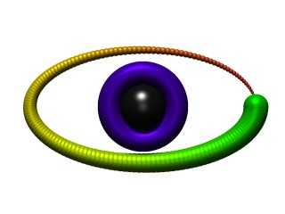
Maybe you could add some shadow to the iris ( as you did to the lettering)
to give more depth to the picture.
> >Well, this is the kind of logo I would vote for. Simplicity is there.
>
> This makes me feel good enough to dance! :)
Post a reply to this message
|
|
| |
| |
|
|
|
|
| |
| |
|
|
In article <39174496@news.povray.org>, "TonyB"
<ben### [at] panama c-comnet> wrote:
> Praise the Lord, Chris Huff is happy!
Sorry if I was sounding picky...
> >Did you try the torus-surrounding-sphere
> >idea for the pupil and iris?
>
> Yes, but good colors escaped me, so I forgot about it.
I made an attempt, see the attached image. No black/white version yet,
though it would be pretty simple.
> >You could make a
> >black(or electric blue) pupil, and a blue iris. The iris could be an
> >outline for the black and white version, maybe with radial lines.
>
> Oh, so *now* you want blue? ;)
Well, not "sky blue" or "water blue", dark purplish electric blue.
Something to say "high tech", not "fresh, pure water". :-)
> It sounds like that would make it overly complex.
It would just be an additional circle in the black/white version, and
would make it look a lot more like an eye.
> >And maybe red lightning emanating from the center, to represent the
> >bloodshot eyes we have after staying up too late tweaking settings. :-)
>
> O... K... I don't think that's the image we want to show... this logo
> represents an ideal situation, not reality. ;)
:-)
--
Christopher James Huff - Personal e-mail: chr### [at] yahoocom
TAG(Technical Assistance Group) e-mail: chr### [at] tagpovrayorg
Personal Web page: http://chrishuff.dhs.org/
TAG Web page: http://tag.povray.org/ c-comnet> wrote:
> Praise the Lord, Chris Huff is happy!
Sorry if I was sounding picky...
> >Did you try the torus-surrounding-sphere
> >idea for the pupil and iris?
>
> Yes, but good colors escaped me, so I forgot about it.
I made an attempt, see the attached image. No black/white version yet,
though it would be pretty simple.
> >You could make a
> >black(or electric blue) pupil, and a blue iris. The iris could be an
> >outline for the black and white version, maybe with radial lines.
>
> Oh, so *now* you want blue? ;)
Well, not "sky blue" or "water blue", dark purplish electric blue.
Something to say "high tech", not "fresh, pure water". :-)
> It sounds like that would make it overly complex.
It would just be an additional circle in the black/white version, and
would make it look a lot more like an eye.
> >And maybe red lightning emanating from the center, to represent the
> >bloodshot eyes we have after staying up too late tweaking settings. :-)
>
> O... K... I don't think that's the image we want to show... this logo
> represents an ideal situation, not reality. ;)
:-)
--
Christopher James Huff - Personal e-mail: chr### [at] yahoocom
TAG(Technical Assistance Group) e-mail: chr### [at] tagpovrayorg
Personal Web page: http://chrishuff.dhs.org/
TAG Web page: http://tag.povray.org/
Post a reply to this message
Attachments:
Download 'POV Logo.jpg' (14 KB)
Preview of image 'POV Logo.jpg'
|
|
| |
| |
|
|
|
|
| |
| |
|
|
>Sorry if I was sounding picky...
It's OK.
>I made an attempt, see the attached image. No black/white version yet,
>though it would be pretty simple.
Hmmm... good colors. I'll modify mine. :)
>It would just be an additional circle in the black/white version, and
>would make it look a lot more like an eye.
It does.
Post a reply to this message
|
|
| |
| |
|
|
|
|
| |
| |
|
|
>> Why an eye?
>
>Well, "POV" means "Persistence Of Vision"...
>
... and the camera might be thought of as an eye...
simen
Post a reply to this message
|
|
| |
| |
|
|
From: Simen Kvaal
Subject: Re: "Eye" logo 2 (~14kau) - POV Logo.jpg (1/1)
Date: 9 May 2000 03:05:04
Message: <3917b8a0@news.povray.org>
|
|
|
| |
| |
|
|
>> >Did you try the torus-surrounding-sphere
>> >idea for the pupil and iris?
>>
>> Yes, but good colors escaped me, so I forgot about it.
>
>I made an attempt, see the attached image. No black/white version yet,
>though it would be pretty simple.
>
Hm.
IMO, it gets over-done. The logo looks good with just two elements. More
would corrupt it, especially at low-res. It sorta looks more like an eye,
but I find it somewhat too less stylized; it like loses some of its
easyness.
Oh, well.
Simen.
Post a reply to this message
|
|
| |
| |
|
|
|
|
| |
| |
|
|
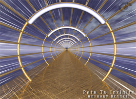
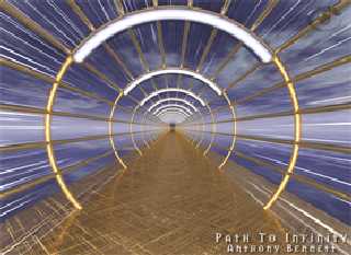
Greetings!
This effect is a supplement to the "grep 'logo' /etc/collectedWisdom"
thread on povray.general.
Premise: Rather than a given logo with a set colour scheme, why not an
_effect_ which can be bundled in an .inc and rendered into any scene?
All due credit to TonyB.
Henry.
Post a reply to this message
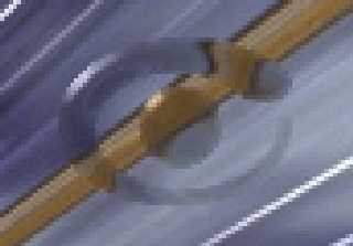
Attachments:
Download 'closeUp.jpg' (4 KB)
Download 'infinity.jpg' (38 KB)
Preview of image 'closeUp.jpg'
Preview of image 'infinity.jpg'
|
|
| |
| |
|
|
|
|
| |
| |
|
|
"Henry" <htp### [at] maccom> wrote :
>
> Premise: Rather than a given logo with a set colour scheme, why not an
> _effect_ which can be bundled in an .inc and rendered into any scene?
>
That's what I was trying to say all along. -Something- that can be
subtly introduced to each scene that will tip people off as to what they are
looking at...
Post a reply to this message
|
|
| |
| |
|
|
|
|
| |
| |
|
|
>All due credit to TonyB.
Wow, and on one of my images, too. :) It looks nice, doesn't it?
Post a reply to this message
|
|
| |
| |
|
|
|
|
| |