|
 |
And lo on Mon, 13 Sep 2004 08:23:42 EDT, Stephen
<mca### [at] hotmail com> did spake, saying:
> "Phil Cook" <phi### [at] nospamdeckingdeals com> did spake, saying:
> "Phil Cook" <phi### [at] nospamdeckingdeals co co uk> wrote:
>> And lo on Mon, 13 Sep 2004 06:54:11 EDT, Stephen
>> <mca### [at] hotmail uk> wrote:
>> And lo on Mon, 13 Sep 2004 06:54:11 EDT, Stephen
>> <mca### [at] hotmail com> did spake, saying:
>>
> And lo … did spake, saying:
>
> Pretentious moi? :-}
> LOL
How else would you write about a disembodied voice offering advice (good
or bad) and criticism ;)
> [snip]
>
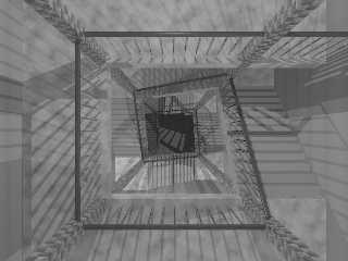
>> The stairs are placed using a macro and have a light above the landing
>> which is either on or off depending on a rand, perhaps if I altered the
>> seed or increase the number of flights it might change the positioning
>> of
>> them. But hmmm switch them all off and go for an overhead skylight I'll
>> give it a go and see what happens :)
>>
>
> You know, the multiple lights take me back to when I did a milk round.
> (don’t ask when)
When? Oh sorry :P
> The tenements had lights on each landing and quite often a
> large skylight, made opaque by years of debris building up. The effect is
> similar but much darker. And as often as not, some lights would be out.
The original thought was a shot in Underworld and a similar one in Leon
from the same viewpoint(with an elevator running up the middle in that
instance), originally it was going to be a dark realistic view, but then I
cocked up a setting (when checking the placement macros and using default
textures) and thought Oooo, but yeah I've been up similar sets of stairs
and that's why I set the lights. Only slightly more complex than an off or
on, either 0, 0.1, or 0.2.
The attached is a straight reversal of that #switch. Amusingly I prefer
this one although one of the lower flights is a touch bright, took me a
second too to work out what was causing that horizontal shadow middle-left
(idiot)
Did a quick try with a single placed light just below the camera in lieu
of a more complex skylight, top landing's not bad but everything below is
a bit flat, unless I add some more defining textures I think the shadows
cast by varying lights work better, might just spread the range more.
> Hmm, I remember picking up a cat instead of empty milk bottles. I don’t
> know who was more scared :-}
LMAO
> How about a post with lower light levels and chip papers on the stairs
> and
> the walls stained with …
Ketchup? Actually some sort of debris might look quite good, I'll have a
play when I've some time.
--
Phil Cook
--
All thoughts and comments are my own unless otherwise stated and I am
happy to be proven wrong. com> did spake, saying:
>>
> And lo … did spake, saying:
>
> Pretentious moi? :-}
> LOL
How else would you write about a disembodied voice offering advice (good
or bad) and criticism ;)
> [snip]
>
>> The stairs are placed using a macro and have a light above the landing
>> which is either on or off depending on a rand, perhaps if I altered the
>> seed or increase the number of flights it might change the positioning
>> of
>> them. But hmmm switch them all off and go for an overhead skylight I'll
>> give it a go and see what happens :)
>>
>
> You know, the multiple lights take me back to when I did a milk round.
> (don’t ask when)
When? Oh sorry :P
> The tenements had lights on each landing and quite often a
> large skylight, made opaque by years of debris building up. The effect is
> similar but much darker. And as often as not, some lights would be out.
The original thought was a shot in Underworld and a similar one in Leon
from the same viewpoint(with an elevator running up the middle in that
instance), originally it was going to be a dark realistic view, but then I
cocked up a setting (when checking the placement macros and using default
textures) and thought Oooo, but yeah I've been up similar sets of stairs
and that's why I set the lights. Only slightly more complex than an off or
on, either 0, 0.1, or 0.2.
The attached is a straight reversal of that #switch. Amusingly I prefer
this one although one of the lower flights is a touch bright, took me a
second too to work out what was causing that horizontal shadow middle-left
(idiot)
Did a quick try with a single placed light just below the camera in lieu
of a more complex skylight, top landing's not bad but everything below is
a bit flat, unless I add some more defining textures I think the shadows
cast by varying lights work better, might just spread the range more.
> Hmm, I remember picking up a cat instead of empty milk bottles. I don’t
> know who was more scared :-}
LMAO
> How about a post with lower light levels and chip papers on the stairs
> and
> the walls stained with …
Ketchup? Actually some sort of debris might look quite good, I'll have a
play when I've some time.
--
Phil Cook
--
All thoughts and comments are my own unless otherwise stated and I am
happy to be proven wrong.
Post a reply to this message
Attachments:
Download 'steps2.jpg' (49 KB)
Preview of image 'steps2.jpg'

|
 |


![]()