And lo on Tue, 26 Feb 2008 15:41:30 -0000, scott <sco### [at] laptop com> did
spake, saying:
>> Just create some more series data to add to the plot, with xy values
>> that
>> start at the origin and then go to some point far away to the upper
>> right.
>> Then change the style for these series so that it draws the connecting
>> lines rather than just the data points. Job done :-)
>
> Seeing as we're all into posting graphs today... what I meant was
> something
> like this:
Meh I prefered mine :-P
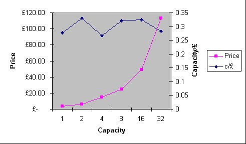
Here, this is a stock Excel chart template with data from a catalogue on
my desk featuring some USB stick prices; should be self-explanatory.
--
Phil Cook
--
I once tried to be apathetic, but I just couldn't be bothered
http://flipc.blogspot.com com> did
spake, saying:
>> Just create some more series data to add to the plot, with xy values
>> that
>> start at the origin and then go to some point far away to the upper
>> right.
>> Then change the style for these series so that it draws the connecting
>> lines rather than just the data points. Job done :-)
>
> Seeing as we're all into posting graphs today... what I meant was
> something
> like this:
Meh I prefered mine :-P
Here, this is a stock Excel chart template with data from a catalogue on
my desk featuring some USB stick prices; should be self-explanatory.
--
Phil Cook
--
I once tried to be apathetic, but I just couldn't be bothered
http://flipc.blogspot.com
Post a reply to this message
Attachments:
Download 'example.jpg' (21 KB)
Preview of image 'example.jpg'
|