On 02/28/2011 09:43 AM, Trevor G Quayle wrote:
> Hope this helps and doesn't sound too critical. Generally it is looking good
> texture-wise, just needs some lighting adjustments. BTW I do really like the
> ground texture you are using.
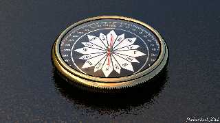
yep it did ... added small spot/area light radius just inside the
compass (to give shadow on needle) and radiosity helped (allowed me to
turn down emission I was using to see compass face before radiosity) ...
strange (to me anyway) tho had to turn down diffuse on the brass as well
... anyway WAY better version ... thanks y'all :-)
Post a reply to this message
Attachments:
Download 'compass.png' (1171 KB)
Preview of image 'compass.png'

|


![]()