>"Warp" schreef in bericht news:4d10761e@news.povray.org...
>
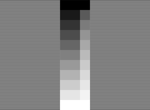
>The problem with the current pov3.7 is that such a gradient is not
>looking even close to linear, even with monitors where 'rgb 0.5' is
>truly 50% bright, as compared to a test pattern. I don't know why this
>is so, but it just isn't.
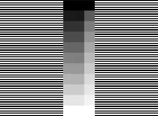
I'm curious Warp. I've shrunk the file you made yourself for the thread
'More Gamma Again' in p.b.i to a very small one. Now you don't have
to see through your eyelids but can simple look at it. For me the 3.6
side is lineair and the 3.7 side absolutely not. How looks this stamp
on your monitor now?
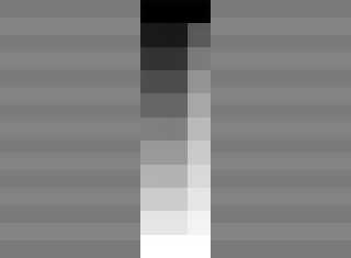
Don't say it's the thrinking technic, because for me it's absolutely
the same for the big and the small one.
If you have windows 7, than put the file on your monitor and you
automatically get a stamp as icon.
Can everybody react on this with which side is for them the right
one, because I'm under the impression that more people see
what I see.
Thanks in advance,
Jaap Frank
Post a reply to this message
Attachments:
Download 'gradient_10_pov.png' (4 KB)
Download 'gradient_pov_mini.png' (1 KB)
Preview of image 'gradient_10_pov.png'
Preview of image 'gradient_pov_mini.png'
|