> I don't see anything in there that would deserve the term "ugly", except
> maybe the scaling of the grey/white checkered pattern indicating the areas
> that haven't been rendered yet. That, and maybe the fact that it's not
> using any form of interpolation. But I'd consider neither of those
> seriously unfit for a preview window.
>
> Though of course if you'd volunteer to improve it, I guess you'd be
> happily invited ;-)
I'll download the source again and take a look.
> (Then again, maybe you're seeing something I failed to see in my simple
> experiments I just did.)
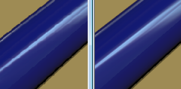
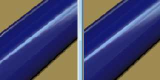
Take a loot at the attached (left maximised, right 100%). I think this is
some kind of "worst case" because it uses diagonal lines and the scale
factor is probably around 99% to fit it full screen.
Post a reply to this message
Attachments:
Download 'image3.png' (44 KB)
Preview of image 'image3.png'
|