> It turns out that if you have the labels in column A and the dates in
> column B and you do an XY Scatter Plot, and turn on data labels, it does
> sort-of the right thing.
>
> However, nothing in hell will convince it to put the dates on the X axis.
> If you put the data that way round, it spazzes out and doesn't know how to
> plot the data any more. So I'm stuck with the dates on the Y axis. *sigh*
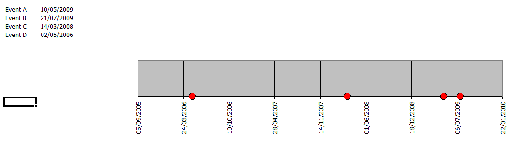
You can do an XY plot and set the X axis manually to be your date column,
you then get the attached. Is that what you want?
Post a reply to this message
Attachments:
Download 'image1.png' (8 KB)
Preview of image 'image1.png'
|