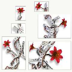
Not much may *seem* changed here, but I've worked a lot on the small
details.
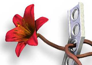
First of all, the stems have a different color and texture. I hope they
don't look so unhealthy now?
The stems had some problems with intersecting with the metal quite a few
places. I started fixing that manually by moving control points in the
splines, but that turned out to be both very difficult and very boring. So I
wrote an algorithm that moves the stems out of the way of the metal, using a
lot of trace() calls. Once I got it tweaked, it did a lot better job at it
than I could ever have done myself. The image should be free of intersecting
objects now. If you spot any at all, please let me know!
I think I have decided not to have any leaves on the stems. It would look
odd with brown or red or gray leaves, which are really the only acceptable
colors in this image. Green is still not an option...
I have troubles deciding on a name for the image. Various ideas have been
"Broken Canvas" - focus perhaps too much on the form and not the content?
"Metal and Flowers" - the simple approach - I'm not so sure.
I've also toyed with several ideas trying to convey the theme of the image,
but none that I'm satisfied with.
"Organic Design" "Artificial Organics" "Organic Artifacts"
Maybe "Constructed Growth"? "Designed Growth"? "Grown Constructions"?
*sigh* I don't know...
Rune
--
http://runevision.com
Post a reply to this message
Attachments:
Download 'metal10.jpg' (164 KB)
Download 'metal_a4_6.jpg' (101 KB)
Preview of image 'metal10.jpg'

Preview of image 'metal_a4_6.jpg'

|


![]()