|
 |
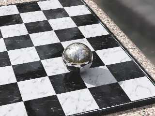
Here's a redesigned board, based loosely on a few boards google found. It
seems wood+marble don't usually appear on the same board so I went fully
marble, with a chrome line to outline the board. Not sure I like the chrome
line, I think I'll try an inverted version with white marble border and a
black line...
--
Tek
http://evilsuperbrain.com
"Tek" <tek### [at] evilsuperbrain com> wrote in message
news:461fd775$1@news.povray.org...
>I totally agree, though focal blur should help tie the blurry HDRI
> background to the sharp foreground a bit better. But in any case I'm going
> to experiment with some kind of ground.
>
> Good suggestion regarding the board, I hadn't thought of that (and I don't
> play it myself). I'll add one now.
>
> --
> Tek
> http://evilsuperbrain.com
>
> "Florian Brucker" <tor### [at] torfbold com> wrote in message
news:461fd775$1@news.povray.org...
>I totally agree, though focal blur should help tie the blurry HDRI
> background to the sharp foreground a bit better. But in any case I'm going
> to experiment with some kind of ground.
>
> Good suggestion regarding the board, I hadn't thought of that (and I don't
> play it myself). I'll add one now.
>
> --
> Tek
> http://evilsuperbrain.com
>
> "Florian Brucker" <tor### [at] torfbold com> wrote in message
> news:461fc967$1@news.povray.org...
>> Uh, pretty nice! Pretty damn nice to be specific :)
>>
>> As you ask for possible improvements: Personally I don't like seeing the
>> background where the table ends, I'd prefer some sort of ground. As a
>> minor thing I'd suggest adding a frame around the chessboard, I've never
>> seen one where the tiles start right at the edges.
>>
>>
>> Regards,
>> Florian
>
> com> wrote in message
> news:461fc967$1@news.povray.org...
>> Uh, pretty nice! Pretty damn nice to be specific :)
>>
>> As you ask for possible improvements: Personally I don't like seeing the
>> background where the table ends, I'd prefer some sort of ground. As a
>> minor thing I'd suggest adding a frame around the chessboard, I've never
>> seen one where the tiles start right at the edges.
>>
>>
>> Regards,
>> Florian
>
>
Post a reply to this message
Attachments:
Download 'before+after.1.jpg' (109 KB)
Preview of image 'before+after.1.jpg'

|
 |


![]()