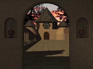
A much improved version if I do say so .....
In order to get a better view it took a combination of moving the camera
back and pushing the outside building out WAY farther in the "Z" axis. It
took a bit to get the camera angle so the image didn't have a pinchusioned
look to it. The close up view of the wall and the oil lamps has an area
light the size of and almost right up against the ceiling. I like this tile
color scheme MUCH better than the previous version ....
Thanks everyone who offered comments on previous version .... I was
suffering from POV version of writters block!
Post a reply to this message
Attachments:
Download 'Courtyard.jpg' (298 KB)
Preview of image 'Courtyard.jpg'

|


![]()