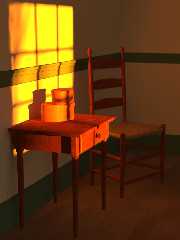
Here is the latest version of my Shaker-inspired scene.
I'm still not 100% happy with the lighting. I also think there should be
more shadows than there are, and I'm not exactly sure what I need to do
about that. I'm guessing that it's a Radiosity issue. Perhaps I should
mess around more with some of the various settings. Any advice in that area
would be appreciated. Mastering radiosity is an art-form of its own. There
are also some radiosity issues behind the table on the wall. I didn't
notice that until now, but I think I can clean that up.
Now that I've expanded the height of the frame, I also feel that the scene
needs more "stuff" in it. I'm just not exactly sure what. A picture
hanging on the far wall might work, but unfortunately, that would kill a
Shaker scene, since they generally did not believe in hanging pictures. I
have a couple ideas, but feel free to make suggestions.
This was actually scaled down from the original which is here:
http://www.beantoad.com/newimages/shaker16.jpg
Post a reply to this message
Attachments:
Download 'Shaker16small.jpg' (97 KB)
Preview of image 'Shaker16small.jpg'

|


![]()