|
 |
Among other things, Tim Nikias v2.0 wrote:
> You should fix that with the inner
> engravement being the wrong way
> round (are you using bump-maps,
> or CSG?).
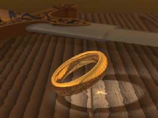
No, mine is fine, it's the rendering Ben Scheele showed the one that's
wrong... The ring (mine) is CSG (lathe & text).
> Aside of that, how about using a slighty
> irregular heightfield for the wood?
Hmm... maybe. I did some tests with function-hf, it looks like I will need a
fairly high resolution and parsing time would grow too much (I guess I
should save the data first). The hardest part would be fitting the hf to
the round corners (the table is made up of round boxes). Right now, most of
the texture is normal-made, which works very nicely under the spotlight,
but is obscured by focal blur and radiosity (though I used "normal on"),
maybe I should add some pigment noise (layers) too.
> And regarding focal-blur: make the
> aperture a nuance smaller, so that the ring
> itself antialiased at most, but not blurred.
> Move the camera away a little, and add
> some stuff, like pots and cups and such,
> in fore- and background. Use radiosity
> to light that, but keep a soft spotlight on
> the ring, to make it the center of attraction.
That's more or less what I've tried now. Not many objects, just two copies
of the same dagger (I had to model it and draw the maps for the occasion),
I also fixed the scale of the table (the planks were too small in
comparison with the ring). Is it any better now?
--
light_source{9+9*x,1}camera{orthographic look_at(1-y)/4angle 30location
9/4-z*4}light_source{-9*z,1}union{box{.9-z.1+x clipped_by{plane{2+y-4*x
0}}}box{z-y-.1.1+z}box{-.1.1+x}box{.1z-.1}pigment{rgb<.8.2,1>}}//Jellby
Post a reply to this message
Attachments:
Download 'theonering.jpg' (14 KB)
Preview of image 'theonering.jpg'

|
 |


![]()