|
 |
Among other things, Ben T. Scheele wrote:
> Not too shabby. I think gold is a hard thing to depict
> realistically.
Especially when I don't have any gold to compare with ;) Thanks for the
picture, it helped me realise that I needed much more reflection and
brightness, though I was aiming for a more reddish kind of gold and a
different kind of shabby (that was a new word for me) wood. By moving the
lights and changing some parameters I was able to eliminate the stupid
"brilliance 4" I had for the wood texture
> If radiosity doesn't affect the scene very much, you
> might want to try photons. They're fun to use with gold textures.
Yep, I tried using them, but with the old layout and textures there was no
noticeable effect, now there is :)
By the way, do radiosity and photons interact? I mean, would a bright
caustics spot illuminate surrounding objects? I've seen you can also get
caustics with pure radiosity (no photons), and I guess these would
illuminate surrounding objects, logic says photon caustics (and faked
caustics) would behave in the same way...
> I thought you might like to see a Brazil render my friend John Henriksen
> did of a scene he modeled in 3dmax. It might give you some ideas. For
> the table he used a height field generated from a scan of a cutting
> board. He had to do a lot of work by hand in Photoshop to get the text
> up to such a high resolution.
You mean the text or the texture? There's a TTF font available for the ring
inscription script (which I didn't use, because I like this one better).
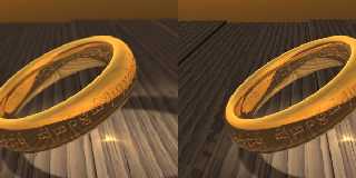
There's something I don't like in that picture: the text in the inner side
of the ring is backwards :D
Here's the new version, better now? (with and without focal blur)
--
light_source{9+9*x,1}camera{orthographic look_at(1-y)/4angle 30location
9/4-z*4}light_source{-9*z,1}union{box{.9-z.1+x clipped_by{plane{2+y-4*x
0}}}box{z-y-.1.1+z}box{-.1.1+x}box{.1z-.1}pigment{rgb<.8.2,1>}}//Jellby
Post a reply to this message
Attachments:
Download 'rings.jpg' (61 KB)
Preview of image 'rings.jpg'

|
 |


![]()