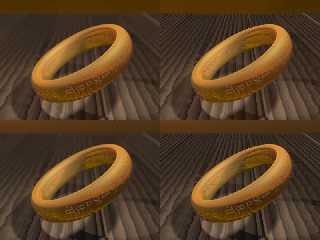
This is my first "serious" scene. It's the One Ring on a
intended-to-be-old-and-weathered wooden table. I've rendered four versions:
radiosity + focal blur radiosity
focal blur vanilla
The radiosity versions are a bit more reddish, but I don't think the effect
is worth the trouble. The focal blur, on the other hand, adds a bit of
realism, but obscures the table's detail. Any advice?
Things I like:
- The Ring model
- The texture of the table
Things I don't like (so much):
- The lighting
- The finishes don't look quite right
--
light_source{9+9*x,1}camera{orthographic look_at(1-y)/4angle 30location
9/4-z*4}light_source{-9*z,1}union{box{.9-z.1+x clipped_by{plane{2+y-4*x
0}}}box{z-y-.1.1+z}box{-.1.1+x}box{.1z-.1}pigment{rgb<.8.2,1>}}//Jellby
Post a reply to this message
Attachments:
Download 'rings.jpg' (52 KB)
Preview of image 'rings.jpg'

|


![]()