|
 |
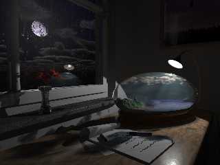
So, this is the latest installment of my Worldbowl
Improvements.
Now, the room is lit mostly by Radiosity, with
the rad-light coming mainly from the spotlight of
the worldbowl.
Then there are some photons in the shadow of the
vase, but that's rather for realism than actual "visual
effect".
I've added another page to the notebook and
exchanged the pencil with the ink-pen from my
"2 Lonely" image.
The base of the bowl was changed, as was its
texturing.
And you might not notice, but the table now uses
blurred-reflections.
I think I'm gonna lower the effect of the radiosity
somewhat, and perhaps make the pigment on the
table darker, it looks a little muddy, and when lit,
issues on my to-do list, e.g. the window-frame and
the window-pane. I'm not sure if I should change a
lot about the walls.
Well, comments always appreciated. This last
image took about 24 hours to rendern, the histogramm
image looked really nice: totally black.
I'm thinking about getting some more light shine
through the clouds again, as their shadows are
in stark contrast now. I've become undecided about
the lighthouse again, though I might model some small
scale trees and plant them on the heightfield.
Ah well, this image needs some more tweaking, but
then I'll put it to rest for a while and do some other,
new stuff, to get detached again, in order to come back
with new and clean thoughts...
Well, enjoy!
Regards,
Tim
--
Tim Nikias
Homepage: http://www.digitaltwilight.de/no_lights/index.html
Email: Tim### [at] gmx de de
Post a reply to this message
Attachments:
Download 'worldbowl_24_02_03.jpg' (350 KB)
Preview of image 'worldbowl_24_02_03.jpg'

|
 |


![]()