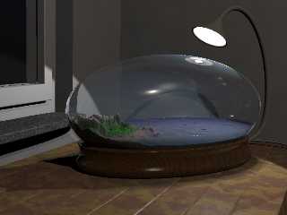
Hi all. My recent work:
Using meshes for the lamp's shade and the base of the
bowl, also created new texture for the base (much more
realistic, me thinks).
The change is not so obvious on the shade, but it has a
subtle curve and (almost) no sharp edges (there's still a
problem at the point where the shade touches the
arm holding it, but I won't spend to much effort on that).
The base looks way better now (less "Beginner's-CSG-like",
no offense to the newbies).
When it's finished, I'll post a pic with the bowl and its new
media clouds. They're much more versatile (speaking of colors
here).
Regards,
Tim
--
Tim Nikias
Homepage: http://www.digitaltwilight.de/no_lights/index.html
Email: Tim### [at] gmx de de
Post a reply to this message
Attachments:
Download 'wbowl_03_02_03.jpg' (39 KB)
Preview of image 'wbowl_03_02_03.jpg'

|


![]()