 |
|
|
|
|
|
| |
| |
|
|
|
|
| |
| |
|
|
This is prompted from the discussion in beta-test under colors.inc.
POV4 should allow you to enter colours and use image files that are already
gamma corrected (ie they look correct on your monitor prior to using in
POV). This, I think, is what most users expect when entering colour values
or using texture files. They expect the colours to look the same as if they
were choosing that colour in PowerPoint, or painting with that pixel colour
in a photo editor.
Currently however, POV assumes all RGB values in the SDL and any RGB values
from textures are in linear colour space, and uses them directly in the
rendering core. This often leads to output not being as expected (see
numerous posts about "washed out" effect when using image files).
I propose that POV4 has the option to apply the inverse of the display gamma
to any RGB values or image files used. This will mean users can directly
use RGB values and expect the correct output.
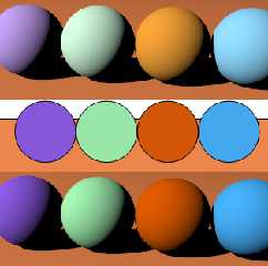
Attached is an example, the middle row of spheres is from eg a 2D drawing or
web page etc. The top row is the result if you just try to use those
colours in POV directly, the bottom row is if POV applied inverse gamma to
those colours prior to rendering. Note that these are both rendered with
display gamma of 2.2, if you try a higher display gamma the difference is
even bigger.
The bottom row is what most users would expect, I think.
Post a reply to this message
Attachments:
Download 'comparison.png' (65 KB)
Preview of image 'comparison.png'
|
|
| |
| |
|
|
From: Warp
Subject: Re: Gamma correction of input colours/image files
Date: 10 Oct 2008 04:05:31
Message: <48ef0cca@news.povray.org>
|
|
|
| |
| |
|
|
scott <sco### [at] scott com> wrote:
> Currently however, POV assumes all RGB values in the SDL and any RGB values
> from textures are in linear colour space, and uses them directly in the
> rendering core. This often leads to output not being as expected (see
> numerous posts about "washed out" effect when using image files).
I still can't understand why assumed_gamma doesn't fix this. Did you
even try it in your example?
--
- Warp com> wrote:
> Currently however, POV assumes all RGB values in the SDL and any RGB values
> from textures are in linear colour space, and uses them directly in the
> rendering core. This often leads to output not being as expected (see
> numerous posts about "washed out" effect when using image files).
I still can't understand why assumed_gamma doesn't fix this. Did you
even try it in your example?
--
- Warp
Post a reply to this message
|
|
| |
| |
|
|
From: scott
Subject: Re: Gamma correction of input colours/image files
Date: 10 Oct 2008 04:26:23
Message: <48ef11af@news.povray.org>
|
|
|
| |
| |
|
|
> I still can't understand why assumed_gamma doesn't fix this. Did you
> even try it in your example?
Yes, assumed_gamma *only* affected the output gamma correction
(display_gamma/assumed_gamma is what is actually used). Anyway,
assumed_gamma has all but been dropped from v3.7.
What I am asking for, is for the inverse of the output gamma to be applied
to RGB literals and image file *before* the rendering engine gets hold of
them. Currently POV does not do this.
Post a reply to this message
|
|
| |
| |
|
|
From: Jim Holsenback
Subject: Re: Gamma correction of input colours/image files
Date: 10 Oct 2008 08:27:00
Message: <48ef4a14@news.povray.org>
|
|
|
| |
| |
|
|
"scott" <sco### [at] scottcom> wrote in message news:48ef0656@news.povray.org...
> Attached is an example, the middle row of spheres is from eg a 2D drawing
> or
> web page etc. The top row is the result if you just try to use those
> colours in POV directly, the bottom row is if POV applied inverse gamma to
> those colours prior to rendering. Note that these are both rendered with
> display gamma of 2.2, if you try a higher display gamma the difference is
> even bigger.
I'm going to jump in here and hopefully I won't look too foolish ....
however I think the top row looks more like what I'd expect. I wrestled with
this when I was doing the v3.7 scene file updates. I settled on
display_gamma = 2.5. You know the documentation example about dosen't really
talk about color. The example shows grey, black, & white probably best for
determining brightness and contrast. Componets of gamma correction right?
> The bottom row is what most users would expect, I think.
>
brightness looks to low to me. contrast compares with top row.
Jim
Post a reply to this message
|
|
| |
| |
|
|
From: Severi Salminen
Subject: Re: Gamma correction of input colours/image files
Date: 10 Oct 2008 08:41:21
Message: <48ef4d71$1@news.povray.org>
|
|
|
| |
| |
|
|
Jim Holsenback wrote:
> however I think the top row looks more like what I'd expect.
Why on earth would you expect the colors to be off?
I'd guess most users want to see the colors they actually chose (of
course, there are many ways to describe spectral power
distributions...). The difference in the two rows was that top spheres
had way too light colors compared to bottom row spheres. So I don't
understand the point in expecting "false" colors.
Of course, I make here some assumptions about light source
color/intensity and tone mapping...
Post a reply to this message
|
|
| |
| |
|
|
From: Jim Holsenback
Subject: Re: Gamma correction of input colours/image files
Date: 10 Oct 2008 09:46:48
Message: <48ef5cc8@news.povray.org>
|
|
|
| |
| |
|
|
"Severi Salminen" <sev### [at] NOTTHISsaunalahtifiinvalid> wrote in
message news:48ef4d71$1@news.povray.org...
> Jim Holsenback wrote:
>> however I think the top row looks more like what I'd expect.
>
> Why on earth would you expect the colors to be off?
I reread my post and I don't believe I said that .....
> I'd guess most users want to see the colors they actually chose (of
> course, there are many ways to describe spectral power
> distributions...). The difference in the two rows was that top spheres
> had way too light colors compared to bottom row spheres. So I don't
> understand the point in expecting "false" colors.
I think I eluded to brightness & contrast differences .... not color.
Jim
Post a reply to this message
|
|
| |
| |
|
|
|
|
| |
| |
|
|
> I'm going to jump in here and hopefully I won't look too foolish ....
> however I think the top row looks more like what I'd expect.
Because you are used to how POV handles colours :-) But seriously, in the
top row, the *colours* (not brightness) are actually different from what you
specified in the SDL. It is easiest to see this with the orange ball,
anybody trying to make some promotional material where the colours need to
be accurate for a certain brand (eg the Sony Ericsson "orange") would likely
get the top row thrown back at them for being the wrong colour. The bottom
row preserves the correct colour.
The reason is that for "colours" (where RGB are not equal), gamma will
modify the brightness of each channel a different amount, so you are
actually changing the colour that you see, not just the brightness. Your
eye is very sensitive to changes in colour, even when the brightness is
different.
> brightness looks to low to me. contrast compares with top row.
The brightness is easily controlled by the diffuse value in the finish
statement, or by cranking up the light colour. Maybe I should have rendered
with more brightness to avoid the confusion between change in brightness and
change of colour?
Post a reply to this message
|
|
| |
| |
|
|
From: scott
Subject: Re: Gamma correction of input colours/image files
Date: 10 Oct 2008 10:56:41
Message: <48ef6d29@news.povray.org>
|
|
|
| |
| |
|
|
> I think I eluded to brightness & contrast differences .... not color.
Try all you want to modify the brightness and contrast of the top row,
you'll never be able to get a match with the middle row because the actual
*colours* are different. The only way to get the match will be do undo the
gamma correction, but then by doing that you're screwing with the physical
correctness of the lighting on the spheres (ie the brightness won't be
proportional to normal of the surface in the correct way anymore).
Post a reply to this message
|
|
| |
| |
|
|
|
|
| |
| |
|
|
On Fri, 10 Oct 2008 16:17:02 +0200, "scott" <sco### [at] scottcom> wrote:
>Because you are used to how POV handles colours :-) But seriously, in the
>top row, the *colours* (not brightness) are actually different from what you
>specified in the SDL. It is easiest to see this with the orange ball,
>anybody trying to make some promotional material where the colours need to
>be accurate for a certain brand (eg the Sony Ericsson "orange") would likely
>get the top row thrown back at them for being the wrong colour. The bottom
>row preserves the correct colour.
>
>The reason is that for "colours" (where RGB are not equal), gamma will
>modify the brightness of each channel a different amount, so you are
>actually changing the colour that you see, not just the brightness. Your
>eye is very sensitive to changes in colour, even when the brightness is
>different.
>
This can be demonstrated in your favorite image editor, GIMP in my case. Open up two
copies of the image, then adjust the gamma of one copy by 0.45, which is 1/2.2 gamma.
The colors of the top row
of the gamma adjusted image will closely match the center row of the original image.
>The brightness is easily controlled by the diffuse value in the finish
>statement, or by cranking up the light colour. Maybe I should have rendered
>with more brightness to avoid the confusion between change in brightness and
>change of colour?
You can do the same experiment above, but instead try and adjust the brightness and
contrast. The colors will never match.
The issue is definitely related to how POV-Ray handles gamma in pigments. For solid
pigments, the gamma-adjusted levels can be easily calculated manually. For image
pigments, a macro can be used...
// Macro to adjust APGPig pigment by APGGam gamma value
// Adapted from the CIE_Imagemap macro by Jaime Vives Piqueres
#macro AdjustPigmentGamma(APGPig, APGGam)
#local APGfn = function { pigment { APGPig } }
pigment {
average
pigment_map {
[function { pow(APGfn(x,y,z).red, APGGam) } color_map { [0 rgb 0][1 rgb
<3,0,0>] } ]
[function { pow(APGfn(x,y,z).green, APGGam) } color_map { [0 rgb 0][1 rgb
<0,3,0>] } ]
[function { pow(APGfn(x,y,z).blue, APGGam) } color_map { [0 rgb 0][1 rgb
<0,0,3>] } ]
}
}
#end
Post a reply to this message
|
|
| |
| |
|
|
From: Severi Salminen
Subject: Re: Gamma correction of input colours/image files
Date: 10 Oct 2008 11:43:05
Message: <48ef7809@news.povray.org>
|
|
|
| |
| |
|
|
Jim Holsenback wrote:
>>> however I think the top row looks more like what I'd expect.
>> Why on earth would you expect the colors to be off?
>
> I reread my post and I don't believe I said that .....
I stand corrected, but that is how I interpreted it as you preferred the
top row. Anyway, inverse gamma correction is the thing to do in order to
get what you ask for.
(This is the same issue I was pondering with my own ray tracer a while ago.)
In addition, it would be nice if POV4 supported some other tone mapping
methods besides this linear one. I guess Megapov has "exposure" keyword
for this.
Post a reply to this message
|
|
| |
| |
|
|
|
|
| |


